DESIGN NAME:
Viennart Academy
PRIMARY FUNCTION:
Branding
INSPIRATION:
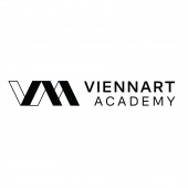
The project draws inspiration from the symmetry of V and A, embodying art as life's reflection. The play of light and shadow, pivotal in all art forms, informs the design ethos. Motivated by art's depth and resonance, the logo captures the essence of ViennART Academy's vision, a harmonious blend of tradition and innovation.
UNIQUE PROPERTIES / PROJECT DESCRIPTION:
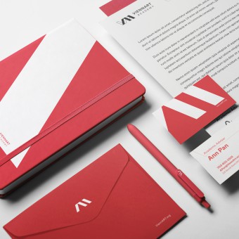
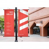
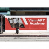
ViennART Academy is an emerging art high school located in Vienna, US. The visual identity design for ViennART Academy is a fusion of tradition and innovation. The logo is a reflective interpretation of VAA, symbolizing that art is a reflection of life. Solid and outlined shapes represent light and shadow in studio art. Parallelogram repetition underscores dynamism, echoing the academy's ethos of creativity and growth.
OPERATION / FLOW / INTERACTION:
ViennART Academy's visual identity features geometric shapes representing "VAA" for Vienna Art and Academy. The simplicity aids understanding and promotion. The repetitive parallelogram reinforces the logo's impact, ensuring it's memorable and recognizable. This design resonates with our core values and facilitates effective communication.
PROJECT DURATION AND LOCATION:
This project started in August 2023 and finished in February 2024. The website was published in September 2023. Print outs are currently under printing. This school location is in Vienna, Virginia, United States.
|
PRODUCTION / REALIZATION TECHNOLOGY:
The design journey commenced with 20 hand-drawn sketches, iteratively refined through stakeholder collaboration to 8 potential logos. These were meticulously digitized using Adobe Illustrator, culminating in the final selection. Mockups were crafted in Photoshop, while Wix facilitated website realization, and InDesign was employed for booklet design. The process integrated traditional sketching with digital tools, ensuring meticulous attention to detail and stakeholder satisfaction.
SPECIFICATIONS / TECHNICAL PROPERTIES:
The primary logo must be displayed with a minimum width of 1 inch in all designs. For smaller applications, secondary logos and logo symbols will be utilized. A padding, as indicated in optional image #1, must surround the logo. The booklet dimensions adhere to A4 standards.
TAGS:
visual identity, logo design, booklet design, website design, marketing materials, graphic design, visual communication, branding
RESEARCH ABSTRACT:
In response to stakeholder input, we opted for a geometric logo to ensure clarity. Insights emphasized the need for concise website information. The signature parallelogram strengthens our visual identity in the booklet and other visual designs, enhancing brand recognition.
CHALLENGE:
The project encountered hurdles starting with naming due to trademark application rejections. Logo development posed another challenge - deciding between full name or initials. We chose simplicity with VAA to differentiate from VA. Design-wise, the sharp corners of parallelograms seemed aggressive, so I adjusted angles in the booklet design for brand recognition and softer visual appeal. External factors like trademark laws and internal considerations like brand differentiation influenced decisions, shaping the project's trajectory.
ADDED DATE:
2024-03-01 07:36:13
TEAM MEMBERS (1) :
IMAGE CREDITS:
The images licenses are updated as a pdf document.
|
