Bits'n'Bites Mobile Application by More By Us |
Home > Winners > #160202 |
 |
|
||||
| DESIGN DETAILS | |||||
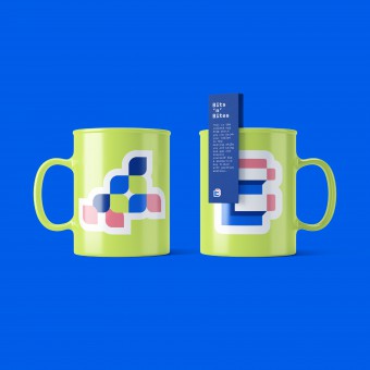
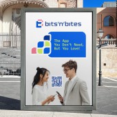
| DESIGN NAME: Bits'n'Bit PRIMARY FUNCTION: Mobile Application INSPIRATION: In conceiving the Bits'n'Bit UNIQUE PROPERTIES / PROJECT DESCRIPTION: The Bits’n’Bites app, initially a showcase of design, now fosters authentic professional connections, prioritising human interactions. Its human-centric approach is evident through its intuitive interface, which streamlines the building of relationships. Featuring aspects that mimic face-to-face interactions, such as personalised conversation starters, it offers a new platform for fostering deep connections. Presently in the MVP (Minimum Viable Product) development stage, it is aimed at empowering users to form meaningful connections upon its launch in five months. OPERATION / FLOW / INTERACTION: A user scans a QR code, downloads the Bits’n’Bites app, and creates a profile. The app's intuitive design facilitates connecting with others, exploring profiles, tagging meeting locations, and following individuals from favoured companies. Users receive customised messages, updates, and invitations. Owners of the QR code obtain statistics on meeting times and locations, as well as insights into which contacts most enjoy their interactions. The app underscores simple navigation, genuine connections, and personalisation, thereby enhancing networking for the cultivation of meaningful relationships. PROJECT DURATION AND LOCATION: The project commenced in June 2023 in Bulgaria and is currently in progress. Being in the MVP (Minimum Viable Product) stage, its release is anticipated within the next five months. |
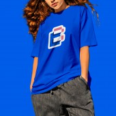
PRODUCTION / REALIZATION TECHNOLOGY: Colour theory was utilised to evoke emotions and enhance usability, employing vibrant greens, blues, and a mellow pink known for their calming and inviting qualities. These hues reflect the networking essence of the app, contributing to a visually appealing interface. Gestalt principles organised layout and visual elements cohesively, facilitating easy navigation and comprehension. User-centric design prioritised audience needs, enhancing satisfaction and retention through intuitive features. SPECIFICATIONS / TECHNICAL PROPERTIES: - TAGS: UI design, Networking App, Digital Networking Platform, App Design, Business Professional Networking, Meaningful Connections RESEARCH ABSTRACT: Research Objectives: To understand user needs within professional networking. Methodology: Conducting in-person interviews and usability testing. Tools Utilised: Personal meetings and prototyping software were employed. Participants: A diverse range of professionals took part. Results: A pronounced desire for genuine connections and the limitations of existing platforms were identified. Insights: There is a prevailing desire among people to improve the quality of their business connections. Impact: The findings are set to enhance the networking experience and foster collaboration. CHALLENGE: The most challenging aspect was striking a balance between technological innovation and human-centred design. Overcoming this issue necessitated navigating internal factors such as historical design perspectives and external factors including evolving technology and user expectations. Despite these obstacles, the continuation of the project was driven by a commitment to creating a platform that authentically fosters meaningful connections in the digital age. ADDED DATE: 2024-02-29 15:12:54 TEAM MEMBERS (8) : Creative Director: Maria Burgelova, Lead Designer: Mimy Yordanova, Senior Designer: Val Petrova, Designer: Vasil Tonev, Designer: Bozhidar Hadzhiev, Designer: Boris Savev, Designer: Beloslava Ivanova and Copywriter: Elisaveta Vakavchieva IMAGE CREDITS: People on images: Generated with AI by Midjourney Mockups: Envato & Freepik Video Sound: Envato PATENTS/COPYRIGHTS: More By Us 2023 |
||||
| Visit the following page to learn more: https://bitsnbites.app/ | |||||
| AWARD DETAILS | |
 |
Bits'n'bit |
| SOCIAL |
| + Add to Likes / Favorites | Send to My Email | Comment | Testimonials | View Press-Release | Press Kit |


