DESIGN NAME:
Portal One
PRIMARY FUNCTION:
Headphone
INSPIRATION:
Globally, wearing headphones has become a universal signal for do not disturb and concentration, a non-verbal cue used by millions to communicate their need for focus and privacy. Despite this widespread understanding, it’s also common for people to communicate with each other while wearing headphones. Thus, the message often falls short of being clearly and effectively communicated, leading to confusion, and resulting interruptions in the context of open offices, studios and classrooms.
UNIQUE PROPERTIES / PROJECT DESCRIPTION:
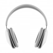
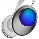
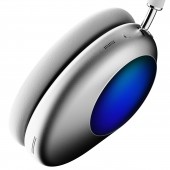
Portal One is beyond a pair of headphones; it is a unique device designed to express a concentration signal through a lighting display. By lighting up in distinctive animated visuals, Portal One serves as a non-intrusive communication tool, signalling to others the wearer's need for focus, thereby avoiding disturbance in the work and study environment. The abstract pattern is noticeable without being distracting or overly bright, which is important in shared spaces.
OPERATION / FLOW / INTERACTION:
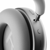
An app on mobile phone could be used to activate the focus time mode that turns the light on as well as other basic functions. The rightside light panel functions as a touch control area, accepting swipe and tap guestures to control media. Long pressing will activate the focus time mode for a default duration of 1 hour.
Portal One offer a unique solution for users looking to focus without interruptions. It also introduces a social code for the modern workplace. This focus Time feature fosters an environment of mutual respect and understanding. Ideal for open offices, studios, and more. By balancing individual focus with collaborative engagement, it promises to enhance workplace harmony, boost productivity, and reduce stress. Whether engaged in deep work or seeking privacy, Portal One users can maintain focus while implicitly communicating their status, paving the way for a more inclusive and respectful working environment.
PROJECT DURATION AND LOCATION:
The project started in Dec 2023 in Pasadena, CA, US and finished in Feb 2024.
|
PRODUCTION / REALIZATION TECHNOLOGY:
Color psychology plays a pivotal role in this communication strategy. Shades of blue, purple, and green on the Portal One displays are chosen for their associations with tranquillity, focus, and creativity. Blue and green, in particular, foster a calming ambience conducive to productivity, while purple hints at creativity and insight. These colors not only convey the wearer's current state effectively but do so in a manner that's subtle and non-disruptive to the surrounding environment.
SPECIFICATIONS / TECHNICAL PROPERTIES:
203.98mm x 82.01mm x 218.37mm
TAGS:
Headphone
RESEARCH ABSTRACT:
How can we express the concentration and do not disturb signal for the headphone users who demand it to others in an effective and gentle way? We studied existing practice of visuals and analysed why they are not suitable for the context of workspace by secondary research and interview. We studied color psychology and abstract visual communication to create the proposals of the visuals. We invited people who work in the office and studio environments to have a perception test of our proposals.
Finally we came to the result:
Abstract Visual Communication: Lights are a clear and non-verbal way to communicate. In a work or public environment, others can easily see the lights and understand that the user is concentrating and prefers not to be interrupted.
Color Psychology: Blue, purple and green are often associated with calmness, focus, and creativity. These colors can subtly signal that the wearer is in a state of deep concentration. Moreover, those colors are more suitable for office etiquette.
Dynamic light, Obvious Yet Non-Disruptive: Dynamic lights are more obvious than static ones, making it more likely that others will notice and respect the user's focus state. At the same time, the abstract pattern can be noticeable without being distracting or overly bright, which is important in shared spaces.
CHALLENGE:
How we let people understand the signal? Historically, we explored past uses of color and light in communication to create an intuitive signal. Socially, we conducted many user researches to ensure our design would be universally understood across different cultures, considering the varied interpretations of colors and light patterns. This approach helped us create a visual signal that resonated with a wide audience, bridging cultural differences effectively.
ADDED DATE:
2024-02-28 21:28:57
TEAM MEMBERS (1) :
IMAGE CREDITS:
Zhenghao Huang
Weiqi Sun
|


