Hilfe Punkt Mobile Application by Ladan Zadfar |
Home > Winners > #159948 |
 |
|
||||
| DESIGN DETAILS | |||||
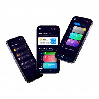
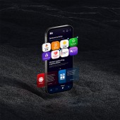
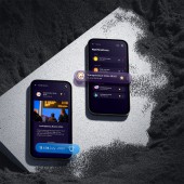
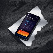
| DESIGN NAME: Hilfe Punkt PRIMARY FUNCTION: Mobile Application INSPIRATION: By migrating, one grapples with unfamiliar rules,especially without language knowledge.The designers, seasoned migrants,feared missing vital regulations!They longed for a clear guide for newcomers,lost in the internet maze.Enter HilfePunkt: a beacon of clarity,simplifying the path for newcomers, offering essential guidance,step by step.With a gentle hand, HilfePunkt aims to ease the strain of settling in a foreign land,providing newcomers with the tools to navigate bureaucracy and law with ease. UNIQUE PROPERTIES / PROJECT DESCRIPTION: A communicative app that aids newcomers in Germany,clarifying legal procedures without confusion and supporting them through it.Tailored for diverse groups, it outlines mandatory and optional activities and legalities,offering different services. Breaking language barriers,it offers information in newcomers' native tongues,facilitating clear communication with authorities.Cruciall OPERATION / FLOW / INTERACTION: HilfePunkt redefines newcomers' integration in Germany, bridging relocation complexities with comfort and knowledge.It provides two different lists of activities one for mandatory activities such as city hall registration,and one for optional activities such as different courses one can take!The users will recieve notifications over what is going to change such as possible bus strikes.HilfePunkt also prevents appointment collisions so all recieved appointments will be set in a reasonable manner. PROJECT DURATION AND LOCATION: The project started in February 2023 in Germany |
PRODUCTION / REALIZATION TECHNOLOGY: The design process unfolded employing a suite of tools: Figma, Photoshop, Adobe XD,and Illustration.Commenc SPECIFICATIONS / TECHNICAL PROPERTIES: The app is designed to be adjusted when using Android or IOS operating systems and different phone sizes. TAGS: HilfePunkt, Termin, Flüchtling, Neuankömmling, Deutschland, Sprachbarriere, Anmeldung, Angebote, Checkliste, Asylgesetz, UX, UI RESEARCH ABSTRACT: In order to design an app that provides classified, short and yet accurate information to the user, the designers needed to do extensive research and check everything with the authorities. On the other hand, to ensure whether they took the right approach and how much such an approach is needed, the designers conducted research in the form of questionnaires and interviews from both involved groups, newcomers and officials who are dealing with them. The results were incredibly positive and effective. CHALLENGE: Our greatest hurdle was serving the vulnerable asylum seeker group, meaning sensitive information. To preserve confidentiality and trust, we established a separate system. Here, no user data reaches us; access is solely through the user's social worker. Additionally, we are facing the challenge of convincing officials to embrace this new approach, navigating communication barriers, and highlighting its merits. ADDED DATE: 2024-02-28 15:35:43 TEAM MEMBERS (1) : Ladan Zadfar IMAGE CREDITS: Ladan Zadfar |
||||
| Visit the following page to learn more: http://hilfepunkt.de | |||||
| AWARD DETAILS | |
 |
Hilfe Punkt Mobile Application by Ladan Zadfar is Winner in Mobile Technologies, Applications and Software Design Category, 2023 - 2024.· Press Members: Login or Register to request an exclusive interview with Ladan Zadfar. · Click here to register inorder to view the profile and other works by Ladan Zadfar. |
| SOCIAL |
| + Add to Likes / Favorites | Send to My Email | Comment | Testimonials | View Press-Release | Press Kit |
| COMMENTS | ||||
|
||||


