DESIGN NAME:
New Visual Direction of Qwale
PRIMARY FUNCTION:
Brand Identity
INSPIRATION:
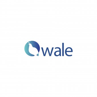
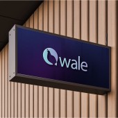
Leveraging color psychology and symbolism, our fintech app's rebranding merges blue and purple for trust and clarity, with a Qwale bird logo symbolizing freedom and growth, embodying financial empowerment and distinctive identity.
UNIQUE PROPERTIES / PROJECT DESCRIPTION:
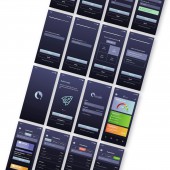
Transformed fintech branding by concentrating on a strategic overhaul of the logo and an intuitive user-centric design for its mobile app. This innovative project, driven by color psychology and in-depth user research, has successfully rebranded Qwale as a contemporary, user-focused player in the fintech industry.
OPERATION / FLOW / INTERACTION:
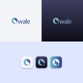
The Qwale App logo is designed for seamless interaction, utilizing SVGs for flexibility across devices. Its color scheme and bird motif embody progress and freedom, engaging users at first glance. The logo enhances user experience by adapting to different interfaces, ensuring accessibility with high color contrast. This thoughtful design not only improves visual appeal but also supports better navigation and user comprehension, making the app more intuitive and effective in helping users achieve their financial goals.
PROJECT DURATION AND LOCATION:
The project, including the further App UI redesign, started in April 2023 in New York City and finished in June 2023.
FITS BEST INTO CATEGORY:
Graphics, Illustration and Visual Communication Design
|
PRODUCTION / REALIZATION TECHNOLOGY:
My design process was anchored in user-centric methodologies, including in-depth interviews, persona development, journey mapping, and story mapping to ensure the fintech app's UX/UI and logo resonated deeply with the target audience. Color choices were informed by rigorous color psychology research, selecting hues that evoke trust, clarity, and empowerment. This comprehensive approach, coupled with the commitment to aligning the design with users' needs and aspirations, underpins the effectiveness and innovation of this rebranding project.
SPECIFICATIONS / TECHNICAL PROPERTIES:
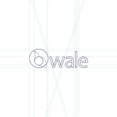
The new logo merges precision with accessibility, using a grid system for balance, SVGs for versatility, and the golden ratio for the Qwale bird, ensuring visual integrity. Adhering to AAA color contrast standards enhances readability for all, embodying our ethos of clarity, professionalism, and inclusivity.
TAGS:
logo design, UI design, user-centric design, color psychology, digital accessibility, brand identity, fintech, startup
RESEARCH ABSTRACT:
The logo redesign for Qwale Credit Builder involved qualitative research, focusing on color psychology and user preferences to enhance brand appeal. I tested prototypes and gathered feedback, particularly on color choices like blue and purple, known for evoking trust and stability. Insights from user interviews influenced the final design, emphasizing a dark theme for privacy and security. This research-driven approach aims to boost user engagement by aligning design with psychological principles and user expectations.
CHALLENGE:
The creative challenge in redesigning Qwale's logo revolved around modernizing its identity while maintaining brand recognition. Internally, I balanced historical loyalty with the need for a fresh, socially relevant appeal. Externally, compliance with digital accessibility laws shaped my design decisions. I navigated production limitations by leveraging current graphic design technologies and information on color psychology. Overcoming these obstacles required iterative design, extensive user testing, and adapting to evolving tech standards to create a logo that resonates across diverse user demographics.
ADDED DATE:
2024-02-27 19:02:36
TEAM MEMBERS (1) :
IMAGE CREDITS:
Ruiqi Sun, 2023.
|
