DESIGN NAME:
Hidden In Wide
PRIMARY FUNCTION:
Residence
INSPIRATION:
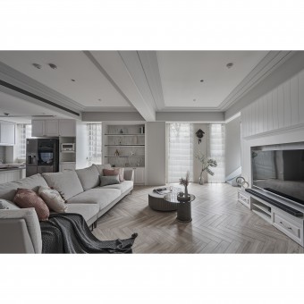
The inspiration came from the client's desire to create a space for children to play freely. However, the original floor plan was unsatisfactory, as the living room would become crowded and disproportionate. To solve this problem, the designer changed the configuration of the living room to a horizontal arrangement, thus creating a more dynamic rhythm. In addition, American lines and pure main color shape a warm and comfortable atmosphere for children to play freely.
UNIQUE PROPERTIES / PROJECT DESCRIPTION:
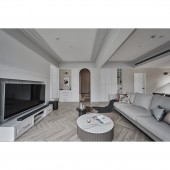
Loop Layout: The designer created a space that rhymes like music through clever circulation planning, a pure color scheme, and American lines. The first consideration is circulation and functionality. The living room is the center of family activities, so the designer arranged the TV wall in the middle.
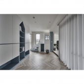
Pure color with layers: Secondly, the overall color scheme is mainly white, with wooden flooring and camel-colored furniture to show simplicity and nature. The texture of different materials and the American-style trims describe the delicacy and layering of the light-colored space.
OPERATION / FLOW / INTERACTION:
Interior design is both an art and a philosophy. Good design not only satisfies the needs of the occupants but also creates a comfortable and beautiful atmosphere. Through careful planning and meticulous design, the designer created a home that is aesthetically pleasing yet functional and received positive feedback from the clients. Clients are particularly drawn to beautiful design ideas and elements.
PROJECT DURATION AND LOCATION:
The project finished in March 2023 in Taiwan.
FITS BEST INTO CATEGORY:
Interior Space and Exhibition Design
|
PRODUCTION / REALIZATION TECHNOLOGY:
Materials: Silestone, stone plastic composite flooring, spray paint, wallpaper, system cabinets, trims, etc.
Different colors and materials are used according to the functional needs of different areas. The social area has good lighting and a greenery view from the windows, so pure white and a variety of materials are used to express the depth of the field. The American lines add vitality to the space and emphasize the elegant lines of the furniture. The private area is covered with low-brightness colors such as mauve, blue, and white to enhance the freshness and elegance.
SPECIFICATIONS / TECHNICAL PROPERTIES:
The site has a total area of 218 square meters and is divided into two floors. The first floor is a social area that includes a living room, dining room, play area, and piano area. The second floor is for a private area, including the master bedroom, second bedroom, and dressing room.
In terms of layout, the designer emphasized the continuity and functionality of each area and made the whole space more practical and comfortable according to the needs of the residents.
TAGS:
Loop space, American lines, pure main color, lighting and ventilation, eco-friendly building materials.
RESEARCH ABSTRACT:
'Wide' comes from the spaciousness of the space. The design team changed the position of the TV wall to create a circular layout, making each space unique. With the trims, the space is evenly balanced and bright. 'Hidden' is the essence of each space. From the quietness of the piano room to the laughter of the children's play area, to the cozy conversation between the living room and the dining room, each scene does not interfere with the other. The design team created unlimited possibilities within the limited space.
CHALLENGE:
The first challenge for the designer was to perfectly configure the space. Especially considering the loop circulation on the first floor, aesthetics, and functionality had to be considered. In addition, the size of the slide was also an issue to be considered. The designer used CNC to cut the slide unit into 3 parts to achieve precision and zero error.
ADDED DATE:
2024-02-26 09:29:19
TEAM MEMBERS (1) :
Jian-Hui Wu
IMAGE CREDITS:
Design-Everywhere
|


