DESIGN NAME:
Yuan Li Sheng Huo
PRIMARY FUNCTION:
Brand Logo Design
INSPIRATION:
The Chinese character for yuan in the brand name yuanlishenghuo has the same pronunciation of circle in Chinese. Inspired by that, the logo incorporates circles reminiscent of small planets, which is interesting and pays a tribute to the movie Star Wars.
- The logo resembles a box able to contain multiple items. Such a design suggests that the brand boasts diverse products and can provide solutions for mainstream emergency scenarios.
UNIQUE PROPERTIES / PROJECT DESCRIPTION:
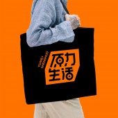
This logo is specially designed for the brand yuanlishenghuo, aiming to establish a youthful and vigorous brand image, promote a positive lifestyle, and meet the aesthetic needs of young people. It combines the brand name with a unique geometric shape, and takes a bright and vibrant orange as the main color, which is visually appealing. This also creates a lasting impression on consumers, thus improving the brand competitiveness in the market.
OPERATION / FLOW / INTERACTION:
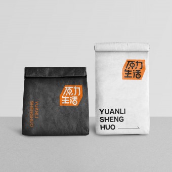
The brand can imprint this logo on product packaging, which enhances the visual appeal of the products and thus boosts brand recognition and competitiveness in the market. Furthermore, the vigorous logo can resonate emotionally with young people aged 20 to 35, increasing brand favorability and establishing an emotional connection between the brand and consumers.
PROJECT DURATION AND LOCATION:
The project was designed in September, 2022 in Hangzhou, and launched in June, 2023 in Hangzhou.
FITS BEST INTO CATEGORY:
Graphics, Illustration and Visual Communication Design
|
PRODUCTION / REALIZATION TECHNOLOGY:
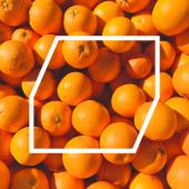
The design team has cut triangles off from a square to form a hexagon as the background of the logo, making it more recognizable and impressive. A vibrant orange as the main color, and the brand name designed with fluid lines, imbuing the logo with a youthful vibe. Additionally, the strokes of characters maintain consistent slant angles, improving overall harmony.
SPECIFICATIONS / TECHNICAL PROPERTIES:
Yuanlishenghuo targets young adults aged 20 to 35 as its core audience, who are predominantly keen on self pleasing consumption and are more willing to spend on daily goods with exquisite designs. To cater to their aesthetic preferences, the design team has created an aesthetically pleasing logo radiating vigor, which advocates for an optimistic attitude towards life.
TAGS:
logo design, vigor, refinement, super symbol, geometric elements
RESEARCH ABSTRACT:
As society rapidly develops and undergoes digitalization, young people are gradually becoming one of the major consumer forces. To cater to their aesthetic preferences and establish a brand image, the design team has crafted a logo using a vibrant orange, cute circles and a sharp geometric background, which blends modernity with vitality, leading to strong visual impact and reflecting the inclusiveness and creativity of the brand.
CHALLENGE:
The biggest challenge of this project was aligning the logo with the brand image and concept. The design team has shaped the logo into a geometric figure reminiscent of box for storing articles of everyday use, which suggests that the brand boasts multiple core products featuring wide adaptability to various scenarios, embodying its goal of creating a refined collection store for daily essentials.
ADDED DATE:
2024-02-26 07:54:45
TEAM MEMBERS (1) :
IMAGE CREDITS:
Fullspeed Network Technologies Hangzhou , 2023.
|


