Kurimu Ice Cream Packaging Design by Lance Francisco |
Home > Winners > #158814 |
 |
|
||||
| DESIGN DETAILS | |||||
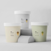
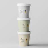
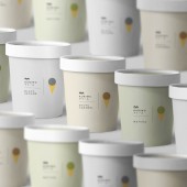
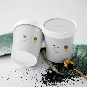
| DESIGN NAME: Kurimu Ice Cream PRIMARY FUNCTION: Packaging Design INSPIRATION: The inspiration for this project came from Japanese minimalist culture and aesthetics, reflecting Kurimu's premium quality and vision. Extensive research into Japanese design philosophy guided the project, resulting in a harmonious fusion of visual appeal and brand essence. UNIQUE PROPERTIES / PROJECT DESCRIPTION: Kurimu's packaging embodies Japanese minimalism with flavor-centric illustrations. This fusion of tradition and modernity elevates Kurimu to a premium brand, enhancing the consumer experience and reinforcing its artisanal image. OPERATION / FLOW / INTERACTION: Interacting with Kurimu's packaging is intuitive and engaging. Customers are drawn to the minimalist design and unique flavor illustrations. Opening the packaging brings anticipation and delight, enhanced by quality materials. The simplicity keeps focus on the ice cream, creating a seamless and enjoyable experience. PROJECT DURATION AND LOCATION: The project started in August 2020 in Manila, Philippines. FITS BEST INTO CATEGORY: Packaging Design |
PRODUCTION / REALIZATION TECHNOLOGY: Kurimu's packaging blends traditional and modern techniques. Durable paperboard was chosen for quality, while digital software crafted minimalist illustrations capturing each flavor. Precision offset printing ensured consistent colors, and prototypes were rigorously tested for functionality. This comprehensive approach delivered a visually stunning and cohesive packaging experience for Kurimu ice cream. SPECIFICATIONS / TECHNICAL PROPERTIES: Label: Top width & diameter 284mm x Bottom width & diameter 229mm x height 90mm Top Label: Diameter 93mm TAGS: Kurimu, Ice Cream, Packaging Design, Japanese, Minimalism, Premium, Artisanal, Minimalist, Culture, Pint RESEARCH ABSTRACT: Market research and design analysis were conducted to understand ice cream packaging preferences and create a design aligning with the brand's vision and target audience. Competitor analysis and cultural semiotics provided insights into consumer behavior and design trends. This informed approach resulted in a unique packaging design enhancing brand recognition, consumer engagement, and sales. CHALLENGE: The creative challenge was distinguishing minimalism from oversimplification. Balancing simplicity while conveying essential information without excessive reduction was key. Careful consideration of design elements like typography and iconography maintained visual appeal and informativeness. Iterative testing and feedback refined the design, effectively showcasing Kurimu's premium handcrafted ice cream while embodying minimalism. ADDED DATE: 2024-02-23 08:19:48 TEAM MEMBERS (1) : IMAGE CREDITS: Lance Francisco, 2023. PATENTS/COPYRIGHTS: Copyright, Lance Francisco. |
||||
| Visit the following page to learn more: https://lancefrancisco.com/ | |||||
| AWARD DETAILS | |
 |
Kurimu Ice Cream Packaging Design by Lance Francisco is Winner in Packaging Design Category, 2023 - 2024.· Press Members: Login or Register to request an exclusive interview with Lance Francisco. · Click here to register inorder to view the profile and other works by Lance Francisco. |
| SOCIAL |
| + Add to Likes / Favorites | Send to My Email | Comment | Testimonials | View Press-Release | Press Kit |


