DESIGN NAME:
Sinten
PRIMARY FUNCTION:
Coffee Packaging
INSPIRATION:
The key image is inspired by the essence of a golden proportion of brewing the best and freshest flavour of coffee that shared by the brand owner.
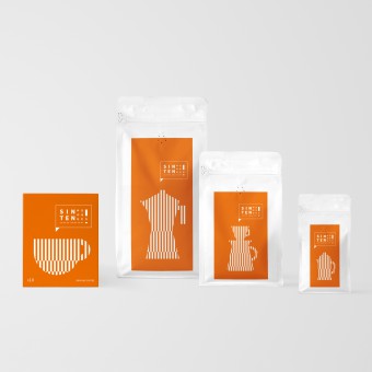
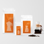
In the packaging design, the visual embodies such a golden proportion (i.e. 60% green bean quality, 30% roasting technique and 10% brewing craft) in a rhythmic graphic illustration. Each main visual is being shown in different coffee or brewing tools which closely associate with the product itself.
UNIQUE PROPERTIES / PROJECT DESCRIPTION:
Sinten Coffee brand is originated in Kaohsiung City, Taiwan. This project is aimed at bringing out the brand’s passionate in bean roastery. Along this direction, a strong colour scheme and minimal layout style are both crucial elements to create uniqueness and reinforce the brand differentiation in the local market.
OPERATION / FLOW / INTERACTION:
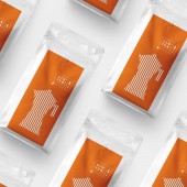
In terms of colour usage, a vibrant orange colour is selected because of its vitality and the warm vibe/sunny weather that brought by the Kaohsiung city.
As for the overall execution, different coffee devices (e.g. a coffee cup are used on the Drip Coffee packaging) are featured in the key visuals and they are all presented with the graphical pattern with stripes in order to maintain the image consistency in the whole series.
PROJECT DURATION AND LOCATION:
The project duration is 2 months and is designed in Taipei.
FITS BEST INTO CATEGORY:
Packaging Design
|
PRODUCTION / REALIZATION TECHNOLOGY:
One color printing. Material: Moisture-proof zipper bag and paper
SPECIFICATIONS / TECHNICAL PROPERTIES:
Width 105mm × length 105mm × height 130mm
Width 90mm × height 165mm
Width 125mm × height 200mm
Width 135mm × height 265mm
TAGS:
Coffee, Drip Coffee, Coffee Beans Packaging, Minimalism, Illustration, Line Graphic, Sinten
RESEARCH ABSTRACT:
The new packaging design is to create an unique personality in the market and make the brand looks different from others. Apart from the coffee bean quality, it is also very important for consumers to project a quality of life and an attitude of lifestyle.
CHALLENGE:
The key creative challenge is to catch consumers’ first attention on the package design from an overwhelming coffee brands. The overall design is based on a minimalism creative approach by applying a clean graphical pattern with an eye-catching orange colour tone which is not often used for a coffee brand.
ADDED DATE:
2024-02-21 12:10:34
TEAM MEMBERS (1) :
Creative Director: Louis Yiu, Motion Graphic Designer: Jason Liu, illustrator: Louis Yiu
IMAGE CREDITS:
A.S.M.D. Creations
PATENTS/COPYRIGHTS:
Copyrights belongs to Sinten Coffee Roastery
|


