DESIGN NAME:
World Vision Organization Overview
PRIMARY FUNCTION:
Book Design
INSPIRATION:
World Vision, born in the ruins of the Korean War, has compiled its diverse projects into a single book. The goal is to reflect on the history of the past 70 years and provide basic information in an easily understandable way, even for those unfamiliar with World Vision. Each project aims to serve as a medium for experiencing a design that is both simple and interesting, avoiding monotony while enhancing awareness.
UNIQUE PROPERTIES / PROJECT DESCRIPTION:
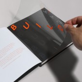
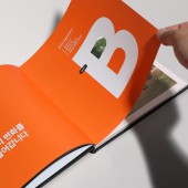
The inspiration was drawn from the word "happiness"; accumulated over 70 years. The concept is "Belief + Unity + Integration + Life + Dream = B.U.I.L.D," and it utilizes typography on the cover, stacking letters to create an intuitive graphic element. When you open the book, the transparent film and perforated design between each chapter, shaped in a specific form, shine a light on the faces of children, adding a playful element.
OPERATION / FLOW / INTERACTION:
The target audience is corporate and institutional PR managers. The goal is to engage their interest in World Vision's activities that have been a part of our lives for the past 70 years, focusing on assistance to children and their local communities. The material includes a booklet and a summary leaflet, with the leaflet having undergone three additional printings to continuously introduce it to a wider audience. This book serves as a valuable opportunity to establish the footprint and history of World Vision in the past seventy years.
PROJECT DURATION AND LOCATION:
This project commenced in August 2021 in Seoul, South Korea, and concluded in February 2022. The content produced during this period has been distributed to customers since March 2022.
FITS BEST INTO CATEGORY:
Graphics, Illustration and Visual Communication Design
|
PRODUCTION / REALIZATION TECHNOLOGY:
The case is designed with black hardboard, and hot foil stamping on the visible part of the cover effectively represents the 'BUILD' stacking concept. In the introduction section of the booklet, an orange silk-screen printed transparent film is overlaid, intending to create a stacking effect of alphabets when the pages are overlapped.
SPECIFICATIONS / TECHNICAL PROPERTIES:
Width 210mm x Height 210mm x Depth 13mm, 112 pages, matte-coated cover, orange hot foil stamping.
TAGS:
World Vision, Art Book, Illustration, Editorial design, Graphic Design, Typography
RESEARCH ABSTRACT:
As a person from South Korea, this project was meaningful to be part of World Vision, which originated from the ruins of the Korean War. Our challenge was to seamlessly integrate manuscripts from various project teams into a cohesive project and narrate the story of World Vision's 70-year history. We designed layouts with meticulous attention to detail, incorporating the 'BUILD' conceptual ideas, and infused meaning into the project concept with visually engaging elements.
CHALLENGE:
The primary goal is to consolidate various departments into a cohesive whole while maintaining a design that feels unified yet non-monotonous. Additionally, since it's an art book, the challenge was to incorporate the 'BUILD' concept seamlessly into the design. Typography and visual elements were utilized to provide a direction for achieving this objective.
ADDED DATE:
2024-02-21 09:37:24
TEAM MEMBERS (5) :
Creative Director : Sun-nam Kim, Creative Director : Yun-sik Son, Designer : Bommina Choi, Designer : Hye-ryun Jung and Planning : Su-jin Bang
IMAGE CREDITS:
Yunsik Son, 2023.
|


