The Giving Tree Clinic by Yusuke Tanaka |
Home > Winners > #158301 |
 |
|
||||
| DESIGN DETAILS | |||||
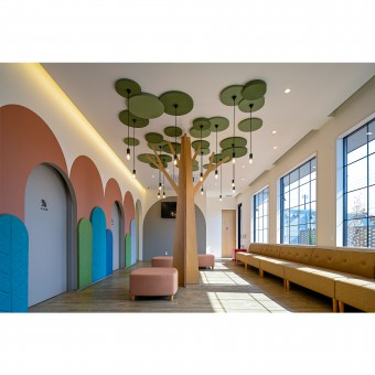
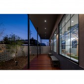
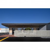
| DESIGN NAME: The Giving Tree PRIMARY FUNCTION: Clinic INSPIRATION: This work was designed based on a space like a forest where people can feel cheerful and healed when they are not feeling well.The design of the waiting room in particular was created so that children and adults of different ages would feel at ease together. The interior of the waiting room in particular is warmly welcoming with wooden objects and a large window from which one can see the trees in the garden and refresh oneself. UNIQUE PROPERTIES / PROJECT DESCRIPTION: The pediatric clinic has two separate entrances one for normal patients and the other for infected patients to prevent the flow of patients from crossing each other and prevent the spread of infectious diseases. Additionally, separate toilets are provided for each type of patient to ensure the facility is thoroughly protected against the spread of infection. There is also a wooden deck accessible from the waiting room which serves as a play area for bored children. OPERATION / FLOW / INTERACTION: This pediatric clinic is well equipped with amenities for children such as washrooms diaper changing stations and nursing rooms. The building has been designed to resemble a forest with wallpaper patterns on the walls that connect the rooms and evoke images of trees and mountains. The examination rooms have rounded ceilings that allow for natural light to filter through creating a serene environment similar to sunlight coming through the trees. PROJECT DURATION AND LOCATION: The construction was finished in October 2023 in Yonago, Tottori, Japan. FITS BEST INTO CATEGORY: Interior Space and Exhibition Design |
PRODUCTION / REALIZATION TECHNOLOGY: Sto painted wall Openwork brick wall Laser cutout panel Structure Wood SPECIFICATIONS / TECHNICAL PROPERTIES: Site area 993.98 square metre Total floor area 234.98 square metre Structure Wood TAGS: Japan, Yonago, pediatrics, big tree, clinic, architect RESEARCH ABSTRACT: To create a comfortable waiting room, we analyzed the size of the windows and the length of the eaves. We used a model to determine how light would enter the room. Our team also took into account the safety of the space by using soft materials for the walls and floor and eliminating sharp corners from the furniture. The design was created with children in mind, and we carefully considered the interior coordination. We even prepared many color samples to choose from when deciding on the final details. CHALLENGE: The staff flow line was simplified by placing the examination rooms at the center of the building. The waiting room has a large window that faces south and lets in a lot of light, but in the summer, it also makes the interior hot. We were able to make the space comfortable throughout the year by lengthening the eaves. The garden is enclosed, so people can freely go out to the garden from the waiting room. ADDED DATE: 2024-02-19 13:07:00 TEAM MEMBERS (1) : IMAGE CREDITS: Photographer Senichiro Nogami |
||||
| Visit the following page to learn more: https://beris1ng-yonago.com | |||||
| AWARD DETAILS | |
 |
The Giving Tree Clinic by Yusuke Tanaka is Winner in Interior Space and Exhibition Design Category, 2023 - 2024.· Press Members: Login or Register to request an exclusive interview with Yusuke Tanaka. · Click here to register inorder to view the profile and other works by Yusuke Tanaka. |
| SOCIAL |
| + Add to Likes / Favorites | Send to My Email | Comment | Testimonials | View Press-Release | Press Kit |


