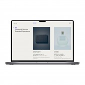
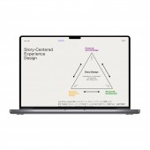
Tacto Inc. Website by Tacto Inc. |
Home > Winners > #158294 |
 |
|
||||
| DESIGN DETAILS | |||||
| DESIGN NAME: Tacto Inc. PRIMARY FUNCTION: Website INSPIRATION: tacto creates clean design based on strong concept. To reflect their design style, design team had inspiration from Swedish and Bauhaus design that strong typography is used as key design elements with organized spacing rule and clean layout. Simplifying the web design to make the story delivers easily. This website design was awarded and nominated in numerous design awards, which Inspiring many designers in Japan UNIQUE PROPERTIES / PROJECT DESCRIPTION: Designed a website for tacto inc, Digital Design agency located in Tokyo, Japan. Since their speciality is to create service from scratch with strong skills on concept making and UXUI, design is reflected their personality by clean layout with strong typography as design essence. Overlapping page transition animation was designed to show how tacto inc. is growing and be continuing in the design field in Japan. OPERATION / FLOW / INTERACTION: Step1: Overall Concept Step2: Wireframe Step3: Design Concept+Direction setting Step4: Visual Design Step5: Development Concept was made to reflect tacto inc.'s personality, Overlapping. Since tacto is small design agency, they tend to work with people from different field, where so many knowledge and experience overlaps, and tacto inc. cherishes and believes the overlapping makes strong creativity. Wireframe was created to organize information and to enhance user experience on the site. Web Design was created based on design concept. PROJECT DURATION AND LOCATION: 3 months Tokyo, Japan |
PRODUCTION / REALIZATION TECHNOLOGY: Design was created to reflect tacto inc's vision to evolve digital design in Japan. Thought out user experience for this website is intuitive, simple, and easy to use. This clean website is the ultimate in simplicity, but not calm. Strong typography design makes great impact on the whole design. SPECIFICATIONS / TECHNICAL PROPERTIES: This website is well designed as responsive. Setting up less break point for less development tasks, and even making easier for the user to use on multiple channel. TAGS: UI, UX, clean, website RESEARCH ABSTRACT: - CHALLENGE: - ADDED DATE: 2024-02-19 12:49:41 TEAM MEMBERS (5) : Creative Director: Hayato Itakura, Copy Writer: Takuro Nakajima , Art Director: Ayaka Mita , Visual Designer: Kazuya Sakamoto and Project Manager: Kaname Suzuki IMAGE CREDITS: Optional Image #3: Photographer: Masato Ishibashi, portrait for tacto inc, 2022. |
||||
| Visit the following page to learn more: https://tacto-inc.com/ | |||||
| AWARD DETAILS | |
 |
Tacto Inc. Website by Tacto Inc is Winner in Website and Web Design Category, 2023 - 2024.· Press Members: Login or Register to request an exclusive interview with Tacto Inc.. · Click here to register inorder to view the profile and other works by Tacto Inc.. |
| SOCIAL |
| + Add to Likes / Favorites | Send to My Email | Comment | Testimonials | View Press-Release | Press Kit |


