Aquetha Branding and Packaging by Tacto Inc. |
Home > Winners > #158293 |
 |
|
||||
| DESIGN DETAILS | |||||
| DESIGN NAME: Aquetha PRIMARY FUNCTION: Branding and Packaging INSPIRATION: Design team faced business issue of what can they do to increase the value of aged sake, which is an idle asset in sake breweries across Japan. They found inspiration in paintings, which value of painting varies depending on popularity and the time. The solution was to open an online gallery as a curator to exhibit and sell aged sake, a treasure hidden throughout Japan. UNIQUE PROPERTIES / PROJECT DESCRIPTION: Aged sake is a minor genre among Japanese sake, and the design team needed to re-propose it to the world in a way that is not bound by the traditional context of Japanese sake. Therefore, they created a design to position AQUETHA, which is characterized by ice-temperature aging, as the umbrella for the online gallery “Kitamura Sake Exhibition,'� OPERATION / FLOW / INTERACTION: This tends to be SDGs project because lots of sake brewery have unsold sake that is asleep for a certain period of time (it is perfectly kept to be aged sake). The design team has branded them as Aged Sake to turn unsold sake into a value for brewery and customer, which ultimately prevented from lots of sake become a waste. PROJECT DURATION AND LOCATION: 2months, Tokyo, Japan FITS BEST INTO CATEGORY: Food, Beverage and Culinary Arts Design |
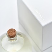
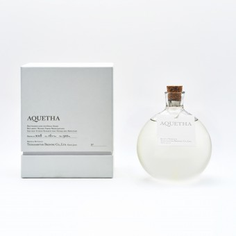
PRODUCTION / REALIZATION TECHNOLOGY: Bottles and packaging that do not compromise on every detail as a “artwork”. Design team commissioned glass artist Yutaro Kijima to create a bottle that is shaped by the force of gravity and has a natural roundness that gives a sense of the passage of time. Furthermore, in order to make the most of the clear impression that is a characteristic of ice-cold aging, they created transparent labels printed using blank letterpress printing. The outer box has a simple shape to make the flask-shaped bottle look more attractive. they created a dent on the border between the lid and the main body to express the aging timeline, creating a luxurious feel that incorporates the delicate image of the work. A website that acts more like a gallery than EC site. On the website, design team aimed to create a gallery-like space where the consumer could "feel" the work rather than "buying" the product. AQUETHA's greatest feature, the delicacy that matures slowly over time, is expressed through white-based visuals and delicate lines. The spacious design creates a clean, simple and sophisticated image. SPECIFICATIONS / TECHNICAL PROPERTIES: Bottle: width 110mm × depths110mm × height150mm Package: width135mm × depth135mm × height 165mm TAGS: Packaging, Product Design, Website RESEARCH ABSTRACT: - CHALLENGE: Since the Sake bottle is designed to be handcrafted one by one with glasswork craftsman, it was challenging to make them a perfect size and shape to keep the quality of sake among temperature and moisture. Design team and glass artist had tried so many different shape to test wether the bottle keeps the quality of sake in different atmosphere. They ended up using rounded bottle that helps smooth aging of sake after sake is bottled. ADDED DATE: 2024-02-19 12:24:49 TEAM MEMBERS (5) : Creative Director: Hayato Itakura, Strategist/Copy Writer: Takuro Nakajima, Art Director: Kohei Futakuchi, Visual Designer: Kazuya Sakamoto and IMAGE CREDITS: Photographer: Masato Ishibashi Glass Artist: Yutaro Kijima |
||||
| Visit the following page to learn more: https://aquetha.com/ | |||||
| AWARD DETAILS | |
 |
Aquetha Branding and Packaging by Tacto Inc is Winner in Packaging Design Category, 2023 - 2024.· Press Members: Login or Register to request an exclusive interview with Tacto Inc.. · Click here to register inorder to view the profile and other works by Tacto Inc.. |
| SOCIAL |
| + Add to Likes / Favorites | Send to My Email | Comment | Testimonials | View Press-Release | Press Kit |


