C'est La Vie Residential House by Yi Chun Chung |
Home > Winners > #157786 |
 |
|
||||
| DESIGN DETAILS | |||||
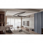
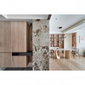
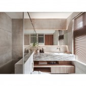
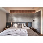
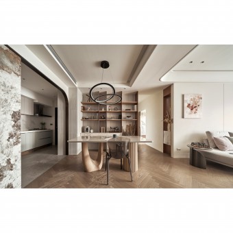
| DESIGN NAME: C'est La Vie PRIMARY FUNCTION: Residential House INSPIRATION: In order to create ample space for children to play, the spatial arrangement of the public area is reconfigured, and the over-sized master bedroom now offers separate zones for a dressing room and a bath space. Through minimal adjustments and the creative use of circular arc, the issue of wasted space in the original layout is elegantly resolved. UNIQUE PROPERTIES / PROJECT DESCRIPTION: The curved enclosure of the master bedroom's headboard releases the corner end scene of the sofa shape within the concave curved space, ensuring that the entrance greets residents with a captivating floral scene, adding depth and dimension to the visual experience and resolving any concerns related to FengShui. A full circle of light tape on the living room ceiling guides the entrance pathway, subtly softening the impact of the structural beams and gradually enhancing the sense of spaciousness. OPERATION / FLOW / INTERACTION: The dining area is accentuated by an iron display cabinet, serving as a striking focal point during dining hours and providing an exceptional platform for showcasing treasured collections. PROJECT DURATION AND LOCATION: The project had finished in 2023. FITS BEST INTO CATEGORY: Interior Space and Exhibition Design |
PRODUCTION / REALIZATION TECHNOLOGY: The entry and kitchen entrance are metal-colored double arc arches that inject vitality into the space. Rich colors and circular rectangles on the ceiling provide a sense of continuous flow. To expand the public space, the design seamlessly integrates the living, dining, and kitchen areas, encouraging harmonious engagement among the resident members. The incorporation of natural elements, such as stone bricks, paint, and wood, infuses the space with an invigorating vitality, while the delicate accents of metal elevate the overall refinement, resulting in a beautiful house that balances functionality, aesthetics,and spatial transparency. SPECIFICATIONS / TECHNICAL PROPERTIES: Dimensions: 100 square meter TAGS: engineered hardwood flooring, Italian paint, iron parts, grille, titanium plating RESEARCH ABSTRACT: The integration of storage functions into the overall TV wall exudes a sense of seamless elegance, incorporating audio-visual elements and display functions in an aesthetically pleasing manner. The kitchen appliance storage is cleverly optimized by the retraction of a corner within the secondary bedroom space. CHALLENGE: While the original layout maintained distinct functional divisions, the scale of the public space was slightly insufficient. A strategic rearrangement involved the retraction of the area near the kitchen and the removal of the enclosing wall, allowing for a more expansive layout. The design of the table foot shape, accentuated by the main visual light, leads the overall space on an intellectually journey. Curved archways and carefully selected flooring materials define the boundaries between the dining and kitchen areas, facilitating fostering a sense of familial connection. ADDED DATE: 2024-02-12 02:22:44 TEAM MEMBERS (1) : IMAGE CREDITS: Photographer Ar Her Kuo Photography Studio |
||||
| Visit the following page to learn more: https://reurl.cc/eLpoEM | |||||
| AWARD DETAILS | |
 |
C'est La Vie Residential House by Yi Chun Chung is Winner in Interior Space and Exhibition Design Category, 2023 - 2024.· Press Members: Login or Register to request an exclusive interview with Yi Chun Chung. · Click here to register inorder to view the profile and other works by Yi Chun Chung. |
| SOCIAL |
| + Add to Likes / Favorites | Send to My Email | Comment | Testimonials | View Press-Release | Press Kit |

