
|
|
| DESIGN DETAILS |
DESIGN NAME:
Arlo Sans
PRIMARY FUNCTION:
Type Design
INSPIRATION:
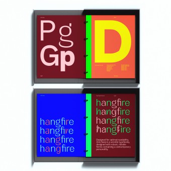
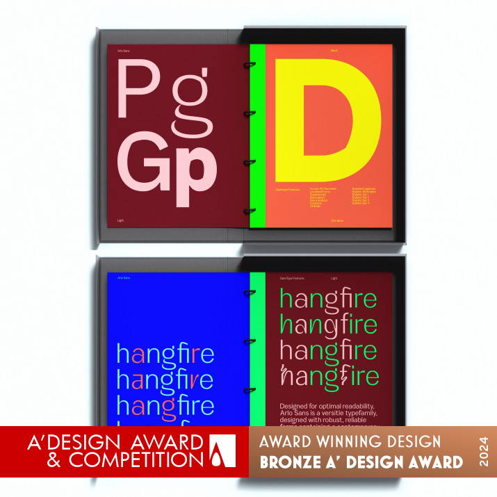
The International Style inspired this Font letterform inspiration. Foremost was the concept of a geometric sans serif typeface containing purposeful subtle design touches, details, and deviations, expressing the movement within a glyph set.
UNIQUE PROPERTIES / PROJECT DESCRIPTION:
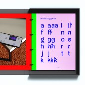
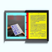
Arlo is a geometric sans serif typeface containing purposeful subtle design touches, details, and deviations. The width of the counters and comfortable, breathable apertures mean that Arlo Sans has excellent legibility and contrast throughout weights and sizes. Mastered for optimal readability, Arlo Sans is a versatile typefamily designed with robust, reliable forms; it contains its contemporary personality. The font includes over 20 stylistic glyphic alternatives.
OPERATION / FLOW / INTERACTION:
The OpenType font can be used on any computer.
PROJECT DURATION AND LOCATION:
The font sketches were designed in March 2023 and produced May 2023, with the product launched July 2023.
FITS BEST INTO CATEGORY:
Graphics, Illustration and Visual Communication Design
|
PRODUCTION / REALIZATION TECHNOLOGY:
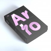
Glyphs was used to create the Font family. The Type specimen book and box were printed as a limited run in offset digital, 8-color.
SPECIFICATIONS / TECHNICAL PROPERTIES:
The specimen dimensions are 210 x 290 mm
TAGS:
Type design, Typeface, Specimen
RESEARCH ABSTRACT:
Our research began with the origins of the International Style, creating forms that could be expanded and adapted into new forms and shapes to encompass movement.
CHALLENGE:
The major challenge was to create a feeling of movement within the letterforms to create a contemporary visual language.
ADDED DATE:
2024-02-10 08:02:39
TEAM MEMBERS (2) :
Paul Henry Robb and Moira Bartoloni
IMAGE CREDITS:
Copyrights belong to Paul Henry Robb & Moira Bartoloni, 2023
PATENTS/COPYRIGHTS:
Copyrights belong to Paul Henry Robb & Moira Bartoloni, 2023
|
| Visit the following page to learn more: https://www.s6foundry.com/ |
|
| COMMENTS |
| Giulia Esposito |
Comment #100231 on June 22, 2024, 2:52 am |
|
Discovering "Arlo Sans" has been an absolute delight; it stands as a testament to the power of simplicity meshed with intricate attention to detail in type design. The inspiration drawn from the International Style shines through in the geometric clarity and the subtle yet impactful deviations that breathe life and movement into each glyph. What strikes me most is the careful consideration of legibility across different weights and sizes, ensuring that the typeface is not just a visual treat but a practical tool for wide-ranging applications. The inclusion of over 20 stylistic alternatives further showcases an understanding of versatility and personalization in contemporary design. It is evident that extensive research and thoughtful realization methods, including the use of Glyphs for font creation and the limited-run type specimen book, were integral to overcoming the challenges of infusing movement into the letterforms. This work not only meets the demands of modern visual communication but does so with a finesse and reliability that sets it apart. The efforts of the team, led by Paul Robb and Moira Bartoloni, have culminated in a design that is both innovative and deeply respectful of its historical roots, making "Arlo Sans" a deserving recipient of the A' Design Award in the Graphics, Illustration, and Visual Communication Design category.
|
| Chloe Turner |
Comment #100777 on June 22, 2024, 4:41 am |
|
The winning of the A' Design Award in the category of Graphics, Illustration, and Visual Communication Design for the "Arlo Sans" type design is a testament to the innovative approach and meticulous attention to detail that went into its creation. The inspiration drawn from the International Style and the ambition to craft a geometric sans serif typeface with purposeful, subtle design nuances showcases a profound understanding of type as not just a tool for communication but as an art form that moves and evolves within its own set of glyphs. The careful consideration of each detail and deviation in the design speaks volumes about the dedication to expressing the dynamism inherent in typography. This work stands as a beacon of creativity and ingenuity in the design community, and it is a pleasure to witness such a remarkable blend of inspiration and execution come to fruition. The success of this project is well-deserved, and I am truly inspired by the depth of thought and expertise displayed in this award-winning work.
|
| Elisabeth Clark |
Comment #101572 on June 22, 2024, 7:20 am |
|
Discovering the exceptional work of Paul Robb and Moira Bartoloni, "Arlo Sans," which was recently honored with the prestigious A' Design Award in the category of Graphics, Illustration and Visual Communication Design, has truly been an inspiring experience. The thought and expertise behind "Arlo Sans" are evident in its geometric sans serif design that boasts subtle yet impactful design touches, details, and deviations. The attention to the width of the counters and the breathable apertures ensures remarkable legibility and contrast across various weights and sizes, making it not only a pleasure to view but to utilize in diverse applications. The dedication to creating a versatile type family that is both contemporary and reliable, coupled with over 20 stylistic glyphic alternatives, showcases an innovative approach to type design. Furthermore, the inspiration drawn from the International Style and the comprehensive research into the origins of this movement reflect a deep understanding and appreciation for the history and evolution of typography. The successful encapsulation of movement within a glyph set highlights an extraordinary level of creativity and technical skill. Paul Robb and Moira Bartoloni have indeed set a new standard with "Arlo Sans," contributing a uniquely beautiful and functional font to the design community. Their work serves as a testament to the power of meticulous research, inspired creativity, and an unwavering commitment to excellence in design.
|
| Adam Harris |
Comment #102062 on June 22, 2024, 8:58 am |
|
The recognition of "Arlo Sans" at the A' Design Award is a testament to the innovative approach and meticulous attention to detail that the creators have poured into this typeface. It is heartening to see such a harmonious blend of geometric precision and creative flair being celebrated in the realm of Graphics, Illustration, and Visual Communication Design. The thoughtful incorporation of subtle design touches and the emphasis on legibility across weights and sizes not only showcases a deep understanding of typographic principles but also reflects a dedication to crafting a typeface that is as functional as it is beautiful. The inspiration drawn from the International Style and the challenges overcome in imbuing the letterforms with a sense of movement have culminated in a contemporary visual language that is both striking and versatile. This work is a shining example of how type design can transcend mere text to become a powerful tool for visual communication, and I am truly inspired by the level of craftsmanship and vision demonstrated.
|
| Mark Allen |
Comment #102782 on June 22, 2024, 11:22 am |
|
Heartfelt congratulations on the well-deserved A' Design Award in the Graphics, Illustration and Visual Communication Design Category for "Arlo Sans." This type design is a testament to the meticulous attention to detail, innovative use of geometric forms, and the pursuit of legibility and versatility in contemporary typography. The inspiration drawn from the International Style and the thoughtful research into creating a dynamic visual language within the letterforms have culminated in a typeface that not only challenges but also expands the boundaries of type design. The successful realization of this project, from its conceptual origins to its sophisticated production methods, showcases a remarkable commitment to excellence in design. Your work serves as a significant inspiration to the design community, demonstrating the profound impact of combining historical influences with modern innovation.
|
|
|
