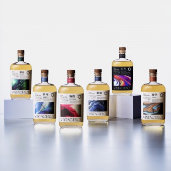
Vintagience Vintage Japanese Sake Packaging by Hisamichi Kasai |
Home > Winners > #157708 |
 |
|
||||
| DESIGN DETAILS | |||||
| DESIGN NAME: Vintagience PRIMARY FUNCTION: Vintage Japanese Sake Packaging INSPIRATION: To encapsulate the aging process and science, we opted for a bottle reminiscent of antique medicine bottles. The gradation on the label embodies the unpredictable changes that occur in aging. It represents the blend of long years, scientific aging methods, and the brewer's passion. The clock hands symbolize the continuous passage of time during the aging process. The design incorporates Japanese aesthetics into the product's name and the symbol, which is inspired by traditional patterns. UNIQUE PROPERTIES / PROJECT DESCRIPTION: This vintage sake is aged using scientific methods by a sake brewery in Iga (a ninja village in Japan). Sake of various qualities are aged, and the flavors of different storage methods are monitored. Changes in flavor caused by water pressure and vibrations are meticulously analyzed in pursuit of flavors not found in conventional aged sake. The design aims to challenge unexplored territories of sake by fusing the aging process with science, to create and develop a new sake culture. OPERATION / FLOW / INTERACTION: This vintage sake, presented in elegant packaging, offers a special moment when poured slowly into a glass after uncorking. Whether enjoyed during a meal with loved ones at a restaurant or while relaxing alone at home, it's perfect for any occasion. It pairs well with various meat and fish dishes, enhancing the dining experience. PROJECT DURATION AND LOCATION: This brand launched in Iga, Japan, in November 2023. FITS BEST INTO CATEGORY: Packaging Design |
PRODUCTION / REALIZATION TECHNOLOGY: To beautifully showcase the gradient on the label, a special printing technique called prism printing was used to create a luminous effect. The letters are all foil-stamped, and the symbol mark and clock hands are embossed to create a sense of luxury. The rigid box uses holographic foil that changes color depending on the angle from which light hits it, expressing the design concept of "gradation of aging." SPECIFICATIONS / TECHNICAL PROPERTIES: Bottle size: 100mm (W) x 224mm (H) x 69mm (D) Box size: 132mm (W) x 239mm (H) x 103mm (D) TAGS: Sake, Japanese Sake, Vintage Sake, Package design RESEARCH ABSTRACT: The conventional design of Japanese sake typically features a tall 720ml bottle with labels bearing the brand name written in Japanese calligraphy. We aimed to break away from such stereotypes and pursue a new form of sake. We strive to enrich the value of Japanese sake by creating an innovative design that overturns the traditional image of Japanese sake, developing bottles that embody our concept, using sophisticated typography, and utilizing visual expressions that evoke the mystery of aging. CHALLENGE: For the sake breweries, they found it challenging to convey the value of their excellent quality aged sake, which had been aging for decades. To solve this, we devoted much time on developing our brand. We focused on how Japanese aged sake was crafted based on scientific principles and developed the brand concept "Vintage x Science." This concept allowed us to create a design that can convey the product's value. ADDED DATE: 2024-02-09 03:51:09 TEAM MEMBERS (8) : Creative Director: Hisamichi Kasai, Art Director: Hisamichi Kasai, Designer: Hisamichi Kasai, Project Manager: Hisashi Kobayashi, Producer: Takahide Toyonishi, Planner: Kenji Nakajima, Copywriter: Aki Kamei and Photographer: Katsumi Nakao, Yoshihiro Yamamoto IMAGE CREDITS: Shunbin Co., Ltd. PATENTS/COPYRIGHTS: Trademark: 2023 Carrier Car Service Co., Ltd. |
||||
| Visit the following page to learn more: https://hisamichikasai.com/ | |||||
| AWARD DETAILS | |
 |
Vintagience Vintage Japanese Sake Packaging by Hisamichi Kasai is Winner in Packaging Design Category, 2023 - 2024.· Press Members: Login or Register to request an exclusive interview with Hisamichi Kasai. · Click here to register inorder to view the profile and other works by Hisamichi Kasai. |
| SOCIAL |
| + Add to Likes / Favorites | Send to My Email | Comment | Testimonials | View Press-Release | Press Kit |


