DESIGN NAME:
35 Anos Shalon
PRIMARY FUNCTION:
Logotipo
INSPIRATION:
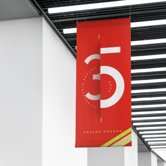
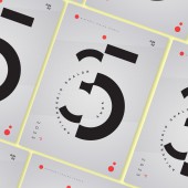
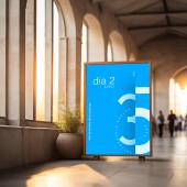
The project developed for the church in celebration of its 35th anniversary reflects an approach to the fundamental values of the institution. The design of the piece is a visual representation of the brand's timeline, divided into two phases, symbolized by the numerals 3 and 5, which also represent a part of a cross, showing the spiritual journey of the institution and the fundamental principles that have guided the church to the present moment. Every detail of the design was conceived to provide a visual experience, symbolizing the simplicity and dedication that the church has provided to its faithful over the years. The tradition and modernity represented in the design signify the fusion of ancient values with contemporary demands. This project goes beyond being a commemorative piece; it is an artistic manifestation that captures the essence of the institution's foundation, offering the audience a brand that expresses their feelings and devotion, celebrating the time they have been in service. With this creation, the project brings achievements from the past, casting an optimistic gaze towards the future, where writing, design, and Christian symbolism converge in a work of art that signifies this time for the Shalon Church.
UNIQUE PROPERTIES / PROJECT DESCRIPTION:
The created brand adheres to basic shapes to enhance comprehension, considering that many members of the institution are elderly and may have limited education. This approach improves visibility, even from a distance, for the numeral, and upon closer observation, it contains additional information that contributes to the artwork. Embracing the concept of "design for all," it seamlessly combines the simplicity of form with the intricacy of customization. The generated symbol, characterized by a vertical cut, represents a timeline that distinguishes ancient from modern times for the institution, also symbolized by the size of the depicted numbers. This symbolically conveys the strength and growth they've experienced over the 35 years of their journey. Children, youth, and adults alike can enjoy the material that marks a new phase in the celebratory journey for the institution's 35th anniversary.
OPERATION / FLOW / INTERACTION:
A story through time, a brand that represents everything the institution has gone through to get to this point.
PROJECT DURATION AND LOCATION:
The institution celebrated its 35th anniversary in June 2023. Located in Paraná, Brazil.
FITS BEST INTO CATEGORY:
Graphics, Illustration and Visual Communication Design
|
PRODUCTION / REALIZATION TECHNOLOGY:
Many materials were used in the creation of the product, but primarily the use of a golden ratio grid was employed to aid in obtaining the shapes
SPECIFICATIONS / TECHNICAL PROPERTIES:
The size may vary because there are different types of products.
TAGS:
Branding, Graphic Design, Visual Identity, church
RESEARCH ABSTRACT:
A high-level celebration for the institution, a church where you can participate in this annual celebration in a grand event that was marked by its 35 years. Transforming a unique spiritual experience into a quality time. - Everyone can enjoy. - A place to experience something new and fulfilling.
CHALLENGE:
The crucial challenge was to infuse a modern concept into a notably traditional environment, known for its resistance to change. Balancing the historical perspective of tradition against the necessity for innovation demanded a delicate equilibrium. Additionally, social factors, such as community acceptance, posed a challenge to a project that aimed to be more modern, marking a new era for the church. They required elements like a timeline, the numerals for the 35th anniversary, and an expression of a cross to be incorporated into a single material that could articulate the institution's aspirations.
ADDED DATE:
2024-01-28 16:34:03
TEAM MEMBERS (1) :
Eluan Araujo
IMAGE CREDITS:
Eluan Araujo - Ash Midia, 2023.
|
