
|
|
| DESIGN DETAILS |
DESIGN NAME:
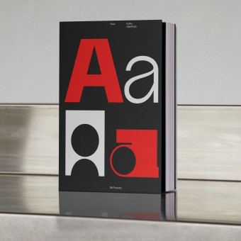
Faffin Font Family
PRIMARY FUNCTION:
Type Design and Specimen
INSPIRATION:
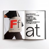
This Font family's inspiration was creating a juxtaposition of two opposing styles that work together in a sophisticated design system that empowers designers to create compelling visual narratives. Inspired by minimalism and clarity of Swiss type design, the design of the forms, whether used independently or combined, Faffin Sans and Faffin Display offer a harmonious and contemporary typographic language.
UNIQUE PROPERTIES / PROJECT DESCRIPTION:
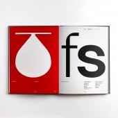
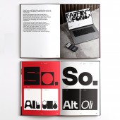
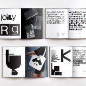
The Faffin font family is a versatile typographic language, offering two distinct styles – Faffin Sans and Faffin Display – designed to be used individually or in tandem, allowing for a seamless blend of contemporary aesthetics. Faffin Sans, inspired by the impartiality of Swiss-type design, this font is a meticulous fusion of contemporary shapes and curves. Faffin Display takes the concept of versatility to the next level as a variable font.
OPERATION / FLOW / INTERACTION:
The font family was launched as a retail font throughout the world and used by international design firms.
PROJECT DURATION AND LOCATION:
The project was started in April 2023 and launched in November 2023.
FITS BEST INTO CATEGORY:
Graphics, Illustration and Visual Communication Design
|
PRODUCTION / REALIZATION TECHNOLOGY:
Glyphs was used to create the Font family. The Type specimen book was printed as a limited run in offset digital, five color.
SPECIFICATIONS / TECHNICAL PROPERTIES:
The specimen dimensions are 210 x 290 mm.
TAGS:
Type design, Typeface, Specimen
RESEARCH ABSTRACT:
Our research began with the origins of Swiss-type design, studying classical forms that could be expanded and adapted into new forms and shapes.
CHALLENGE:
The major challenge was to create a san serif font and display font that work in harmony together, to create a contemporary visual language.
ADDED DATE:
2024-01-26 08:42:26
TEAM MEMBERS (2) :
Paul Henry Robb and Moira Bartoloni
IMAGE CREDITS:
Paul Henry Robb
Moira Bartoloni
PATENTS/COPYRIGHTS:
Copyrights belong to Paul Henry Robb & Moira Bartoloni, 2023
|
| Visit the following page to learn more: https://www.s6foundry.com/retail-fonts/faffin
-sans/ |
|
| COMMENTS |
| Giulia Esposito |
Comment #100203 on June 22, 2024, 2:47 am |
|
The recent unveiling of the "Faffin Font Family" as a celebrated winner of the A' Design Award in the category of "Graphics, Illustration and Visual Communication Design" truly exemplifies the pinnacle of typographic innovation and design excellence. The creation of this font family, inspired by the minimalism and clarity that characterize Swiss type design, represents a bold and successful attempt to marry two contrasting styles into a cohesive and sophisticated design system. This system not only empowers designers with a versatile typographic language but also challenges and expands the boundaries of contemporary design. The Faffin Sans and Faffin Display, with their distinct styles, offer a seamless blend that speaks to the meticulous research and creative prowess behind this project. The ability to use these fonts individually or in tandem showcases an unprecedented level of versatility and adaptability in design. The dedication to creating a harmonious typographic language that can adapt to various narratives without losing its contemporary edge is truly commendable. Furthermore, the realization methods and the thoughtful consideration given to the type specimen book production — printed in a limited run using offset digital, five-color — underscore the meticulous attention to detail and quality that define this project. Facing the design challenge of creating a serif and display font that work in harmony, the team, led by Paul Henry Robb and including Moira Bartoloni, has not only met this challenge but also set a new standard for typographic design.
|
| Chloe Turner |
Comment #100775 on June 22, 2024, 4:41 am |
|
The winning of the A' Design Award in the category of Graphics, Illustration and Visual Communication Design for the "Faffin Font Family" is a testament to the ingenuity and creativity that can emerge from the fusion of contrasting design philosophies. The inspiration drawn from the minimalism and clarity of Swiss type design speaks volumes about the vision behind this work. It is fascinating how the design of Faffin Sans and Faffin Display, despite their inherent opposition, come together to form a sophisticated design system. This not only empowers designers to craft compelling visual narratives but also enriches the typographic landscape with a harmonious and contemporary language. Witnessing such an innovative approach to type design, where both independence and combination of forms are equally celebrated, truly inspires. It is this kind of forward-thinking and boundary-pushing work that enriches our field, reminding us of the power of typography in visual communication. This achievement is a beacon of inspiration for aspiring designers and a remarkable contribution to the design community.
|
| Paul Phillips |
Comment #101090 on June 22, 2024, 5:44 am |
|
The Faffin Font Family stands as a testament to the power of innovative design in typography, effortlessly bridging the gap between functionality and aesthetic appeal. The dual nature of this typographic language, with its Faffin Sans and Faffin Display, showcases an exceptional understanding of contemporary design needs. It is not just the versatility that captivates me, but the seamless integration of Swiss-type design’s impartiality with modern curves and shapes that defines a new standard in type design. The concept of a variable font elevates this work further, pushing the boundaries of creativity and utility in visual communication. This award is a well-deserved recognition for a project that exemplifies the pinnacle of graphic, illustration, and visual communication design. The meticulous attention to detail and the forward-thinking approach in the creation of the Faffin Font Family is truly inspiring.
|
| Elisabeth Clark |
Comment #101570 on June 22, 2024, 7:20 am |
|
The recognition of Paul Robb's "Faffin Font Family" by the A' Design Award is a testament to the innovative and meticulous approach taken in crafting this typographic masterpiece. The versatility Paul has embedded within the Faffin Sans and Faffin Display fonts is truly remarkable, offering a rich palette for designers to work with, whether in harmony or as standalone styles. The inspiration drawn from the minimalism and clarity of Swiss-type design is palpable, blending traditional aesthetics with contemporary flair. This font family does not only enrich the visual communication landscape but also serves as a beacon of design excellence that pushes the boundaries of typographic expression. Paul Robb's dedication to marrying form and function within the "Faffin Font Family" is an inspiration, reflecting a deep understanding of the power of type in shaping compelling visual narratives. This work is undeniably a significant contribution to the field of Graphics, Illustration, and Visual Communication Design, and it is heartening to see such creativity and innovation recognized on an esteemed platform like the A' Design Award.
|
| Adam Harris |
Comment #102060 on June 22, 2024, 8:58 am |
|
The recognition of the Faffin Font Family with the prestigious A' Design Award in the category of Graphics, Illustration, and Visual Communication Design is truly well-deserved. The intricate thought process and dedication behind creating such a versatile typographic language, combining the contemporary aesthetics of Faffin Sans and Faffin Display, are evident and commendable. The seamless blend of these two distinct styles, inspired by the clarity and minimalism of Swiss-type design, not only enhances the usability of this font family but also elevates the visual narratives it empowers designers to create. The meticulous research into the origins of Swiss-type design and the successful overcoming of the challenge to harmonize a sans serif and display font showcase a profound commitment to innovation and excellence in design. This work stands as a remarkable example of good design, reflecting a deep understanding of typography as a crucial element of visual communication. It is inspiring to see such a sophisticated design system that enables creativity and sets a new benchmark in typographic design.
|
| Paul Williams |
Comment #102336 on June 22, 2024, 9:53 am |
|
Faffin Font Family stands as a testament to the power of thoughtful design, seamlessly blending the boundaries between functionality and artistic expression. The dual nature of Faffin Sans and Faffin Display, each with its distinct style yet perfectly harmonious when used together, showcases an innovative approach to typographic design. The inspiration drawn from Swiss-type design, characterized by its clarity and minimalism, is evident and admirably applied in creating a font family that is not only versatile but also deeply engaging. The meticulous research into the origins of Swiss-type design and the challenges overcome in harmonizing a sans serif with a display font, culminate in a visual language that is contemporary and rich in narrative potential. Utilizing Glyphs for creation and offset digital printing for the type specimen book further illustrates a commitment to quality and craftsmanship. Winning the A' Design Award in Graphics, Illustration and Visual Communication Design category is a well-deserved recognition for a project that pushes the boundaries of typographic design, offering a fresh perspective on what fonts can achieve in both digital and print media. This work is truly inspirational, demonstrating how design can effectively merge tradition with innovation to create something truly remarkable.
|
| Mark Allen |
Comment #102780 on June 22, 2024, 11:22 am |
|
Congratulations on the well-deserved success at the A' Design Award for the "Faffin Font Family" in the Graphics, Illustration and Visual Communication Design category. The ingenuity in creating a harmonious typographic system that bridges two distinct styles—Faffin Sans and Faffin Display—is truly commendable. This work not only showcases a profound understanding of Swiss-type design's clarity and minimalism but also elevates it by offering versatile application possibilities for contemporary visual narratives. The meticulous research and creative process behind this project, overcoming the challenges of blending a sans serif and display font seamlessly, reflect a deep dedication to pushing the boundaries of typographic design. Utilizing Glyphs for the creation and opting for a limited run in offset digital printing for the type specimen book further highlight a commitment to quality and innovation. This achievement is a testament to the power of thoughtful design in crafting compelling visual languages that inspire and engage across various mediums.
|
| Elena Petrenko |
Comment #103140 on June 22, 2024, 12:34 pm |
|
The Faffin Font Family stands as a remarkable testament to innovative typography, masterfully blending Swiss-inspired minimalism with contemporary versatility to redefine visual communication.
|
|
|
