Hen Olive Oil Dispenser by Bernardo Diaz Lopez |
Home > Winners > #157284 |
 |
|
||||
| DESIGN DETAILS | |||||
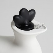
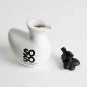
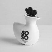
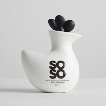
| DESIGN NAME: Hen PRIMARY FUNCTION: Olive Oil Dispenser INSPIRATION: The packaging design was inspired by the aim to craft an oil bottle that harmonised with the iconic bland salt shaker of the brand, resembling an egg. A playful twist on the age-old question "which came first, the chicken or the egg?" sparked the inception of the concept, injecting it with a lively and vibrant essence synonymous with SoSo's product range. Going beyond mere aesthetics, the team sought to embrace sustainability by introducing a user-friendly dispensing cap that can be detached for easy refills. UNIQUE PROPERTIES / PROJECT DESCRIPTION: The gourmet olive oil dispenser presents a compact and iconic product concept that seamlessly complements other offerings from Soso. It's conceived as a durable, reusable container with a distinctive integrated opening and closing mechanism. Crafted from ceramic and sourced from local producers in Andalusia and the Spanish Levant, it embodies Spanish roots through its tactile feel and aesthetic purity. The innovative stopper enables hermetic sealing and effortless pouring with a simple twist, eliminating the need for removal. OPERATION / FLOW / INTERACTION: The hen-shaped design offers an ergonomically comfortable grip, while the cap serves multiple functions including sealing, pouring, and refilling, with an integrated return and anti-drip system seamlessly integrated into the overall design. The tactile feel and aesthetic simplicity evoke our cultural heritage. The innovative stopper enables hermetic sealing and pouring with a twist, maintaining the overall aesthetic integrity. When fully twisted off, it can be removed for easy refilling, featuring a double anti-drip and oil return system for added functionality. PROJECT DURATION AND LOCATION: the project started in mid-2021 and was completed in early 2022. The design was carried out in Murcia, collaborating with the ceramic producer in Cordoba and with the stopper producer located in Alicante. FITS BEST INTO CATEGORY: Packaging Design |
PRODUCTION / REALIZATION TECHNOLOGY: Targeting consumers who prioritise product aesthetics and sustainability, the design appeals to those who appreciate the value of locally sourced goods such as Andalusian oil, and the renaissance of ceramics as a reusable material. Additionally, the incorporation of recycled plastics further underscores its eco-friendly credentials, resonating with conscientious buyers seeking both style and sustainability in their purchases. SPECIFICATIONS / TECHNICAL PROPERTIES: The dimensions are approx. 125 L x 150 H x 85 W, with a capacity of 365 ml of oil (for each of the days of the year). TAGS: Olive oil, bottle, hen, iconic, sustainable RESEARCH ABSTRACT: The primary challenge lay in crafting an oil bottle with significant visual impact that seamlessly complemented the brand's existing product, the egg salt shaker, both in terms of aesthetics and conceptual coherence. Moreover, the aim was to enhance sustainability and functionality beyond a mere single-use bottle. Employing a Design Thinking methodology, the team prioritised user, producer, and business model considerations, gathering extensive insights to define the product's foundations and business model. Through numerous brainstorming sessions, a compelling and original storytelling emerged, resolving the age-old question of whether the chicken or the egg came first. Subsequently, the team tackled the task of distilling the chicken icon into simple and elegant lines, aiming to evoke an emotional connection reminiscent of childhood toys. Clay modelling and 3D rendering refined the aesthetics. Simultaneously, the multifunctional cap design took shape, intended to seamlessly integrate with the ceramic body, preserve contents, prevent spillage, and facilitate easy refilling without compromising the hen motif. Extensive CNC prototyping and digital printing experiments were conducted to achieve the desired geometry and material combination. The main body utilised polycarbonate, the crest polypropylene, while a natural cork ring formed the seal between the stopper and the bottle. Navigating the challenges of finding suitable plastic, cork, and ceramic injection suppliers proved daunting, particularly due to the non-standard bottle neck design. After extensive dialogue with over 30 ceramic suppliers, one was found willing to undertake the experimental design and bring it to fruition. Following manufacturing tests, fine-tuning of production processes ensued, with control batches produced to ensure product integrity and performance standards were met. CHALLENGE: The primary challenge was to conceive an iconic concept that seamlessly integrated with the brand's existing product line. Additionally, there was a strong emphasis on embracing sustainability and adapting to the evolving landscape of refillable packaging models. A significant aspect of the development process centred around engineering a completely novel cap, necessitating rigorous technical feasibility assessments for a non-standard product. ADDED DATE: 2024-01-26 07:28:06 TEAM MEMBERS (7) : Creative director: Bernardo Diaz, Project director: Juan Esteban Sanchez, Technical director: Ezequiel de San Pedro, Management director: Alicia Alcazar, CMF designer: Pedro Cifuentes, Industrial designer: Pepe Garcia and IMAGE CREDITS: Bernardo Diaz Lopez, 2023. |
||||
| Visit the following page to learn more: https://www.ideadesign.es/ | |||||
| AWARD DETAILS | |
 |
Hen Olive Oil Dispenser by Bernardo Diaz Lopez is Winner in Packaging Design Category, 2023 - 2024.· Press Members: Login or Register to request an exclusive interview with Bernardo Diaz Lopez. · Click here to register inorder to view the profile and other works by Bernardo Diaz Lopez. |
| SOCIAL |
| + Add to Likes / Favorites | Send to My Email | Comment | Testimonials | View Press-Release | Press Kit |

