DESIGN NAME:
Yonghe
PRIMARY FUNCTION:
Brand Identity Design
INSPIRATION:
The new logo of the brand stems from the brand name and its philosophy. The Chinese character He has inspired the logo, symbolizing upward growth. It conveys the idea of aiding customers in nurturing their hair growth like seedlings. Furthermore, the brand aims to establish a future medical lab that combines medicine and aesthetics. The design employs blue, known for its technological and symbolic significance in the medical field, to echo the futuristic orientation of the brand.
UNIQUE PROPERTIES / PROJECT DESCRIPTION:
Yonghe, a brand with a long history in hair medical field, aimed to break the stereotype of the public by remodelling its visual identity, forming a youthful and highly grouped brand style with special visual memory points. In light of this, the logo design centred around the Chinese character He from the brand name. As a result, a logo with the sense of technology was created through font interpretation and colour selection, expressing the concept and vision of the brand.
OPERATION / FLOW / INTERACTION:
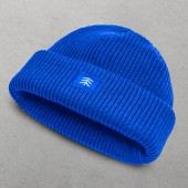
The new VI design utilizes the Chinese character He as the carrier of the memory of the brand. Through symbol changes and colour selections, it creates a visual hammer exclusive to the brand and unifies the first impression of customers towards the brand. Additionally, the design achieves a multiform, crossfield, and personalized extension, renewing the visual experience for customers. It strengthens the interaction between the brand and users, improving its core competitiveness.
PROJECT DURATION AND LOCATION:
The project was developed in Beijing in October 2022 and officially released in April 2023.
FITS BEST INTO CATEGORY:
Graphics, Illustration and Visual Communication Design
|
PRODUCTION / REALIZATION TECHNOLOGY:
The brand super symbol of Yonghe is modelled after the Chinese character He. It is constructed using three blue arrows with a focus and colour gradient. This design gives consumers the impression of perpetual innovation and breakthroughs. The VI visual is dynamic in various settings, reflecting the sense of growth, technology, and the future of Yonghe.
SPECIFICATIONS / TECHNICAL PROPERTIES:
The saturation of the colour blue has come to symbolize the future of medicine and represents an interpretation of the philosophy of the brand. The choice of a more intense shade of blue, known as medical blue, further distinguishes the visual experience for users. At the same time, upgrading this colour reflects the concept of returning to the essence of medical care, which is the goal of Yonghe.
TAGS:
Brand identity design, VI design, logo design, brand identification, hair medical brand
RESEARCH ABSTRACT:
The typical visual representation of hair medical brands often employs a restricted format of the Chinese brand name with pinyin, resulting in monotony. As the market evolves, demand for hair implant services has expanded beyond the conventional older male group to include younger and female customers. Consequently, it has become necessary for brands to establish unique logos that align with the aesthetic preferences of their target audience to better reflect the pursuit of the brand.
CHALLENGE:
The challenge was the remodeling of the visual identity of the brand, aimed at creating a unique and recognizable design. The design team recognized the fundamental strength of the brand in breaking industry standards and exploring technological advancements. As a result, the design utilized the Chinese character He in the brand name, which was transformed into an arrow representing positivity, enhancing the visual identity of the brand with a sense of freshness and attraction.
ADDED DATE:
2024-01-22 01:51:08
TEAM MEMBERS (9) :
Creative Agency: JAN Creation, Strategy Director: Li Dongqi, Research&Strategy: Li Dongqi, Mou Lan, Chen Jueqian, Ji Zhaoye, Sun Shan, Design Director: Sun Shan, VI Design: Relative Design, Wang Zhiyun, Zhang Yuhang, Wu Yaming, Motion Design: Wen Zi, Relative Design: Kang Jingchen, Supporting Design: Zhang Yuhang, Mou Lan, Sun Shan, Midjourney and Account Management: Chen Jueqian
IMAGE CREDITS:
Jan Creation Boutique Co.Ltd, 2023.
|


