Cala di Seta 932 Wine Labels by Giovanni Murgia |
Home > Winners > #157143 |
 |
|
||||
| DESIGN DETAILS | |||||
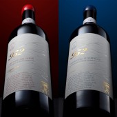
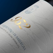
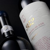
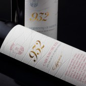
| DESIGN NAME: Cala di Seta 932 PRIMARY FUNCTION: Wine Labels INSPIRATION: It was the 1932 when 13 Calasetta winemakers joined together to form one of the first cooperative wineries in Sardinia. A people who arrived on the island from the sea and who have the sea in their soul. From here came the idea of representing the history of the winery in these wines. UNIQUE PROPERTIES / PROJECT DESCRIPTION: The design of these labels is characterized by its elegance and the ability to communicate heritage and tradition to those who observe it. The special paper, the distinctive workmanship and the elements that ennoble it make it unique and unmistakable. OPERATION / FLOW / INTERACTION: The design of the labels conveys to the bottles a sense of prestige and tradition but at the same time innovation and projection into the future. The paper used and the finishing touches ensure that whoever takes the bottle is involved in the story of a story that has been going on for 90 years PROJECT DURATION AND LOCATION: The project started in February 2023 in Sassari and finished in April 2023 in Sassari. FITS BEST INTO CATEGORY: Packaging Design |
PRODUCTION / REALIZATION TECHNOLOGY: For the labels we have thought of a prestigious paper such as Avery Dennison Fasson Cotton on which a debossing has been carried out embellished with a glossy paint in areas that recalls the effect of light reflecting on the surface of the water. A heraldic-like element recalls, in a modern key, the Calasetta coat of arms, and is made with a metallic Pantone colour, as is the text at the foot that tells the story of these wines. SPECIFICATIONS / TECHNICAL PROPERTIES: Label dimension is width 90mm height 136 mm Paper is Avery Dennison Fasson Cotton White Printing techniques is Debossing, Braille, Hot foil gold TAGS: wine, label design, debossing, hystoric RESEARCH ABSTRACT: The research started from the history of the territory and from the study of the elements that characterize the history of the winery. The concept is that of the sea, a very strong element of identity rooted both in the history of this locality and in the life history of this community. We have created two labels with a classic style but with innovative and contemporary, elegant and refined details, able to best represent the story contained in these two bottles. CHALLENGE: The challenge for this design was to create a project that could convey the prestige and winemaking tradition of this winery and the area. We did it thinking of a design with a classic flavor but with elements of innovation that made it current and contemporary. ADDED DATE: 2024-01-21 09:53:13 TEAM MEMBERS (4) : Creative director: Giovanni Murgia, Designer: Giovanni Murgia, Print: Etichettificio Antoniano and Photo: Diego Attene IMAGE CREDITS: Image #1: Diego Attene Image #2: Diego Attene Image #3: Diego Attene Image #4: Diego Attene Image #5: Diego Attene PATENTS/COPYRIGHTS: Copyrights belong to Cantina di Calasetta |
||||
| Visit the following page to learn more: https://shorturl.at/adIXY | |||||
| AWARD DETAILS | |
 |
Cala Di Seta 932 Wine Labels by Giovanni Murgia is Winner in Packaging Design Category, 2023 - 2024.· Press Members: Login or Register to request an exclusive interview with Giovanni Murgia. · Click here to view the profile and other works by Giovanni Murgia. |
| SOCIAL |
| + Add to Likes / Favorites | Send to My Email | Comment | Testimonials | View Press-Release | Press Kit |


