Nova App by Eugenio Bini |
Home > Winners > #156460 |
 |
|
||||
| DESIGN DETAILS | |||||
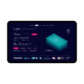
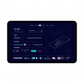
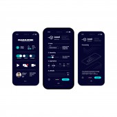
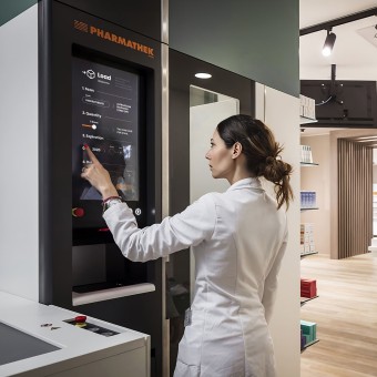
| DESIGN NAME: Nova PRIMARY FUNCTION: App INSPIRATION: Novareflect the brand's values, committed to offering highly technological solutions, while giving maximum importance to usability, efficiency, speed and reliability of their products. UI was inspired by a clean and minimal style suggesting the idea of a futuristic and timeless design. The simplicity behind this concept allows to configure and improve app depending on the company needs, ensuring an high degree of flexibility to all the project. UNIQUE PROPERTIES / PROJECT DESCRIPTION: Nova is the new app designed for Pharmathek robotic warehouses solutions. It helps pharmacists, sales-people or warehouse workers to manage product rotation and deadlines, optimize times, costs and consumptions. A revolutionary workflow where innovation is able to improve the relationship of professionals with their customers, and where intelligent automation can take charge of repetitive tasks. Nova sets itself apart by combining aesthetics with user-friendliness, ensuring a relaxing, engaging, and personalized experience. The brandnew dashboard simply lead users within every task while an enhanced status-bar enables to keep everything under control in a heartbeat. Captions and illustrations draw an intuitive experience making tasks easier and faster. A new integrated keyboard and vocal assistant finally simplify input operations offering a touchscreen-only interaction with a fluid, intuitive and responsive user experience. OPERATION / FLOW / INTERACTION: As a part of Pharmathek philosophy, Nova promotes a new direction of industrial development in which design can optimize times, cost and consumptions. The new interface is able to offer an intuitive and easy to use experience, organised in various screens that may enable the operator to perform all the functions offered by the system. In particular: "Warehouse status" enables the operator to monitor the status of the warehouse (medicines availability, boxes position, ongoing operations, etc.), including information on its normal functioning; "Load" enables the operator to enter medicines inside the warehouse; "Modify" enables the operator to edit the information of a product already present inside the warehouse or to perform the first registration of a product that is added to the system for the first time; "Unload" enables the operator to select the medicines to unload from the warehouse, according to various criteria and filters, with the possibility to choose at what exit the products should be delivered; "Search" helps the operator to research and visualize the position where a specific box is located inside the warehouse, to perform some checks and to address anomalies, if any, related to the products added to the system. Moreover, the operator is able to perform some maintenance tasks or to run queries on the warehouse to read system messages. PROJECT DURATION AND LOCATION: Research - 1 month Concept and prototyping - 2 months Evolutives & App development - 3 months FITS BEST INTO CATEGORY: Interface, Interaction and User Experience Design |
PRODUCTION / REALIZATION TECHNOLOGY: The design was created using a user-centered approach, involving iterative wireframing and prototyping. Company values and mission guided visuals and UI project, with a focus on simplicity and accessibility. User feedback and usability testing played a crucial role in refining the interface and UX. The final design prioritizes user comfort, engagement, and customization. SPECIFICATIONS / TECHNICAL PROPERTIES: The platform has been designed to be responsive defining a convenient experience on every device and browser. Users will be able to choose between light and dark mode, landscape or portrait version according to the specific needs. TAGS: ui, ux, app, design, brand, minimal, automated, robots, warehouses, pharmacies, logistic RESEARCH ABSTRACT: Type of Research: User-Centered Design Research Research Objectives: To create a user-friendly app interface that maximizes engagement and relaxation. Methodology: Employed a mixed-methods approach combining qualitative and quantitative data. Conducted surveys, interviews, and usability testing. Data Collection and Research Tools Used: Surveys were conducted using Google Forms, interviews via Zoom, and usability testing with tools like UserTesting.com. Data analyzed using qualitative coding and statistical software. Participants or Experiments: Engaged with a group of 100 pharmacists, sales-people or warehouse workers of various backgrounds and needs. Results: Found that dark backgrounds reduced eye strain, and customizable modes (widgets) improved user satisfaction. Users appreciated the intuitive dashboard and accessibility features. Insights and Impacts: The research highlighted the importance of user comfort and customization. Insights informed the design, resulting in an app interface that prioritizes user engagement and productivity. Effect on Real-Life Phenomena: The design positively impacts users' digital experiences, promoting relaxation and inclusivity. Moreover it can enhance productivity, user satisfaction, and accessibility in the digital landscape. CHALLENGE: The most important challenge was to setup the workflow and draw the ux. During this process it was also necessary to improve and fix some technologies issues regarding interaction between app, hardware and third-party systems. ADDED DATE: 2023-12-21 14:05:42 TEAM MEMBERS (1) : IMAGE CREDITS: Photos: People contained within the uploaded images are AI generated. Video: Music from https://filmmusic.io - "Son of a Rocket" by Kevin MacLeod (https://incompetech.com. License: CC BY (http://creativecommons.org/licenses/by/4.0/) |
||||
| Visit the following page to learn more: https://www.eugeniobini.it | |||||
| AWARD DETAILS | |
 |
Nova App by Eugenio Bini is Winner in Interface, Interaction and User Experience Design Category, 2023 - 2024.· Read the interview with designer Eugenio Bini for design Nova here.· Press Members: Login or Register to request an exclusive interview with Eugenio Bini. · Click here to register inorder to view the profile and other works by Eugenio Bini. |
| SOCIAL |
| + Add to Likes / Favorites | Send to My Email | Comment | Testimonials | View Press-Release | Press Kit |
Did you like Eugenio Bini's Interface Design?
You will most likely enjoy other award winning interface design as well.
Click here to view more Award Winning Interface Design.


