Janus Bar by Junlin Zhang |
Home > Winners > #156360 |
 |
|
||||
| DESIGN DETAILS | |||||
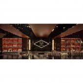
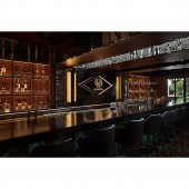
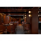
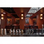
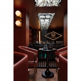
| DESIGN NAME: Janus PRIMARY FUNCTION: Bar INSPIRATION: When I first went to the site for mapping, I was very excited and surprised by the light on the second floor, when the sunlight was pouring down from the daylight opening. My first reaction was that the place already has distinctive features that can bring audiences different moods, and experiences in the daytime and night-time. I then began to conceptualise how to create two or more different atmospheres in the space. Creating is the art of making a meaningful whole out of individual components UNIQUE PROPERTIES / PROJECT DESCRIPTION: Janus is a whisky and cocktail bar with a social aspect. Our client had two demands: one was that the audience should not interpret this place according to the literal meaning of Janus or their traditional concepts, and the other was that the audience should have more than two different spatial experiences in this place. These different spatial experiences combine as an integral whole rather than to be independent ones. OPERATION / FLOW / INTERACTION: When I open the door to the first floor, the confrontation between the interior space and the facade appeared which is confrontation in colour, material, the whole and the fragmented. But this does not detract from the formal unity of the exterior and interior. The retroism without losing the independent style declares their relevance. The staircase guides to the upward space, and I deliberately used loose wood as the tread of the staircase. Stepping on it has a rustling sound and can feel the rebound of the wood. This is completely different from the feeling of crossing the first floor with steady steps. The first floor also doesn’t have the light and shadow spilling out from the top. The low linear strip of light on the side of the handrail is a safety cue as well as an orientation. People in such environment begins to become focused and anticipated. The spatial atmosphere of the second floor is basically the same as what I had conceived. Everything is as it is. There is no conflict, no exaggerated arrangement, no criticism and no attempts. I am like a director who arranges the work of each department and position in an orderly manner. Covered wood veneer with vertical grain delivers both hard and warm feeling. Mirrored stainless steel breaks the calm and refract light and images that change with the activities of the people in the space. Sometimes it is cold, sometimes warm, sometimes noisy, sometimes quiet and ambiguous. PROJECT DURATION AND LOCATION: The project was launched in March 2023 in Changsha, China and completed in June 2023 in Changsha, China FITS BEST INTO CATEGORY: Interior Space and Exhibition Design |
PRODUCTION / REALIZATION TECHNOLOGY: What exactly are we talking about when we talk about spatial ambience? Is it sunlight, air, sound, materials, textures, or colours? I began to think about the overall relevance of the façade in relation to the first and second floors. They are at once traditional, strong and thick, even a little archaic and they are at the same time receptive, inclusive, interesting and experimental. I tried to use postmodernism to summarise the atmosphere created inside and outside the building. I decided to create the façade with clean and simple geometric blocks, which is the style of contemporary. But it also has classical features in the details. To this point I felt that these designs were not enough because the conflict had not reached its climax. So I added a cantilever platform to place a classical sculpture. It was at this point that I felt the importance of such design planning came to the fore. The pure black and hard blocks together with the classical sculpture bring the sense of power and make it attractive. Such not complicated aesthetics give audiences more possibilities to imagine. SPECIFICATIONS / TECHNICAL PROPERTIES: 200 meter-square TAGS: bar, whisky, postmodernism, hard and warm feeling, retroism, experimental RESEARCH ABSTRACT: I tried to decipher the form of beauty, but I found that I could not describe or categorise it accurately and clearly. It can be specific things such as people, air, light, sound or colour. When we deal with different clients and different conditions of the place, the results are unpredictable. It reminds me of Louis Kahn, who asked the red brick what it wanted to be. CHALLENGE: I decided to create the façade with clean and simple geometric blocks, which is the style of contemporary. But it also has classical features in the details. To this point I felt that these designs were not enough because the conflict had not reached its climax. So I added a cantilever platform to place a classical sculpture. It was at this point that I felt the importance of such design planning came to the fore. The pure black and hard blocks together with the classical sculpture bring the sense of power and make it attractive. Such not complicated aesthetics give audiences more possibilities to imagine. ADDED DATE: 2023-12-16 17:04:12 TEAM MEMBERS (4) : Lead designer: JunLin Zhang, Extension designer: WenLiang Liu, Rendering designer: JingYu Zhang and IMAGE CREDITS: Ueya photography(Lei Liu) |
||||
| Visit the following page to learn more: https://www.0103design.com/#/detail/9733 |
|||||
| AWARD DETAILS | |
 |
Janus Bar by Junlin Zhang is Winner in Interior Space and Exhibition Design Category, 2023 - 2024.· Press Members: Login or Register to request an exclusive interview with Junlin Zhang. · Click here to register inorder to view the profile and other works by Junlin Zhang. |
| SOCIAL |
| + Add to Likes / Favorites | Send to My Email | Comment | Testimonials | View Press-Release | Press Kit |

