Sanat Visual Identity Design by Tamer El-Menyawi |
Home > Winners > #156024 |
 |
|
||||
| DESIGN DETAILS | |||||
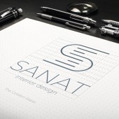
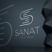
| DESIGN NAME: Sanat PRIMARY FUNCTION: Visual Identity Design INSPIRATION: Minimalism is my artistic approach that I follow in most of my work, which converged with the vision and approach of the company’s management when we communicated and discussed the design idea. We agreed on the importance of conveying the communication message in a simple and easy way, without complications or many details. UNIQUE PROPERTIES / PROJECT DESCRIPTION: The design was based on minimalism and abstraction, using lines that form the letter s in a minimal and modern way that reflects the company’s vision and approach to design. OPERATION / FLOW / INTERACTION: Minimalism in the design parts and colors, along with the use of the golden ratio, gave the desired and impressive impression to most viewers of the design, whether from the work team or from the clients of the company that has the visual identity. PROJECT DURATION AND LOCATION: This design was implemented in about two weeks, in February 2020. FITS BEST INTO CATEGORY: Graphics, Illustration and Visual Communication Design |
PRODUCTION / REALIZATION TECHNOLOGY: This design was implemented through a minimalist approach with the golden ratio to form the letter S through simple lines. SPECIFICATIONS / TECHNICAL PROPERTIES: The creative conception drew inspiration from a myriad of tones within a singular hue, embodying a deliberate and artistic strategy employed in crafting the visual identity. TAGS: Minimal, Creative, Visual Identity, Interior Design, Logo RESEARCH ABSTRACT: With my artistic and scientific background on the basics of design, the minimalism approach, and the golden ratio; The only thing left to research about this design is global and local competitors in the field of work of the company that owns the visual identity, which is the field of interior design and decoration. As usual in most of my work; Before starting the design, I conduct as detailed research as possible about competitors and the trend of similar artworks to understand the nature of the field from a technical and communication standpoint. CHALLENGE: The toughest part of creating the brand identity was finding the right balance between artistic expression and professional minimalism. As someone who leans towards minimalism, it was a challenge to ensure that the design captured the richness of interior design while keeping it simple and memorable. ADDED DATE: 2023-11-30 20:55:51 TEAM MEMBERS (1) : IMAGE CREDITS: Tamer El-Menyawi, 2023. |
||||
| Visit the following page to learn more: https://www.behance.net/gallery/10228926 |
|||||
| AWARD DETAILS | |
 |
Sanat Visual Identity Design by Tamer El-Menyawi is Winner in Graphics, Illustration and Visual Communication Design Category, 2023 - 2024.· Press Members: Login or Register to request an exclusive interview with Tamer El-Menyawi. · Click here to register inorder to view the profile and other works by Tamer El-Menyawi. |
| SOCIAL |
| + Add to Likes / Favorites | Send to My Email | Comment | Testimonials | View Press-Release | Press Kit |


