Miok Milk Beer Packaging by Iris Fan |
Home > Winners > #155700 |
 |
|
||||
| DESIGN DETAILS | |||||
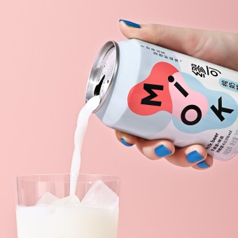
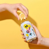
| DESIGN NAME: Miok PRIMARY FUNCTION: Milk Beer Packaging INSPIRATION: The packaging design is inspired by the product's creative spirit. As an innovative beverage, Miok is mixing two very different liquids, milk and beer. Therefor the brand and packaging design took the concept of "Mixing" and expressed in a visual language. UNIQUE PROPERTIES / PROJECT DESCRIPTION: Miok is a milk beer brand that started in Hangzhou, China, in 2021. It explores the fun of mixing milk and beer, which creates this new combination of sweet and sour milk with tasty beer bubbles. It has abundant probiotics, but low alcohol. As a new kind of beverage brand, Miok wants to be adventurous, creative, and joyful. OPERATION / FLOW / INTERACTION: The project was created from the branding strategy stage, to visual design and product's production. The original flavor of Miok was selling very well on the market, and we created the new lemon flavor Miok later. PROJECT DURATION AND LOCATION: The project started in May 2021 in Hang Zhou, China, and finished in March 2022 FITS BEST INTO CATEGORY: Packaging Design |
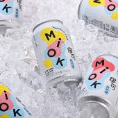
PRODUCTION / REALIZATION TECHNOLOGY: The concept of Miok's brand identity is "Mixing". Around the floating Miok letters, two liquid shapes are mixing into a new shape. The visual means to be bold, dynamic, and joyful to represent the beverage’s unique characteristics. The logo is the main visual element on product packaging, to make this new brand eye-catching and memorable in the market. Consumers can buy Miok both online and in-store, so the packaging system included gift boxes, shipping box and portable boxes for different usages. The campaign design also included online store design and offline activity design. SPECIFICATIONS / TECHNICAL PROPERTIES: 375mL per can TAGS: Mixing, Milk Beer, Packaging, Can, Miok RESEARCH ABSTRACT: The research includes the market and target user research, and competitors' products analyzing. The research result combined both marketing strategy and visual design direction. The goal is to create a design concept that is unique, recognizable and representing the product's spirit. CHALLENGE: One problem is how to print the vibrant colors on the can as bright as possible. We took a lot of time to communicate with the can factory to make sure the printing is perfect. ADDED DATE: 2023-11-09 16:11:03 TEAM MEMBERS (1) : Iris Fan IMAGE CREDITS: Chinese Logotype Design / Guohao Yuan Photography & Video / Hejun Zhang Packaging Execution / Fan Fan Motion Graphic Editing / Wenhui Gao PATENTS/COPYRIGHTS: Copyrights belong to IBEA, 2021 |
||||
| Visit the following page to learn more: https://www.behance.net/gallery/13241894 |
|||||
| CLIENT/STUDIO/BRAND DETAILS | |
 |
NAME: Miok PROFILE: Miok is a beverage brand created by CHO Factory in Hang Zhou, China. It’s an innovative product that mix milk and beer. |
| AWARD DETAILS | |
 |
Miok Milk Beer Packaging by Iris Fan is Winner in Packaging Design Category, 2023 - 2024.· Press Members: Login or Register to request an exclusive interview with Iris Fan. · Click here to register inorder to view the profile and other works by Iris Fan. |
| SOCIAL |
| + Add to Likes / Favorites | Send to My Email | Comment | Testimonials | View Press-Release | Press Kit |


