Sentoms Health Application by Shani Abass |
Home > |
 |
|
||||
| DESIGN DETAILS | |||||
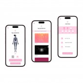
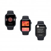
| DESIGN NAME: Sentoms PRIMARY FUNCTION: Health Application INSPIRATION: Sentoms emerged from Shani Abass's personal journey with chronic pain. Describing her sensations with words and conventional pain icons proved inadequate and led to misinterpretations by doctors, leaving her without a diagnosis. Shani conducted user research revealing that individuals depicted pain terms differently, emphasizing the need for specificity. This drove the creation of customizable multimedia icons, including visuals, motion, and sound, to accurately represent diverse sensations. UNIQUE PROPERTIES / PROJECT DESCRIPTION: sentoms are editable multimedia pain icons (incorporating sound, motion, and color) which can be used to log pain symptoms via the sentoms CP mobile and wearable applications. They are designed to increase specificity in clinical pain communication and supplement verbal descriptions, which can often be misinterpreted. Changes in the visual and sonic intensity of the logged icons over time also provide valuable insights into a patient's progress. Applications beyond chronic pain include aiding those with language barriers or non-verbal autism. OPERATION / FLOW / INTERACTION: When initially logging into the mobile app, a unique code connects users to their patient profile, after which a survey establishes common pain symptoms and accessibility needs. Once onboarded, users can customize pain icons (name, colors, shapes, sounds, motion) and use them to log symptoms. Other features include curated chronic pain resources, messaging with healthcare providers, and exercise banks and curated to-do lists, covering both physical and therapeutic exercises. The wearable app provides additional exercise progress tracking. PROJECT DURATION AND LOCATION: The project started in January 2021 in London, England, and the bulk of the initial round of work was finished in May 2021, although the project has continued to be refined in both London and Boston, MA, USA. FITS BEST INTO CATEGORY: Interface, Interaction and User Experience Design |
PRODUCTION / REALIZATION TECHNOLOGY: The icons were designed using a combination of Adobe Illustrator, Adobe Photoshop and Keynote. The mobile app was wireframed using Balsamiq. The apps were designed and prototyped in Figma; the brand assets were also created in Figma. SPECIFICATIONS / TECHNICAL PROPERTIES: The mobile application is intended to be responsive and applicable to all smartphone models but was originally designed for an iPhone 11 Pro. The wearable application is intended to be responsive and applicable to all wearable device models but was originally designed for a 42mm Apple Watch. TAGS: chronic pain, pain icons, wearable, mobile, apple watch, ux design, inclusive design, digital health RESEARCH ABSTRACT: A Google Forms survey gathered insights from 20 people with chronic pain. Part one evaluated initial pain icon sketches and allowed participants to suggest edits. Part two gathered data on chronic pain experiences and preferences for a potential pain management app. Results showed diverse suggestions for visuals and sounds for the same words, highlighting the need for multimedia icons to supplement verbal conversations. Feedback informed icon refinement, with the knowledge that customization of names, visuals, and sounds would still be necessary. CHALLENGE: As my target user was those with chronic pain, I had to consider factors such as confidentiality, restricted mobility or energy, and compromised immunity. Accommodations included conducting remote, anonymous user research, especially as my initial user research took place during the earlier stages of COVID-19; providing pre-made icons to be critiqued and edited in the user research study and apps respectively to reduce user effort; and providing alternative exercise options within the app. ADDED DATE: 2023-09-29 02:23:44 TEAM MEMBERS (1) : IMAGE CREDITS: Shani Abass, 2023. |
||||
| Visit the following page to learn more: https://www.sentoms.com/ | |||||
| AWARD DETAILS | |
 |
Sentoms Health Application by Shani Abass is Runner-up for A' Design Award in Interface, Interaction and User Experience Design Category, 2023 - 2024.· Press Members: Login or Register to request an exclusive interview with Shani Abass. · Click here to register inorder to view the profile and other works by Shani Abass. |
| SOCIAL |
| + Add to Likes / Favorites | Send to My Email | Comment | Testimonials |


