
|
|
| DESIGN DETAILS |
DESIGN NAME:
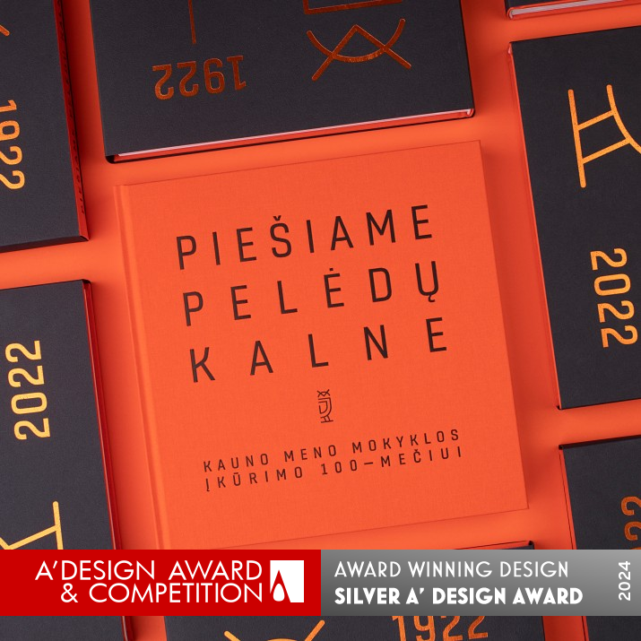
Hill of Owls
PRIMARY FUNCTION:
Book Design
INSPIRATION:
Drawing on the Hill of Owls is a book dedicated to the centenary of the Kaunas School of Arts. It presents the history of drawing as a teaching course, which began at the Kaunas School of Arts and continued in various institutions that have taken over its traditions. The schools have been collecting and preserving a valuable collection of drawings for many years, which, as the 100th anniversary approached, inspired a large publication (which reproduces more than 400 pieces of artwork).
UNIQUE PROPERTIES / PROJECT DESCRIPTION:
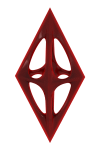
While creating its design, the designer aimed for the book not only to remind of the past, but also to reflect the present, so the bright orange color was chosen for its cover and various elements through the book, which is a symbol of energy, creativity, and the thematic color of the present institution at the premises - Faculty of Arts and Education. The book has a sleeve which has time period and an Owl symbol encoded on its front - which is a symbolic way of marking the centenary.
OPERATION / FLOW / INTERACTION:
The minimalistic design and typography throughout the book, and especially on the cover, sleeve and section pages, exudes elegance subtlety, while the contrast of orange and black colours gives a premium look and the feeling of importance. The drawings in the album are arranged chronologically, so the processes of change and complexity in the technique, method of execution of the works can be seen quite clearly.
PROJECT DURATION AND LOCATION:
The project started in July 2022 and was finished in October 2022. It was presented and exhibited to the public in December 2022.
|
PRODUCTION / REALIZATION TECHNOLOGY:
Book was printed on different papers and multiple printing technologies was used. For the book sleeve "Remake Carapace 1/S Midnight 250g" paper was chosen, with Orange hot foil stamping on top. The book cover is canvas fabric "Brillianta 4196 Bright Orange" with Matte Black hot foil stamping. While "Caribic ziegelrot 170g" was used for front and end pages. For the inside pages - offset printing on GalerieArt Matt 150g paper.
SPECIFICATIONS / TECHNICAL PROPERTIES:
Hardcover book, 260mm x 260mm x 30 mm, case bound, square back spine.
The cover is orange canvas with matte black hot foil stamping.
TAGS:
Kaunas School of Arts, Kauno meno mokykla, Hill of Owls, Peledu kalnas, Book, Drawings, Typography, Aurimas Mickus, Kauno kolegija, Lithuania
RESEARCH ABSTRACT:
The layout was carefully put, so it would feel balanced and easy to understand - especially to for the reader. Because text section has a lot of historical information - the particular type of layout was chosen so it would be easy to find correct additional information.
CHALLENGE:
The goal was to find balance between history of the past and the present times while representing and expressing the feeling and recognizability of the Kaunas School of Arts in the shape of design and symbols. The most dificult thing was to put everything in a fluid and continuous way, when the material was from different times in history, while trying to show the processes of change and complexity in the technique, method of execution of the works of this school.
ADDED DATE:
2023-09-28 22:32:48
TEAM MEMBERS (1) :
IMAGE CREDITS:
Images Photographer: Svetlana Batura
|
| Visit the following page to learn more: https://www.behance.net/gallery/192607431/Hil
l-of-Owls-Book |
|
| COMMENTS |
| Giulia Esposito |
Comment #100094 on June 22, 2024, 2:25 am |
|
The "Hill of Owls" book design is a remarkable testament to the power of visual storytelling and the meticulous attention to detail that can elevate a publication to a work of art. The choice of the bright orange color for its cover, symbolizing energy and creativity, brilliantly ties the past to the present, reflecting the vibrant spirit of the Faculty of Arts and Education. The inclusion of a sleeve with encoded symbols adds a layer of depth and intrigue, inviting readers to explore the rich history and artistic achievements detailed within its pages. The thoughtful selection of materials, from the canvas fabric cover to the variety of papers used for the interior, showcases a commitment to quality and an understanding of how texture and color can enhance the reader's experience. The challenge of weaving together a century's worth of artistic evolution, represented through more than 400 pieces of artwork, has been met with a design that is not only informative but also visually captivating and easy to navigate. This achievement underscores the importance of design in the preservation and celebration of cultural heritage, making it a source of inspiration for both current and future generations. The dedication to balancing historical context with contemporary design elements is commendable, highlighting the designer's ability to create a publication that is both a tribute and a forward-looking piece of art. This work by Aurimas Mickus is truly deserving of recognition, serving as a beacon of excellence in the realm of Print and Published Media Design.
|
| Chloe Turner |
Comment #100911 on June 22, 2024, 5:08 am |
|
The "Hill of Owls" stands as a remarkable testament to the power of preserving and celebrating educational heritage through the medium of book design. The dedication to encapsulating the centenary of the Kaunas School of Arts, alongside the meticulous effort to present the historical significance of drawing as a teaching course, is both enlightening and inspiring. The decision to reproduce over 400 pieces of artwork not only showcases a rich tapestry of creative expression but also highlights the importance of visual storytelling in capturing the essence of an institution's legacy. This work is a beacon of inspiration, demonstrating a profound understanding of how design can bridge the past with the present, ensuring that valuable traditions and knowledge are not only preserved but also celebrated. The recognition of this project with the A' Design Award is well deserved, and it is heartening to see such thoughtful and impactful work being celebrated in the realm of Print and Published Media Design. This achievement is a clear reflection of the designer's dedication to their craft, and their ability to convey deep narratives through the intricate art of book design.
|
| Paul Phillips |
Comment #101151 on June 22, 2024, 5:56 am |
|
The "Hill of Owls" book design marvelously intertwines the essence of the past with the vibrancy of the present through its thoughtful color choice and symbolic elements. The use of bright orange not only injects energy and creativity into the design but also thoughtfully aligns with the thematic color of the present institution it represents. Additionally, the incorporation of a sleeve that cleverly encodes a time period and an owl symbol is a testament to the designer's innovative approach to celebrating a centenary with elegance and significance. This work stands as a beacon of how design can transcend mere aesthetics to embody deeper meanings and connections. It is a vivid demonstration of the power of design to narrate history, embody cultural values, and inspire the future. This recognition is well-deserved, highlighting a remarkable blend of creativity and thoughtfulness in print and published media design.
|
| Elisabeth Clark |
Comment #101746 on June 22, 2024, 7:55 am |
|
The award-winning "Hill of Owls" by Aurimas Mickus stands as a beacon of innovation and creativity in the realm of Print and Published Media Design. It is truly inspiring to see how the book not only honors the rich history of the Kaunas School of Arts but also vibrantly captures the essence of the present through its thoughtful design elements. The choice of a bright orange cover symbolizes energy and creativity, perfectly encapsulating the spirit of the Faculty of Arts and Education. Furthermore, the inclusion of a sleeve with a time period and an Owl symbol ingeniously marks the centenary, adding a layer of depth and meaning to the design. The meticulous attention to layout ensures that the wealth of historical information is presented in a balanced and accessible manner, making it a pleasure to explore. Aurimas Mickus's ability to blend tradition with modernity, resulting in a publication that not only serves as a repository of valuable artwork but also as a piece of art in itself, is truly commendable. This work rightly deserves the recognition it has received, setting a high standard for design excellence in the Print and Published Media Design category.
|
| Adam Harris |
Comment #102184 on June 22, 2024, 9:23 am |
|
The work titled "Hill of Owls" exhibits a profound understanding of the intricate balance between historical reverence and contemporary relevance, a trait that undeniably contributes to its recent accolade at the A' Design Award in the category of Print and Published Media Design. The choice of the vibrant orange color for its cover not only injects a burst of energy and creativity into the design but also thoughtfully aligns with the thematic essence of the present institution it represents. The symbolic sleeve design, incorporating a time period and an owl symbol, ingeniously marks the centenary in a manner that is both elegant and meaningful. The inspiration drawn from the centenary of the Kaunas School of Arts and the dedication to presenting the evolution of drawing as a teaching course through this publication is commendable. It is a testament to a well-researched foundation that facilitates a layout which is not only balanced but also accessible, making the rich historical content engaging and easy to navigate for readers. Tackling the challenge of weaving the past and present together, while ensuring the design remains fluid and coherent, showcases an exceptional level of skill and dedication. This work is a brilliant example of how design can transcend mere aesthetics to encapsulate and communicate the essence of an institution's legacy and its ongoing journey.
|
| Paul Williams |
Comment #102390 on June 22, 2024, 10:04 am |
|
Hill of Owls stands as a testament to exceptional design prowess, brilliantly capturing the essence of a century's worth of artistic education and creativity. The decision to employ a vibrant orange hue on its cover and throughout the book brilliantly symbolizes energy and creativity, reflecting the spirit of the Faculty of Arts and Education with profound elegance. The incorporation of a sleeve that artistically encodes the centenary with an Owl symbol showcases an innovative approach to commemorating history while inviting readers into a rich narrative woven from the past and present. The meticulous layout, designed for balance and ease of understanding, demonstrates a deep consideration for the reader's experience, especially in navigating the historical content. Moreover, the challenges of melding historical and contemporary elements into a cohesive design have been navigated with exceptional skill, making the book not just a piece of history, but a piece of art in itself. The use of varied paper types and printing technologies further accentuates the book’s unique character and the dedication to quality. It is clear that this work does not merely remind us of the past; it serves as a luminous beacon of creativity and innovation in print and published media design, deserving of every accolade and admiration it receives.
|
| Mark Allen |
Comment #102953 on June 22, 2024, 11:57 am |
|
The winning of the A' Design Award in the Print and Published Media Design Category for "Hill of Owls" truly showcases an exceptional blend of historical reverence and contemporary vibrancy. The thoughtful selection of bright orange to represent energy and creativity, coupled with the symbolic use of the owl and the meticulous attention to layout and material choice, demonstrates a deep understanding of both the subject matter and the art of book design. It is inspiring to see how the challenges of balancing the past and present, along with the technical complexities of production, have been navigated with such finesse. This work stands as a testament to the power of thoughtful design in bringing history to life in a manner that is both educational and visually captivating.
|
| Elena Petrenko |
Comment #103094 on June 22, 2024, 12:25 pm |
|
This work brilliantly navigates the delicate balance between commemorating history and embracing contemporary design, employing a vivid color palette and thoughtful material selection to create a truly engaging reading experience.
|
|
|