|
|
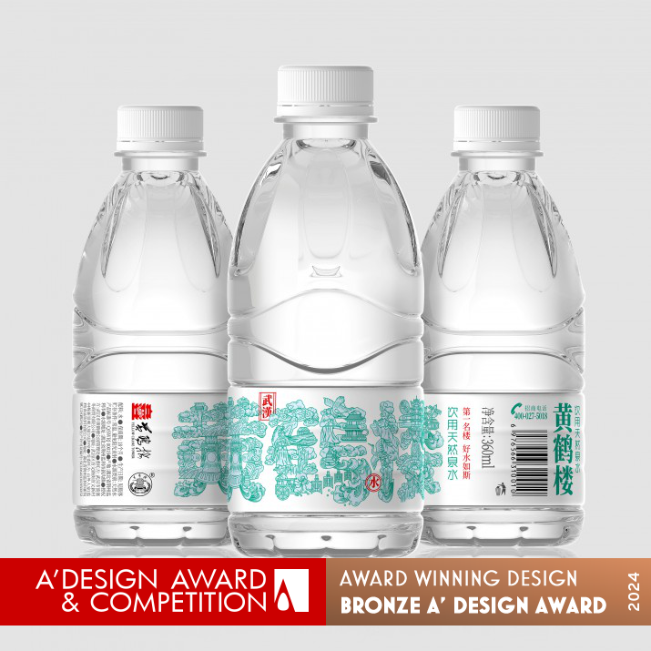
Yellow Crane Tower Water Packaging by Jin Zhang |
|
|

|
|
| DESIGN DETAILS |
DESIGN NAME:
Yellow Crane Tower
PRIMARY FUNCTION:
Water Packaging
INSPIRATION:
The thousands of years of exclusive culture in this region have inspired designers. In traditional Chinese aesthetics, there are paintings in words and characters in paintings. This unique expression technique makes this product design unique.
UNIQUE PROPERTIES / PROJECT DESCRIPTION:
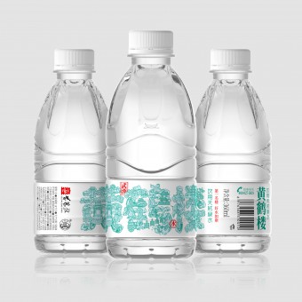
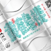
This is a very special water, the most famous landmark of Wuhan, China, the Yellow Crane Tower. It witnesses the history and culture of this region for thousands of years. Designers use painting to draw the most representative elements and combine them into Chinese characters for product names, breaking the boundaries between text and graphics.
OPERATION / FLOW / INTERACTION:
The designer first started with the study of urban culture and selected the most representative elements of the city's thousands of years of culture. Then, combined with the size of the label, they decided to use illustrations combined with Chinese characters to design, so that there are characters in the picture and pictures in the characters.
PROJECT DURATION AND LOCATION:
The project started in Wuhan, China in July 2023 and was completed in Wuhan, China in September 2023. It is expected to be sold in China in October 2023.
FITS BEST INTO CATEGORY:
Packaging Design
|
PRODUCTION / REALIZATION TECHNOLOGY:
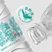
In order to better showcase the water quality, the proportion of bottle stickers should be kept as small as possible, allowing large areas of bottles to be exposed and allowing consumers to see the crystal clear water more intuitively.
SPECIFICATIONS / TECHNICAL PROPERTIES:
225mmx60mmx60mm
TAGS:
Packaging design, Yellow Crane Tower, Water, illustration, Chinese design, Wuhan Sanbu brand design
RESEARCH ABSTRACT:
The brand wants to make this water a product with local cultural characteristics, so they initially determined their research direction and deeply explored local culture. Taking Yellow Crane Tower as the core area, they will focus on many aspects, which can not only closely connect with the brand, but also showcase urban culture.
CHALLENGE:
The biggest challenge lies in making choices. The culture of a city that has been around for thousands of years is very rich, but in the end, the designer focuses on the brand name and focuses on the brand as the core, narrowing the scope while also showcasing the city's culture.
ADDED DATE:
2023-09-27 12:48:03
TEAM MEMBERS (1) :
IMAGE CREDITS:
Jin Zhang, 2023.
|
| Visit the following page to learn more: http://www.sanbu.cc |
|
| CLIENT/STUDIO/BRAND DETAILS |
 |
NAME:
Wuhan Sanbu Brand Design
PROFILE:
Wuhan SANBU Brand Design focuses on providing customers with full brand design and product packaging design services. In the constant upgrading of the consumer market, Sanbu always aims to "making designs that convey feelings", uses culture and emotion to influence and touch consumers, and reshapes the brand and product packaging design that subverts convention and makes people fall in love at first sight for many consumer product enterprises. Services include: liquor, food, tea, coffee, dairy, catering, agricultural tourism, home furnishing, education and training, clothing and other fields, including Yellow Crane Tower, Yingbo Jinlongquan Beer, TsingTao Beer, Lijiang Shanlan Wine, Jiangjun Red Wine, etc.
|
|
|
| COMMENTS |
| Giulia Esposito |
Comment #100080 on June 22, 2024, 2:22 am |
|
As a fervent admirer of innovative packaging designs, I was genuinely captivated by the "Yellow Crane Tower" water packaging, which not only embodies the essence of traditional Chinese aesthetics but also seamlessly blends centuries of cultural heritage with modern design sensibilities. The ingenious use of painting techniques to integrate the most iconic elements of Wuhan’s landmark into Chinese characters for the product's name is a testament to the designer's ability to transcend the conventional boundaries between text and graphics. This approach not only pays homage to the region's rich history but also elevates the product in a crowded market. The meticulous research undertaken to ensure the water not only represents local cultural characteristics but also connects with the brand and showcases urban culture is commendable. Moreover, the strategic decision to minimize label size to enhance the visibility of the clear water is a brilliant reflection of the thoughtfulness put into every aspect of the design process. Overcoming the challenge of distilling a city’s millennia-old culture into a singular brand focus showcases a remarkable level of creativity and dedication. This work is a shining example of how packaging can tell a compelling story and forge an emotional connection with consumers. The accolades received are well-deserved, and the creativity and innovation displayed are truly inspirational. The genius behind this exceptional design, Jin Zhang, has indeed set a benchmark in the realm of packaging design.
|
| Chloe Turner |
Comment #100524 on June 22, 2024, 3:51 am |
|
Discovering the "Yellow Crane Tower" water packaging design was truly an inspiring moment for me today. The way this work encapsulates the essence of a region's culture that spans thousands of years is nothing short of remarkable. It is fascinating how traditional Chinese aesthetics have been seamlessly woven into this design, marrying the poetic beauty of words with the visual splendor of paintings, thus creating a product that stands out not just for its utility but as a piece of art. The designer's ability to translate such a rich heritage into a tangible object that speaks volumes of the exclusive culture it represents is a testament to their mastery and innovation in packaging design. This achievement in winning the A' Design Award in the Packaging Design category is well-deserved, underscoring the unique expression technique that truly sets this product apart. It is a celebration of cultural heritage and design excellence, and it is this kind of work that continues to inspire and push the boundaries of what is possible in packaging design.
|
| Elisabeth Clark |
Comment #101290 on June 22, 2024, 6:24 am |
|
It is with great admiration that I reflect upon Jin Zhang's remarkable achievement in securing the A' Design Award for the "Yellow Crane Tower" water packaging. This work is not merely a testament to innovative packaging design but a profound exploration of the cultural essence that defines Wuhan, China. By ingeniously integrating the most emblematic elements of the Yellow Crane Tower and encapsulating thousands of years of history and culture within the design, Jin Zhang has transcended traditional boundaries between text and graphics. The approach of embedding the rich tapestry of local culture and landmark significance into the product design through a meticulous research process showcases a deep respect and understanding of the subject matter. The inspiration drawn from the region's exclusive culture, where paintings are found in words and characters in paintings, is brilliantly reflected in this design, making it truly unique. This work not only highlights the importance of cultural characteristics in product branding but also celebrates urban culture in a way that is both innovative and deeply respectful. Jin Zhang's "Yellow Crane Tower" is indeed a quintessential example of good design, embodying the essence of thoughtful and culturally rich packaging design.
|
| Adam Harris |
Comment #101849 on June 22, 2024, 8:16 am |
|
The recognition of the "Yellow Crane Tower" water packaging with the prestigious A' Design Award is thoroughly deserved, showcasing an extraordinary fusion of cultural heritage and innovative design. It is evident that the work not only pays homage to the iconic landmark of Wuhan but also intricately weaves the essence of the region's history and culture into a visually captivating narrative. The approach of blending traditional Chinese characters with representative elements to break the conventional boundaries between text and graphics is both ingenious and inspiring. Delving into the deep cultural research that informed this creation, it is clear that the dedication to embodying the local culture while addressing design challenges has been met with remarkable creativity and finesity. This work sets a high bar for packaging design, proving that thoughtful, culture-rich design can elevate everyday products into art forms that resonate deeply with both locals and a global audience alike.
|
| Mark Allen |
Comment #102510 on June 22, 2024, 10:28 am |
|
The winning of the A' Design Award in the Packaging Design Category for the "Yellow Crane Tower" water packaging is a testament to exceptional creativity and a profound understanding of cultural integration into design. The approach of merging traditional Chinese characters with graphical elements to narrate the rich history and culture of Wuhan is both innovative and respectful. It is commendable how the design not only pays homage to the iconic Yellow Crane Tower but also pushes the boundaries between text and imagery, offering a unique visual experience that enhances the product's identity. The meticulous research and thoughtful consideration in showcasing local culture while maintaining a connection to the brand's core values exemplify a masterful balance between aesthetic appeal and meaningful content. This work stands as a remarkable example of how packaging can transcend its conventional role and serve as a bridge between generations, celebrating heritage through the lens of modern design. Congratulations on this well-deserved recognition, and may it inspire more designers to explore the rich potential of cultural narratives in their creations.
|
|
|
Did you like Jin Zhang's Packaging Design?
You will most likely enjoy other award winning packaging design as well.
Click here to view more Award Winning Packaging Design.
Did you like Yellow Crane Tower Water Packaging? Help us create a global awareness for good packaging design worldwide. Show your support for Jin Zhang, the creator of great packaging design by gifting them a nomination ticket so that we could promote more of their great packaging design works.
|
|
|
|
|
|
