The D Showroom Commercial Space by Chiang Tzu-Chien |
Home > Winners > #154494 |
 |
|
||||
| DESIGN DETAILS | |||||
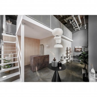
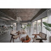
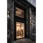
| DESIGN NAME: The D Showroom PRIMARY FUNCTION: Commercial Space INSPIRATION: The D is a skincare brand showroom in Taiwan. The showroom's design blurs the lines between indoor and outdoor spaces, creating a natural and comfortable atmosphere that reflects the brand's spirit of simplicity and uniqueness. UNIQUE PROPERTIES / PROJECT DESCRIPTION: This project repurposes an old industrial warehouse while preserving its original structure. Mezzanine and stair are placed in the warehouse's spacious and high-ceilinged space to maximize space utilization. The large windows introduce outdoor plants and sunlight into the warehouse, creating an open and airy atmosphere and reducing the use of artificial lighting. The brand's minimalist, and eco-friendly philosophy is reflected in the selection of materials and construction methods in the interior design, which promotes environmental sustainability. OPERATION / FLOW / INTERACTION: By using “light and shadow,” the designer creates a silhouetted window grille combining changes in sunlight. This technique subtly incorporates the brand's essence without overdoing it while maintaining the original look. The new space embodies elegance and confidence while keeping its character. The brand chooses the harbor city as the stating point to convey its beautiful culture and philosophy of life from the inside out. PROJECT DURATION AND LOCATION: The project started in January 2022 and was completed in June 2022. The project is located in Taiwan. FITS BEST INTO CATEGORY: Interior Space and Exhibition Design |
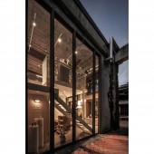
PRODUCTION / REALIZATION TECHNOLOGY: Interior materials are chosen to create a natural atmosphere by using wood, gravel paint, and iron pieces based on the architecture and environment. The brand’s minimalist and eco-friendly concept is reflected in its furniture and decorations made of natural elements such as paper and rattan. SPECIFICATIONS / TECHNICAL PROPERTIES: The project covers an area of 106 square meters. TAGS: Interior design, Commercial space, Retail space, mezzanine, Stair design, warehouse, Neutral interior, Japandi style RESEARCH ABSTRACT: To highlight the timeless charm of the brand, the commercial space, which was once an old warehouse, has been transformed to preserve its original constructive elements and combine them with creative design. CHALLENGE: The designer has created ample space by adding mezzanine floors and stairs to a spacious warehouse. They use lightweight iron structures and metal mesh to maintain visibility and light. The shop and office spaces are separated by just one window from the sky and trees, creating a comfortable and light-filled atmosphere. The staircase next to the floor-to-ceiling windows is a focal point that draws people's attention and adds interactive amusement to the indoor space. ADDED DATE: 2023-09-24 06:28:11 TEAM MEMBERS (1) : Design Director : Chiang, Tzu-Chien IMAGE CREDITS: Chiang Tzu-Chien, 2023. PATENTS/COPYRIGHTS: Copyrights belong to Chiang, Tzu-Chien, 2022. |
||||
| Visit the following page to learn more: https://withindstudio.com/work | |||||
| AWARD DETAILS | |
 |
The D Showroom Commercial Space by Chiang Tzu-Chien is Winner in Interior Space and Exhibition Design Category, 2023 - 2024.· Press Members: Login or Register to request an exclusive interview with Chiang Tzu-Chien. · Click here to register inorder to view the profile and other works by Chiang Tzu-Chien. |
| SOCIAL |
| + Add to Likes / Favorites | Send to My Email | Comment | Testimonials | View Press-Release | Press Kit |


