DESIGN NAME:
Beauty of Orient
PRIMARY FUNCTION:
Office
INSPIRATION:
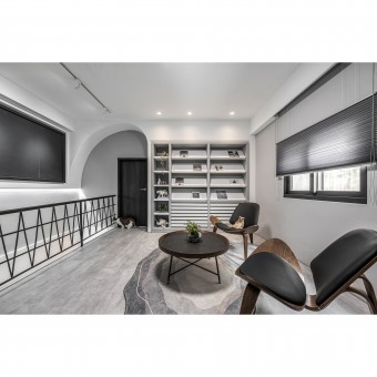
A 50-year-old residence is transformed into a modern minimalist design studio. The 'Whitecore Style' uses white as the base to enhance the spaciousness and brightness of the experience and is embellished with greyish black. The curves are the highlights of the project. The asymmetrical, organic curves and the rhythmic sense of the curves demonstrate the aesthetics of the blend and make the office more human-oriented.
UNIQUE PROPERTIES / PROJECT DESCRIPTION:
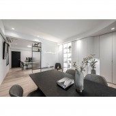
1. Low-saturation black, white, and gray: Neutral colors of black, white, and grey cover the entire office to make it classic and intellectual. The low-saturation color scheme achieves a relaxing atmosphere.
2. Organic Curves: The ceiling and storage cabinet at the entrance have curves to dissolve the sharpness of the border and embellish softness in the minimalism. The asymmetrical curve on the second floor is the focal point, and the grey wall with a moon pattern creates an avant-garde style, shaping an image of modernity and efficiency.
OPERATION / FLOW / INTERACTION:
The space was crowded and dilapidated. The design team removed the partitions to make the interior more open and well-lit. The comfortable and pleasant space enhances work efficiency and reduces stress and fatigue. Indirect lighting is installed in the mirrors, the screen also has curves, and the tiles are the final touch, creating a functional and artistic bathroom, which becomes the most impressive part of the interior for visitors. Visitors and staff alike can feel relaxed and at ease here. The inclusive and flexible planning embodies the Chinese culture of the golden mean.
PROJECT DURATION AND LOCATION:
The project finished in April 2022 in Taiwan.
FITS BEST INTO CATEGORY:
Interior Space and Exhibition Design
|
PRODUCTION / REALIZATION TECHNOLOGY:
Materials: laminate flooring, woodwork, baked paint, stone pattern fabric.
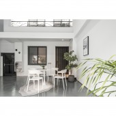
Extending the classic earthy tone, the grey color scheme is combined with wood and stone patterns to form the base. The first floor is covered with wood grain flooring, while the second floor is covered with architectural concrete style flooring. The mixing and matching of various materials increase the variability of details, natural texture, and depth of view, and is easy to clean and maintain, making it suitable for the office. Finally, plants are placed as decoration.
SPECIFICATIONS / TECHNICAL PROPERTIES:
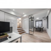
The site is a 50-year-old house with a total of 99.1 square meters of indoor area and 49.5 square meters of yard. The design team fine-tuned the layout. The center wall of the first floor is replaced by a matte glass partition to preserve transparency, while the wall on the second floor is removed to serve as a building materials display area and meeting area. By reducing the partitions, the design team realized unobstructed circulation, which in turn increased the spaciousness and brightness. Furthermore, during their breaks, staff can sunbathe in the yard, and enjoy the outdoor greenery.
TAGS:
Modern Minimalist, Office, Old House, Curves, Multiple Materials, Grille.
RESEARCH ABSTRACT:
'The Beauty of the Orient: Grey Modern Design Studio' is a renovation project of an old house. The design team gave the old building a new look. The classic black, white, and grey form a timeless style, outlining the modern minimalist office silhouette. The first floor is an open plan, removing partitions to create a wide view. The design team placed the partitioned kitchen against the wall to provide flexibility and maintain circulation. Standing at the viewpoint of staff or visitors, no matter walking around or discussing work matters, they are unrestricted.
CHALLENGE:
Due to the unsatisfactory condition of the old house, the foundation work took about three months, including door and window renovation, floor leveling, roof waterproofing, fence wall repair, and painting. Considering the practicality and safety, the design team re-planned the interior wiring and restored the basic functions of the house. Converting the house into an office, the core issues were to make the function fit the work needs, to present a quiet and refreshing atmosphere, and to improve the happiness, work efficiency, and concentration of the staff.
ADDED DATE:
2023-09-22 01:20:27
TEAM MEMBERS (2) :
Tzu-Chien Huang, Sherry Zhong and
IMAGE CREDITS:
Dangli Design+SC Architects
|


