|
|
|

|
|
| DESIGN DETAILS |
DESIGN NAME:
Unicorn Rebrand
PRIMARY FUNCTION:
Visual Identity
INSPIRATION:
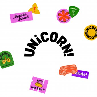
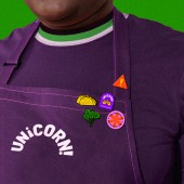
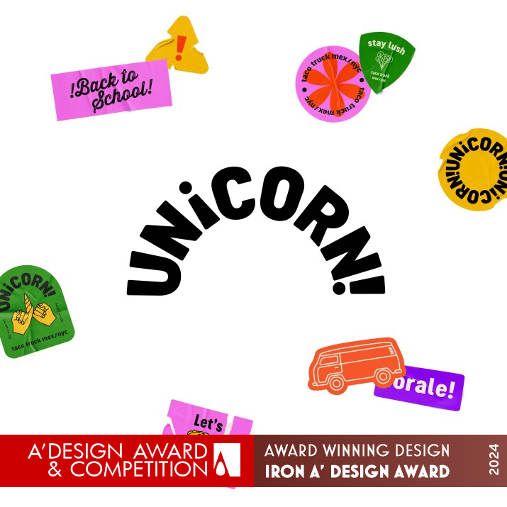
This is a rebranding project for Unicorn Taco, a New York-based taco brand specializing in Mexican food. The design features a lively and bold color palette, complemented by badge graphics that resonate with the college student identity. These elements work together to create a more enticing brand image, appealing to a youthful audience.
UNIQUE PROPERTIES / PROJECT DESCRIPTION:
"Unicorn" has a dual meaning: it signifies the mythical animal "Unicorn", aligning with the brand's weekly flavor launches, and it can be dissected into "Uni" and "CORN," representing "university" (as the food truck targets college students near universities) and "the taco". The exclamation mark at the end of the logo mirrors the third letter "i," a distinctive punctuation mark in Spanish.
OPERATION / FLOW / INTERACTION:
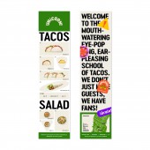
The design features a lively and bold color palette, complemented by badge graphics that resonate with the college student identity. These elements work together to create a more enticing brand image, appealing to a youthful audience. Additionally, each product name in the menu design cleverly incorporates words closely related to college life, such as "all-nighter," "group project," "brainstorm," and more, ensuring that every element in the design is closely connected to the brand's core, ultimately forming a cohesive and unified visual system.
PROJECT DURATION AND LOCATION:
The project started in July 2021 and finished in September 2021 in Beijing, China.
FITS BEST INTO CATEGORY:
Graphics, Illustration and Visual Communication Design
|
PRODUCTION / REALIZATION TECHNOLOGY:
The logo is easily applied to stationery, packaging and menu designs, and other various applications including loyalty card, balloon, badges, taco truck graphic, apron and tape designs.
SPECIFICATIONS / TECHNICAL PROPERTIES:
Loyalty card 90mm x 54mm
TAGS:
Logo, visual identity, branding, corporate identity, graphic design, food identity, New York
RESEARCH ABSTRACT:
The overall logo takes a semi-circular shape, cleverly mirroring the appearance of Taco corn tortillas. The letters "i" in "UNi" in the name, along with the exclamation mark at the end, form a mirrored pattern, adhering to the rules of Spanish grammar.
CHALLENGE:
This brand design challenge is how to make every element in the design closely connected to the brand's core, ultimately forming a cohesive and unified visual system. Like the logo design which skillfully incorporates various pieces of information, such as the brand's origin, product characteristics, and target audience, into a simple graphic without losing uniqueness and detail.
ADDED DATE:
2023-09-21 15:08:35
TEAM MEMBERS (1) :
IMAGE CREDITS:
Yating Liu, 2023.
|
| Visit the following page to learn more: https://www.yatingliu.space |
|
| CLIENT/STUDIO/BRAND DETAILS |
 |
NAME:
Yating Liu
PROFILE:
Yating Liu holds a BFA in Communications Design from the School of Visual Arts. Following graduation, she worked for Viacom, Prophet, and other design agencies in New York. Yating Liu is a versatile graphic designer with a strong penchant for customized typefaces and branding design. She has thrived in multicultural cities like Beijing, Hong Kong, and New York, which have helped her to become more well-rounded and upbeat in personality. Yating is currently making images at 2x4 (Beijing), where she utilizes her branding and advertising background to express her distinctive and mature views through visual language.
|
|
|
| COMMENTS |
| Giulia Esposito |
Comment #100053 on June 22, 2024, 2:17 am |
|
The rebranding project for Unicorn Taco by the talented individual showcases an exceptional grasp of visual identity development in the realm of Graphics, Illustration, and Visual Communication Design. The lively and bold color palette, along with the clever use of badge graphics, creates an inviting and resonant image that perfectly targets the youthful, college student demographic. The ingenious play on the word "Unicorn" to incorporate dual meanings that reflect both the mythical creature and the essence of the brand's offering is nothing short of brilliant. The attention to detail, from the semi-circular logo that mirrors taco corn tortillas to the unique punctuation mirroring in the logo, demonstrates a deep understanding of visual branding and the importance of connecting every design element to the brand's core values. The ability to overcome design challenges and create a cohesive visual system that is not only unique but also fully integrated with the brand's identity, product characteristics, and target audience is commendable. The execution of this project, from research to realization, including the application of the logo across various media, displays a high level of creativity and professionalism. This work stands as a testament to the power of thoughtful design in creating compelling brand identities that engage and resonate with their intended audiences. The recognition of this project with an A' Design Award is well-deserved, and it is a pleasure to celebrate the success of Yating Liu in this achievement.
|
| Elisabeth Clark |
Comment #101565 on June 22, 2024, 7:19 am |
|
The award-winning "Unicorn Rebrand" by Yating Liu is an exemplary showcase of innovative design, blending a clever play on words with an astute understanding of its target audience. The dual meaning of "Unicorn" not only captures the essence of the mythical creature and the brand's evolving flavors but also smartly incorporates a nod to its primary audience, the university students, with a playful twist on "Uni" and "CORN." What truly sets this work apart is the meticulous attention to detail, particularly in the logo's design, which mirrors the shape of a taco corn tortilla and cleverly uses punctuation to adhere to Spanish grammar rules, enhancing its cultural authenticity. The vibrant color palette and badge graphics further energize the brand, making it more appealing to a youthful demographic and encapsulating the spirit of Mexican cuisine with a modern twist. Yating Liu’s ability to research deeply and think creatively has evidently paid off, resulting in a visual identity that is not only visually engaging but also rich in meaning and context. This rebranding is a testament to the power of thoughtful design in transforming and elevating a brand's identity, making it a deserving recipient of the A' Design Award in the category of Graphics, Illustration, and Visual Communication Design.
|
| Mark Allen |
Comment #102775 on June 22, 2024, 11:21 am |
|
The "Unicorn Rebrand" project stands as a remarkable achievement in the realm of Graphics, Illustration, and Visual Communication Design, rightfully earning its accolade with the A' Design Award. This work brilliantly marries conceptual depth with visual appeal, ingeniously encapsulating the dual essence of "Unicorn" to resonate with its target audience while presenting a vibrant and engaging visual identity. The thoughtful integration of elements reflecting the brand's core, from its nod to Spanish grammar to the clever use of shape and color, showcases a masterful approach to design challenges. It is both inspiring and instructive to see how every component of the design is meticulously crafted to form a cohesive, unified visual system that speaks directly to the youthful spirit of its audience. Congratulations on this well-deserved recognition; it is a testament to the power of innovative design in transforming a brand's image and connecting with consumers on a deeper level.
|
|
|
Did you like Yating Liu's Graphic Design?
You will most likely enjoy other award winning graphic design as well.
Click here to view more Award Winning Graphic Design.
Did you like Unicorn Rebrand Visual Identity? Help us create a global awareness for good graphic design worldwide. Show your support for Yating Liu, the creator of great graphic design by gifting them a nomination ticket so that we could promote more of their great graphic design works.
|
|
|
|
|
|
