DESIGN NAME:
Merak
PRIMARY FUNCTION:
Residence
INSPIRATION:
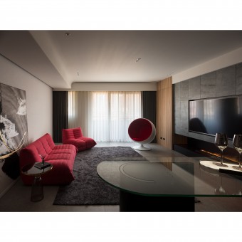
The site is a new apartment. The client is looking for a space that could serve two people, either alone or with a significant other, to feel at home in a relaxed and cozy atmosphere. The design team envisioned the space as a box of love, filled with warmth and care. The client even chose 'Merak', the Serbian word for happiness, as the name of the project. The style satisfies the client's preference for Western feelings, and the red theme creates an elegant taste that matches the client's characteristics.
UNIQUE PROPERTIES / PROJECT DESCRIPTION:
1. Minimalist volume for visual effect: Black, white, and grey emphasize the nature of the material and the purity of the color. Architectural concrete, metal, and black wood grain all have their different textures and reflections. Minimalism is constructed through the three color tones and different materials, presenting balance and rationality.
2. The contrast between the solid and the void for emotional expression: For the social area, dark colors and bar style are applied to highlight the red and show the client's pursuit of a lively social atmosphere.
OPERATION / FLOW / INTERACTION:
The design team considered his lifestyle and installed the kitchen island as an ideal place for dining and socializing. An electric fireplace below the TV wall also fulfills the client's lifestyle preference for a water vapor fireplace that reduces carbon emissions and creates a captivating effect that resembles a real flame.
The elegant and delicate design makes the clients feel that they seldom want to leave their homes. Moreover, the clients shifted their focus to socializing, watching movies, and working out in the spacious living room.
PROJECT DURATION AND LOCATION:
The project finished in December 2022 in Taiwan.
FITS BEST INTO CATEGORY:
Interior Space and Exhibition Design
|
PRODUCTION / REALIZATION TECHNOLOGY:
In terms of material, the project is based on the principle of low saturation. However, the texture of the materials is preserved in the details, such as steel brush-sawn oak, and natural thin mineral stones with rough surfaces and indentations, which best express the client's individuality and reveal the dynamic rhythm of the space. Hand-painted stucco and architectural concrete coatings express the essence of materials. The reflective gradation of the stucco serves as a base to accentuate every moment of life.
SPECIFICATIONS / TECHNICAL PROPERTIES:
The site has a documented area of 181.8 square meters and an actual interior area of approximately 99.1 square meters. The layout is three rooms, a living room, a dining room, and two bathrooms.
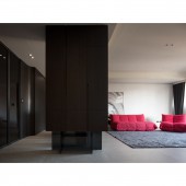
The design team removed the entrance wall and created a small landscape in the kitchen island area while planning a space similar to an entrance, which serves as a foyer and induces a natural flow of circulation. The dressing room meets the client's storage needs, while considering the future possibilities, defining the guest room as a future studio or children's room.
TAGS:
Merak, minimalism, solid and void, bar style, environmentally friendly materials, atmosphere creation, light and shadow, color.
RESEARCH ABSTRACT:
In terms of style, the client loves dark colors and bar style, which comes from his living experience overseas. Red is emphasized in the social area, which accurately reflects the client's taste for color. In terms of material selection, the design team selected the client's favorite elements and created a depth of field with the lighting plan. Hand-painted coatings add a natural and distinctive texture and a trace of sophistication to the space, which is complemented by lighting to create a captivating luster.
CHALLENGE:
When the design team took over the project, they found that it was a new apartment that had been customized. The interior layout had been slightly modified, especially the foyer with a vertical wall separating the kitchen from the living room. This layout made it difficult for the design team to understand the client's original intention. In addition, the living room was enlarged, relatively compressing the private area. Considering the client's reluctance to make drastic changes to the partition to avoid increasing the budget, the design team achieved a smooth flow with minimal remodeling.
ADDED DATE:
2023-09-21 08:42:17
TEAM MEMBERS (2) :
Tse-Ming Wang, Catherine Lin and
IMAGE CREDITS:
Chen Hsu Interior Design
|


