DESIGN NAME:
Monet
PRIMARY FUNCTION:
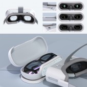
VR Color-blind Diagnosis System
INSPIRATION:
About 8% of all men and about 0.5% of all women suffer from color blindness (color vision deficiency). This means the chances that your neighbor or one of your classmates is colorblind are very high.
To put the percentages into perspective, close to 300 million people are colorblind and struggle every day.
What if our inclusive design promotes a cheap, efficient, and accurate way to diagnose colorblindness?
UNIQUE PROPERTIES / PROJECT DESCRIPTION:
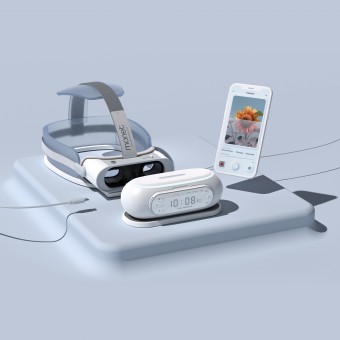
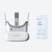
Monet is a VR color-blind diagnosis system that combines powerful VR products with a digital app. It allows colorblind people to regularly check their eye condition, see actual color and build a community that provides a sense of belonging.
OPERATION / FLOW / INTERACTION:
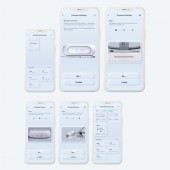
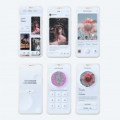
The monet®️ app provides a cohesive user flow for individuals with color vision deficiency, offering a sense of community, enhanced color perception, accurate diagnosis, and ongoing eye care management. Users can connect with a supportive community, use the filtered camera feature to experience color changes, take an initial diagnosis test, access a VR system for detailed diagnosis, and receive step-by-step instructions for testing. The app ensures users feel a sense of belonging, understand their condition better, and receive convenient and comprehensive eye care support.
PROJECT DURATION AND LOCATION:
The project started in Jan 2021 in California, Pasadena and finished in May 2023 in California, Arcadia.
FITS BEST INTO CATEGORY:
Interface, Interaction and User Experience Design
|
PRODUCTION / REALIZATION TECHNOLOGY:
The production or realization technology for Monet involves a combination of advanced software development techniques and cutting-edge hardware integration. The app is developed using modern programming languages, frameworks, and tools to ensure optimal performance, seamless user experience, and efficient data processing. The color-enhancing filters in the filtered camera feature are designed using sophisticated algorithms and image processing techniques. In addition, the app integrates with virtual reality (VR) systems, utilizing VR headset technology for detailed color vision diagnosis. The design process follows user-centered methodologies, incorporating user feedback and testing to refine and enhance the app's functionality. The materials used for the physical components of Monet, such as the VR headset and frame for the pod, are carefully selected for durability, comfort, and ergonomic design. Overall, Monet leverages the latest advancements in technology and materials to deliver a comprehensive and user-friendly solution for individuals with color vision deficiency.
SPECIFICATIONS / TECHNICAL PROPERTIES:
-
TAGS:
Inclusive Design, Diagnosis Test, Awareness Design, User Empowerment, SocialImpact, User Experience, UI UXDesign, Product Design, VR system
RESEARCH ABSTRACT:
The design research for monet followed an inclusive design approach, aiming to understand and address the needs of users with color vision deficiency. The objectives were to create a powerful tool for colorblind individuals, allowing them to see colors accurately, providing regular condition checks, and fostering a sense of belonging through community-building. The research employed a user-centered methodology, incorporating surveys, interviews, user testing, and literature reviews. Participants included a diverse range of individuals with color vision deficiency, representing various demographics. The results highlighted the challenges faced by colorblind individuals in everyday life, such as food preparation, technology usage, and discrimination in the workplace. The research provided valuable insights into the emotional, practical, and societal impacts of color vision deficiency, promoting awareness, inclusivity, and equal opportunities.
CHALLENGE:
The creative and research challenge for Monet product was to figure out the design style that accommodates the unique requirements of colorblind individuals. Given their varied perception of colors, we decided to employ the neumorphism style, where color is not the primary distinguishing factor. Instead, we relied on shadows and highlights surrounding the elements to create a 3D effect, providing visual cues and clarity without relying solely on color differentiation.
Another challenge we faced was integrating the app's digital experience with the physical VR product. We wanted to ensure that users could seamlessly transition between the virtual and physical environments. To achieve this, we designed the VR experience in a way that accurately represents what users see in the virtual environment. By leveraging intuitive physical buttons, users can interact with the VR interface, making selections and choices effortlessly through touch.
ADDED DATE:
2023-06-30 06:36:14
TEAM MEMBERS (2) :
Shuaicheng Dong and Xiyu Chen
IMAGE CREDITS:
Shuaicheng Dong
Xiyu Chen
PATENTS/COPYRIGHTS:
Copyrights belong to Shuaicheng Dong,Xiyu Chen,2023
|
