Espresso Coffee Branding by Andromachi Kakava |
Home > Winners > #152991 |
 |
|
||||
| DESIGN DETAILS | |||||
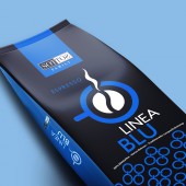
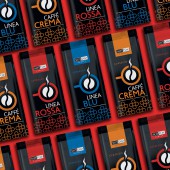
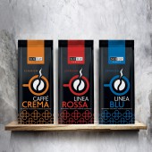
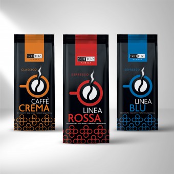
| DESIGN NAME: Espresso PRIMARY FUNCTION: Coffee Branding INSPIRATION: The logo of the series was inspired by the blend of coffee and its delightful aroma. The artistic approach was based on the linear top view of an espresso cup and the aroma that spreads in the space, stimulating coffee cravings. The pattern was given repetition in such a way that it can be a useful visual and in any other application needed so that it is recognizable for the entire series of coffees, but also for the actions that will follow in the promotion of the product. UNIQUE PROPERTIES / PROJECT DESCRIPTION: The Sottos family, based in Germany and having more than fifty years of experience in the production and packaging of coffee products, expanded its range with its most recent series of products designed exclusively for professional use: Espresso Linea Blue, Espresso Linea Rossa & Espresso Linea Aroma. Seeking uniqueness and visual creative ways of approach, coffee itself revealed the image of its aesthetic transformation. OPERATION / FLOW / INTERACTION: An important aspect of the packaging design strategy was its aesthetics to be able to win over the public and at the same time win over the branded demand in catering areas. Sottos Family now gains a strategic high position, both qualitatively and aesthetically, in the packaging and retailing of coffee. PROJECT DURATION AND LOCATION: The project started in November 2019 in Athens and finished in December 2022 in Athens FITS BEST INTO CATEGORY: Packaging Design |
PRODUCTION / REALIZATION TECHNOLOGY: The symbol became the central pattern and characteristic feature of the packaging. The colors of the packaging, red, blue and orange, along with the dominant black color, make the packaging stand out and claim a prominent place in the display cases of coffee houses, breaking thusly the stereotype that wholesale products must remain invisible to the consumer. SPECIFICATIONS / TECHNICAL PROPERTIES: Metallic Pouch: Width 155mm x Height 325mm TAGS: espresso, sottos, coffee, RESEARCH ABSTRACT: Coffee packaging requires special design due to the great competition. The research carried out based on the color coding of espresso, gave SOTTOS FAMILY an aesthetically different image on the packaging. Thus, the color palette of the packaging defines the coffee blends, leading the consumer's consciousness to combine color with the corresponding taste and aroma. The study was developed in depth taking into account the development of regional materials that highlight the SOTTOS FAMILY espresso coffee brand. In this way, the visual design with the pattern and the marking, was adopted in packaging and promotional material, making the brand quickly recognizable among competing coffee products. CHALLENGE: Strategically, among the multitude of coffee packaging available on the market, the creative line that would differentiate the product had to be found. ADDED DATE: 2023-06-29 09:01:56 TEAM MEMBERS (2) : Costas Lakis and Andromachi Kakava IMAGE CREDITS: Andromachi Kakava, 2023. |
||||
| Visit the following page to learn more: https://www.sottosfamily.de/kaffeewelten |
|||||
| AWARD DETAILS | |
 |
Espresso Coffee Branding by Andromachi Kakava is Winner in Packaging Design Category, 2023 - 2024.· Press Members: Login or Register to request an exclusive interview with Andromachi Kakava. · Click here to register inorder to view the profile and other works by Andromachi Kakava. |
| SOCIAL |
| + Add to Likes / Favorites | Send to My Email | Comment | Testimonials | View Press-Release | Press Kit |

