DESIGN NAME:
Human Haus Tn
PRIMARY FUNCTION:
Clothing Store
INSPIRATION:
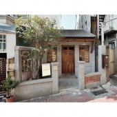
The site is in Tainan, which is known as Castletown. Tainan has a rich and interesting story, and the site is near the Lin Department Store, which was the essence of the early development of the local fashion industry. The design team historical objects in the space, including brick walls, roof tiles, wood veneer, and layout, and restored them with new designs to find the perfect balance between new and old. Moreover, the vintage colors give visitors a new meaning that is different from the common clothing stores.
UNIQUE PROPERTIES / PROJECT DESCRIPTION:
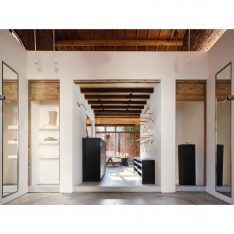
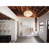
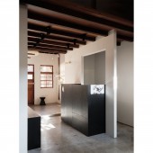
Combining the old and the new: There are many contrasting techniques in the space. The original wall panels that had been sealed up were broken down to reveal brick walls with traces of age. The ceiling panels were removed to reveal the former wooden roof structure in the new interior design. Took the concept of contrast to reveal the highlights.
Layout: The layout of the site is a common one in Taiwan. The narrow layout requires consideration of movement, sight, and experience. Used a staircase to create a vertical vision and an hourglass-loke look to create a horizontal axis.
OPERATION / FLOW / INTERACTION:
The convenience of the space is more interesting than the client thought because the site has several conditions that cannot be changed. First, it has a slope; second, it has a long and narrow layout; and third, the space has non-modifiable storage space on both sides and above.
Used a staircase and hourglass style plan to create a spacious visual experience. In the storage, they installed preserved wood pieces where the view level is visible to enhance the nostalgic atmosphere. For the loft above, the vertical route was too steep, and ropes are installed to facilitate the goods in and out.
PROJECT DURATION AND LOCATION:
The project finished in December 2022 in Taiwan.
FITS BEST INTO CATEGORY:
Interior Space and Exhibition Design
|
PRODUCTION / REALIZATION TECHNOLOGY:
Building materials: stucco, ironwork, brick, oak veneer stain, paint, topcoat, etc.
The project aims to prioritize preservation and avoids using complicated new materials. Instead, it emphasizes the restoration and preservation of existing materials.
To avoid moisture damage to the wood, the design team painted the brick walls, ceilings, window frames, and doors with a waterproof topcoat to ensure the antiques are preserved.
SPECIFICATIONS / TECHNICAL PROPERTIES:
The site has a total area of 52.8 square meters on the first floor and is over 60 years old.
The site is an old house built during the Japanese period. It has a narrow and long floor plan and a pitched roof ceiling. In the early days, people would use the triangular space of the pitched roof as a loft for storage. Following this idea, the design team arranged the clothing store's warehouse on the mezzanine floor and installed ropes to help the client efficiently when moving goods in and out.
TAGS:
Tainan, history, Japanese occupation era, clothing store, open plan, small space, solid wood, brick, stucco
RESEARCH ABSTRACT:
The space holds a strong historical significance and a sense of time as it is located in Tainan, where the fashion industry thrived half a century ago.
The project's core is centered around the 'integration of the old and the new'. The old and the new are intertwined, bringing a new era of vitality through the story of history, while highlighting the strong textures of the past through the minimalist style. Through contrasting techniques in color, style, and visual effects, such as new and old, dark and light, and rough and smooth, the project makes the space more vivid.
CHALLENGE:
The project places a strong emphasis on the 'contrast' between the old and the new, which involves carefully deciding what to preserve and what to discard. Keeping everything intact would not only defeat the purpose of revitalization but also fail to capture the essence of the old house. Conducted extensive deliberations and considerations, and eventually retained the most valuable elements. In the subsequent phase, the integration of modern elements became the focal point. Achieving a balance between the two elements was also a crucial aspect of the design that required meticulous planning.
ADDED DATE:
2023-06-29 06:52:35
TEAM MEMBERS (1) :
Yu-Hsuan Chu, Yu-Chen Chang
IMAGE CREDITS:
Minusplus Design
|
