DESIGN NAME:
Tranquil
PRIMARY FUNCTION:
Office
INSPIRATION:
The site is in an old building and serves as the brand's office. The original site was too small, but as the brand's reputation grew and the team expanded, it also meant that an iconic change was necessary. In line with the brand's development and intent, the designer used 'blank space' as a theme to create an open and aesthetic space. Just as the brand keeps its original intention when moving to the next stage, the achievements accumulated from scratch are brilliantly presented in front of clients' eyes.
UNIQUE PROPERTIES / PROJECT DESCRIPTION:
1. Blank space represents the possibilities of the future: In the long and narrow layout, the designer realized a retracted design at the entrance. The beveled glass serves as a highlight, and a touch of greenery enters the view.
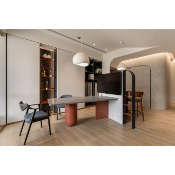
2. Inviting clients to experience the sense of security that comes from being wrapped up: The curves in the interior design give the space an image of trust and peace of mind. There is a large beam on the ceiling, to make the ceiling not too oppressive, the designer used curved remodeling to weaken the volume.
OPERATION / FLOW / INTERACTION:
The design team believes that good spatial quality comes from the close relationship with clients and the integration of the design team's professional ability, so they insist on treating people with sincerity and paying attention to the quality of construction. In the first-floor meeting area, there are many new techniques for clients to experience the space directly and feel the design team's dedication to planning and quality from the outside to the inside.
PROJECT DURATION AND LOCATION:
The project finished in August 2023 in Taiwan.
FITS BEST INTO CATEGORY:
Interior Space and Exhibition Design
|
PRODUCTION / REALIZATION TECHNOLOGY:
Materials: Benjamin Moore paint, system cabinets, walnut veneer, cement paint, stone veneer sheet, solid wood flooring, Italian artistic paint, etc.
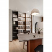
For the color scheme, the designer adopted a minimalistic and layered color palette. The cement paint, which serves as the base, presents a large area of warm gray tone and is mixed with white or beige gloss to enhance the overall visual effect. Then, the burgundy and dark blue embellishments give the space a cozy bar-like atmosphere. Through contrasting colors, the designer added a distinctive touch of fashion to the space.
SPECIFICATIONS / TECHNICAL PROPERTIES:
The site is a four-story building about 40 years old. Its total area is 238 square meters, and each floor is 59.5 square meters.
For the layout, the designer re-planned the space based on the original cut pattern. In the long and narrow layout, the intuitive circulation appears narrow and crowded. By removing the unnecessary partition in the center, the designer enlarged the horizontal axis. The entrance retreat with its slanted glass and interior furniture attracts people to the reception area as soon as they step into the space.
TAGS:
Blank design, tranquil, smart home system, eco-friendly building materials, innovation, old building.
RESEARCH ABSTRACT:
The project is a model of a brand office and old building renovation. With 'blank space' as the concept, the designer skillfully transformed the original defects of the space into strengths and made them become the symbolic element of the brand. Faced with the challenge of a long and narrow layout, took a retracted design and a slanted glass entrance to bring in greenery and sunlight from the outdoors and form the central axis of the space, allowing people to enjoy the interior design intuitively. The curved ceiling and wrap-around design further create a sense of trust and security.
CHALLENGE:
The site is over 40 years old. During the demolition work, the team found termites, with the largest nest reaching 50 centimeters in diameter. Given the large amount of wooden furniture and materials installed in the project, it was necessary to spray insecticides during the demolition and treat the ceiling, floors, and walls to eliminate the problem for good. The designer restored the boarded-up windows and found that the ceiling beam was protruding, which was overcome by a curved design.
ADDED DATE:
2023-06-29 06:25:55
TEAM MEMBERS (1) :
Max Wang
IMAGE CREDITS:
Tglivable Interior Design
|


