DESIGN NAME:
Metro
PRIMARY FUNCTION:
Salon
INSPIRATION:
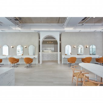
The owner left the rented premises and moved the Salon to a new location by building on private land. The designer adopted a minimalist approach to the renovation, giving an eco-friendly and stylish image to the brand. Considering the frequent movement of staff and equipment, the designer took a minimalist design to make the interior unobstructed and comfortable. Grey and white cover the walls and iron fittings, and the original concrete ceiling is deliberately kept showing the industrial style. The designer hopes the staff and customers can embrace the change in a cozy space.
UNIQUE PROPERTIES / PROJECT DESCRIPTION:
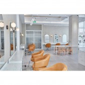
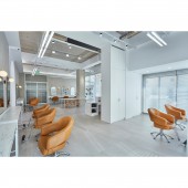
1. Minimizing Aesthetics: To protect the environment, the designer retained the roughness of the original concrete ceiling and blended it with the grayish-white in the interior. The saturated monochrome color of the orange seats is emphasized in the uniform grayscale, symbolizing the innovative nature of the hair design.
2. Circulation of the two cores: Good circulation facilitates the work of the staff. In addition to the counter at the entrance, the color bar in the center of the space connects all areas and plays a vital role.
OPERATION / FLOW / INTERACTION:
The layout is planned with the color bar as the core and extended to all areas.
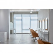
The color temperature and mirrors make the space look spacious and bright. The large floor-to-ceiling windows on both sides bring in good natural light. Inside, 5800k LED lights are installed to evenly illuminate the working area to help with hair coloring. By leaping from a traditional chain salon to a design studio, customers feel the aesthetics of the space have been enhanced, and their satisfaction has increased as well.
PROJECT DURATION AND LOCATION:
The project finished in September 2022 in Taiwan.
FITS BEST INTO CATEGORY:
Interior Space and Exhibition Design
|
PRODUCTION / REALIZATION TECHNOLOGY:
Gray paint, ironwork, polished quartz tiles, system panels, mirrors, glass, blinds, marbling, and metal.
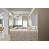
Light gray polished quartz tiles on the floors and concrete ceilings provide the basis for the industrial style. Off-white ironwork can be found on the lamp rails, tables, partitions, desktops, and cabinets made of system boards. The metal ring pendant lamps and light shelves reflect the texture of the light. The cabinet surfaces at the core of the counter and color bar are covered with white tiles, accented with curves and colorful shards.
SPECIFICATIONS / TECHNICAL PROPERTIES:
The site has a total area of 195 sq. ft and is on private land. The project area is the 1st floor.
The architect determines the exterior of the building and the position of the columns, and then the interior layout is planned by the designer. With two large floor-to-ceiling windows to provide good lighting.
The designer also emphasized the depth of view. For example, from the doorway to the counter in the foreground, the archway to the hair-cutting area is the central view, behind the archway is the color bar and connected to the two sides of the washing and treatment rooms.
TAGS:
Hair salon, industrial style, eco-friendly, gray tone, concrete, built on private land, yuppie.
RESEARCH ABSTRACT:
The project is named 'Silky Glow' because of the uniform lighting warm color accents, and the round and curved imagery in the space.
The designer adopted a 'minimalist�9; design to enhance the sense of spaciousness. The pure gray and white, the concrete ceiling and the iron parts shape the modern industrial style. The curves start from the hallway, and the pattern of tiles from mirrors, and desktops to countertops echo each other. On the other side, the saturated orange chairs and the warm light from the wall lamps symbolize the salon's boldness and innovation in the gray tones.
CHALLENGE:
In addition to aesthetics and texture, circulation within the salon is equally important. The designer put a lot of effort into understanding the detailed workflow in the salon to plan the most streamlined routes.
The goal of minimizing secondary construction is also a challenge to the accuracy of the plans. During the construction, there was constant checking and matching of the construction and interior finishes so that they were integrated.
The hair salon is a chain brand. Compared with the old store, the new space emphasizes the concept of trend, fashion, and environmental protection.
ADDED DATE:
2023-06-29 05:09:51
TEAM MEMBERS (1) :
KUN-SEN CHANG
IMAGE CREDITS:
Sen studio
|
