DESIGN NAME:
Meridiana
PRIMARY FUNCTION:
Residence
INSPIRATION:
Although there is a full side of light in the west, and there are retracted patios on the north and south sides, the natural light comes almost exclusively from the single floor-to-ceiling windows. Therefore, the designer changed the conventional spatial plan by adding three-dimensional layers through concave folding and circulation, solid and void, and material textures. The project attempts to make the visual orientation of the space with the turning of the route so that the participation of light from different angles can create layers in solid and void.
UNIQUE PROPERTIES / PROJECT DESCRIPTION:
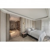
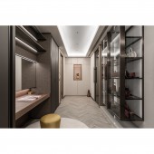
The project has three techniques to create layers of light and shadow changes, making light more vivid. Firstly, the designer boldly created several curved walkways according to the left and right lighting of the base, to change the position of people about the light. Next, reflective materials are placed at the end of the walkways to extend the scale of light. Thirdly, the walls are concave and convex, and the designer created 5cm and 7cm grooves to emphasize the trajectory of light according to the light source in the area.
OPERATION / FLOW / INTERACTION:
The duplex is divided into a social and private area downstairs and upstairs. A moonlit staircase leads upstairs to a living area with an executive suite. The master bedroom is installed with linear lighting to showcase the client's stylish and sophisticated lifestyle. At the same time, indoor air temperature, humidity, and freshness are precisely controlled, as well as noise reduction. Last but not least, the electric doors and mattresses provide the most comfortable living experience for the client.
PROJECT DURATION AND LOCATION:
The project finished in April 2023 in Taiwan.
FITS BEST INTO CATEGORY:
Interior Space and Exhibition Design
|
PRODUCTION / REALIZATION TECHNOLOGY:
Building materials: marble, artistic paints, Benjamin Moore paint, steel brushed solid wood veneer, metal, glass, etc.
To create a variety of textures, the walls are not only grooved, but also sponged, scraped, and swatched to present textures of varying thicknesses. When the wall is illuminated from the left or right, natural light and shadow lines appear. It is worth mentioning the selection of lighting fixtures, including moon lamps, feather lamps, and lotus leaf lamps with hand-applied gold leaf inside, which naturally convey the solid and void of light.
SPECIFICATIONS / TECHNICAL PROPERTIES:
The site has a total of 185.1 square meters of half-empty apartments. Based on the client's lifestyle, the layout is divided into social and private areas on different levels. Whether it is a gathering for wine tasting or solitude, there is a place that suits the context. The extended walkways serve as a gallery, while the turns can be used to display paintings or sculptures. On the other side, the 156cm half-height TV wall with a B&O TV system creates a multifaceted look of light and shadow when the elevation of the TV.
TAGS:
Light and shadow aesthetics, time illusion, duplex, multi-story, sundial, luxury.
RESEARCH ABSTRACT:
Time passes through the space as if it were a retrograde sundial, and the texture of the material is well-adjusted to make the contours of light vivid. The designer created a depth of field for the space through the three techniques of curved walkways, solid and void, and texture. The participation of light at different angles balances the circulation, revealing the trajectory of light in layers.
The social and private areas are demarcated. The long walkways create a gallery-like area where every turn is a showcase. The presentation of light varies according to the theme of each area.
CHALLENGE:
The original conditions of the site are special. It is in a square pattern, plus the door is in the middle, which means that it is quite challenging to realize the intuitive circulation. In addition, the beams form a cross-shaped structure, which can cause a sense of oppression if the layout is not planned appropriately. Lastly, the designer precisely determined the relationship between light and building materials, perfectly depicting the unique look and maximizing the advantages of lighting.
ADDED DATE:
2023-06-29 03:46:59
TEAM MEMBERS (1) :
Tsu-Wei Chang
IMAGE CREDITS:
JPY Design Co., Ltd.
|


