DESIGN NAME:
Uncover The Light
PRIMARY FUNCTION:
Residence
INSPIRATION:
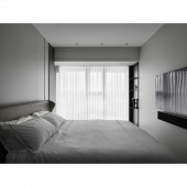
The site is an apartment for a family of four and has severe Western exposure. The male and female clients have their views on the space. Especially in terms of color, one of them prefers dark and the other light. The design team took wood grain to form separation, supplemented by lines and louvers to make light and shadow and grilles the main characters. The staircase is positioned as a transitional area to meet the darker tones preferred by the male and lighter tones preferred by the female, striking a balance between two different styles.
UNIQUE PROPERTIES / PROJECT DESCRIPTION:
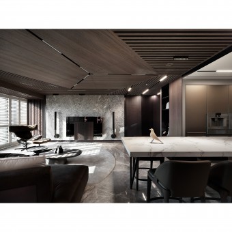
Grilles and Lighting: There are many grilles in the social area. Unlike the standardized expression and position of grilles, the design team took the idea of breaking down the vertical and horizontal to make the grilles appear interesting. The grilles are arranged in an irregular way on the ceiling, exposing the various lines.
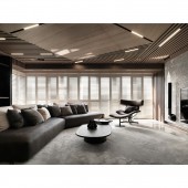
Conflict and Aesthetics: The site has severe Western exposure. To turn the disadvantage into an advantage, the design team installed adjustable blinds. The step area between the two is particularly important as it incorporates a dark and light color tone.
OPERATION / FLOW / INTERACTION:
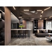
The client attaches great importance to the taste of life and the sense of ceremony. The large span of the kitchen island combined with the induction hob is a great experience to satisfy the taste of food. The open cabinet is also equipped with sophisticated linear lighting to showcase the client's collection. The private area then continues the theme of grand and nature, with large storage space and even a double washbasin, providing high-quality living for the family.
PROJECT DURATION AND LOCATION:
The project finished in February 2023 in Taiwan.
FITS BEST INTO CATEGORY:
Interior Space and Exhibition Design
|
PRODUCTION / REALIZATION TECHNOLOGY:
Building materials: titanium-plated chiseled panels, marble flooring, grilles, wooden louvers, iron parts, metal, etc.
The project uses many materials with patterns or three-dimensional grooves. In particular, the titanium-plated chiseled panel, which is metal in nature, has a different impression from the flat, hard, cold, and sleek. The natural chiseled surface of the pattern is rough and handmade, echoing the wood grain surface. The titanium-plated chiseled panels are placed in the hallway and on the storage cabinet as highlights.
SPECIFICATIONS / TECHNICAL PROPERTIES:
The site is an empty apartment with a total area of 181.5 square meters, with three bedrooms, a living room, a dining room, three bathrooms, and a study room.
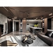
The social area is an open plan. The design team installed staggered grilles in the ceiling to give a new impression to the standard square layout and to shape a better visual flow. This is to solve the disadvantages of low ceiling height, western exposure, and only 245cm height under the beam. With the open plan and staggered ceiling grilles, the design team reversed the traditional square plan and created a great visual extension.
TAGS:
Dark tone, light tone, grille, stone, light, stairs, modern.
RESEARCH ABSTRACT:
The lines and color blocks are grand and natural. The lines are clearly layered, and the main visual is on the ceiling. The lines of the grille convey an extended effect, and the design team reinterprets it by breaking, reorganizing, and interlacing. The finished look has a technological and intellectual impression. The grille can also be matched with B&O's flagship TV set to enhance style consistency. The wall surface retains the texture of the materials themselves, such as the marble stone pattern to add elegance. Larger beams are clad with wood veneer to reduce their prominence.
CHALLENGE:
The most significant drawback of the site is the western exposure. The installation of wooden louvers can regulate the sunlight well, and at the same time, the dark tone of the wood veneer blurs the sunlight in the interior. In addition, the height under the beams is too low, with a minimum height of 245cm. To eliminate the constraint, the design team divided the social and private areas, and used lines to maintain the extension, so that the ceiling and wooden louvers echoed to achieve the magnifying effect.
ADDED DATE:
2023-06-29 03:35:36
TEAM MEMBERS (1) :
YAO-CHENG TSENG
IMAGE CREDITS:
CHANG JU Space Design
|
