DESIGN NAME:
Hanauta
PRIMARY FUNCTION:
Residence
INSPIRATION:
The client prefers a classical style and expects to enjoy the relaxation of a park view from an elegant and grand high-rise home.
The designer tried to simplify the lines according to the client's demand and presented the 'neo-classical' style with modern minimalism. In the light-colored space, the spatial axes are linked and the material is penetrated so that the outdoor view fills the room and people can enjoy the beautiful green scenery outside the window.
UNIQUE PROPERTIES / PROJECT DESCRIPTION:
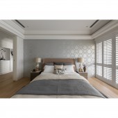
Wallpaper for the finishing touch: Under the modern classical style, the designer used pure tones as the base. The creamy white rendered the space, showing an elegant and calm atmosphere. And the wallpaper becomes the visual focus.
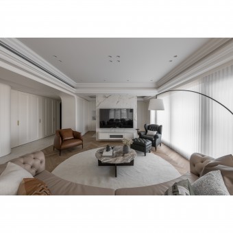
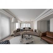
Axially linked social areas: The large social area is an open plan, with furniture as the boundary of each area. A TV wall stands in the middle of the study room and living room, while the axis of continuity is preserved by an openwork design on both sides. The large floor-to-ceiling windows in the unified space allow the view of the outdoors to extend into the room.
OPERATION / FLOW / INTERACTION:
The space planning is based on the needs of two people, especially the collection space and dressing rooms. The designer created separate dressing rooms for the man and woman. In the space for two people, the designer created private spaces for them.
The open social area is circular with axial lines to present a spacious and extended visual experience. The large floor-to-ceiling windows bring the blue sky and greenery into the interior, allowing people to open the curtains to see the delightful scenery. The project's neo-classical interpretation also concretizes the client's imagination of home.
PROJECT DURATION AND LOCATION:
The project finished in December 2022 in Taiwan.
FITS BEST INTO CATEGORY:
Interior Space and Exhibition Design
|
PRODUCTION / REALIZATION TECHNOLOGY:
Building materials: wallpaper, wooden louvers, stone patterned tiles, herringbone wood flooring, etc.
The floor-to-ceiling windows with wooden louvers brighten the interior with natural light, while the wallpaper shows elegance. The designer used stone patterned tiles to pave the walkway flooring in the modern classical style. The simple lines of thin tiles avoid stealing the beauty of the facade. The living room and master bedroom floors are transformed into herringbone wood floors to reveal a cozy atmosphere.
SPECIFICATIONS / TECHNICAL PROPERTIES:
The site is an empty apartment on the 16th floor connected by two apartments with a total area of 198.3 square meters. It has one bedroom and one living room.
Since the site is connected by two apartments, the designer had to improve the inherent disadvantage of its poorly positioned beams and columns. The designer used curves to soften the 90-degree angle of the foyer column, which can also be seen in the archway connecting the living room. In addition, the designer focused on concealing the beams. The hallway is narrow, so a certain height must be preserved to give it a perfect transition effect.
TAGS:
Neo-classical, light tone, wallpaper, empty apartment, two apartments combined, open plan.
RESEARCH ABSTRACT:
Gave the site a pure and elegant modern classical style according to the client's requirements. The light tone helps to extend the greenery outside. In a creamy white space, colorful wallpaper serves as a highlight. With spotlights and arched doors, the depth of field in the interior is clearly defined, reducing the narrowness of the aisle and separating the social and private areas. The social area is an open plan, with the flooring defining each area. The herringbone flooring can be seen in the living room, dining room, and study room, framing the circulation on the same axis.
CHALLENGE:
The site is an apartment, serving only two people. The designer re-planned the partitions in the large space of 198.3 square meters according to the client's requirements. As the two apartments are connected, the transition area from the foyer to the master bedroom and living room is not ideal. It was a challenge for the designer to achieve proper circulation.
As for the style, the designer taken great efforts to figure out the abstract concept around 'classical style' and has been communicating with the clients to visualize their expectations as much as possible.
ADDED DATE:
2023-06-29 03:22:30
TEAM MEMBERS (1) :
YP Interior Design
IMAGE CREDITS:
YP Interior Design
|


