DESIGN NAME:
Window View
PRIMARY FUNCTION:
Residence
INSPIRATION:
The client couple has lived here for over 20 years and are facing a new stage in their lives after their children left home. They are looking forward to renovating their old apartment and finding a home that meets their needs. The designer took a simplified and enlarged approach to create a connection between the interior and exterior. The project, 'View From the Window', accompanies the couple as they embark on a carefree second half of their lives.
UNIQUE PROPERTIES / PROJECT DESCRIPTION:
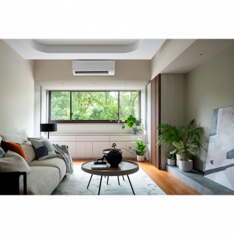
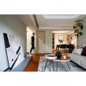
1. Restore the ceiling height by keeping the beams intact: Contrary to the flat studded ceilings, the designer created a minimalist design with a single curved ceiling to weaken the beams in the interior. He retained the original ceiling height above the walkway, allowing the beam to serve as a boundary between the dining and living rooms.
2. Saturated colors to create a harmonious contrast: The client focused on stereo. Used teak flooring, walnut cabinets, and warm grey walls to create an unobtrusive color transition in line with the pre-determined placement of the wooden speakers.
OPERATION / FLOW / INTERACTION:
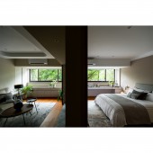
The key to the renovation is to subvert the established impression of the residents. In addition to fulfilling the storage and basic needs, the biggest difference between before and after the renovation was the lighting. By restoring the ceiling height and retaining the large windows, the designer significantly improved the lighting. The daylight also changes according to the daily routine. Outside the window, there is a green landscape, and the most beautiful scene is to spend a relaxing day at home.
PROJECT DURATION AND LOCATION:
The project finished in October 2023 in Taiwan.
FITS BEST INTO CATEGORY:
Interior Space and Exhibition Design
|
PRODUCTION / REALIZATION TECHNOLOGY:
Building materials: solid teak flooring, walnut veneer, latex paint, stone slabs, system cabinets, etc.
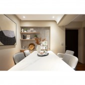
The designer took a minimum number of lines to achieve a clean visual effect. Light colors and wood embellishments turn the light gray TV wall into a canvas. The refraction of light from the outdoor trees makes the building blend with nature, and the overall look becomes more unadorned. The back of the shelves next to the dining table is covered with stone-textured high-pressure laminates and lines to create a distinctive wall that cleverly hides the electrical box.
SPECIFICATIONS / TECHNICAL PROPERTIES:
The site is a 112.3 square meter old apartment with 3 rooms and 1.5 bathrooms.
The large windows blur the lines between the interior and exterior to create the effect of enlarging the space. In the open-plan social area, there is no obvious separation between the living room and the dining room. Smooth layout and circulation create a spacious area. The columns by the window in the living room are added with storage space for functionality.
Considering the retirement life of the client couple, the consistency of the height of the flooring is created to achieve accessibility.
TAGS:
Old apartment, modern, curves, wood tone, minimalism, semi-retirement home.
RESEARCH ABSTRACT:
The designer gave the old apartment unlimited possibilities, and the refreshing 'View From the Window' materialized. The minimalist style and the design method of restoring the ceiling height created ideal lighting and ventilation. Next, the designer took advantage of the large windows to bring the park and forest into the home. Looking out from the windows is a healing green landscape, which gives a sense of coziness and comfort, and is the most important feature of the site.
CHALLENGE:
Because of the water leakage in the decades-old apartment, the preconstruction period was focused on the foundation work. The designer's willpower and patience were tested in laying the foundation within a tight schedule. The space is in a minimalist modern style, with simplification and enlargement techniques. Presenting a space that is minimalistic and bright without being monotonous, and at the same time meeting the client's requirements, were the primary considerations for this project.
ADDED DATE:
2023-06-29 01:58:19
TEAM MEMBERS (1) :
Kun-Han Yang
IMAGE CREDITS:
THINK THROUGH Design
|
