Ecohiny Branding by Cansu Dagbagli Ferreira |
Home > Winners > #152882 |
 |
|
||||
| DESIGN DETAILS | |||||
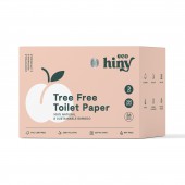
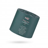
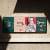
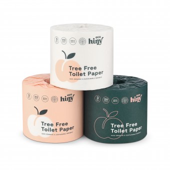
| DESIGN NAME: Ecohiny PRIMARY FUNCTION: Branding INSPIRATION: We created the brand direction inspired by the quirky name of the brand. The brand symbol is chosen as a peach, while the choice of colors creates a fun and playful personality for the brand. Deep blueish green hue, paired with peach, also conveys a sense of eco-friendliness and sustainability. As a typeface, a modern sans-serif font was chosen to convey a sense of simplicity and approachability. The font is legible and easy to read, making it ideal for product packaging and web design. UNIQUE PROPERTIES / PROJECT DESCRIPTION: ecoHiny is a newly launched brand of bathroom products made from 100% organic bamboo, FSC certified and soft as a feather. The brand personality is intended to be young, playful and bold. Design conveys eco-friendliness in a unique way. Branding features unique color combination and minimal approach. The product name and features are displayed prominently and in large font size on the packaging, as the product is displayed and sold on online e-commerce platforms. OPERATION / FLOW / INTERACTION: Bamboo toilet paper is a tree free product. It's septic free, soft and strong. The differentiation points from the competitors are being 350 sheet, elemental chlorine free and having a 100% recyclable packaging. PROJECT DURATION AND LOCATION: Project started in April 2022 and finished in April 2023. The products were launched in May 2023 FITS BEST INTO CATEGORY: Graphics, Illustration and Visual Communication Design |
PRODUCTION / REALIZATION TECHNOLOGY: The design thinking method of Diverge and Converge was used. All design was realized digitally as vector based assets with Adobe Creative Suite and then physical items such as toilet paper wraps and the shipping box were produced by 4 color printing technique. SPECIFICATIONS / TECHNICAL PROPERTIES: 3 sizes for shipping box was designed: 12 pack, 24 pack and 36 pack. Wrap dimensions are R11 x H11 TAGS: bathroom, toilet paper, packaging, bamboo, sustainable, eco friendly, packaging design RESEARCH ABSTRACT: A thorough competitor research was done online and offline. During the research phase we realized that all bamboo toilet paper brands use the same tone of bright green. Our aim was to differentiate the brand from others on the market by using a unique color palette. CHALLENGE: The challenge was being able to produce the same color for the toilet paper wraps and the shipping box. Even though a propriate Pantone color was chosen, the fact that the wraps and the box has different materials resulted in different printed colors. We had to make adjustment in the trial print phase, to make sure the colors matched. ADDED DATE: 2023-06-28 12:51:58 TEAM MEMBERS (1) : IMAGE CREDITS: Cansu Dagbagli Ferreira, 2023. |
||||
| Visit the following page to learn more: https://www.cansudagbagli.com | |||||
| AWARD DETAILS | |
 |
Ecohiny Branding by Cansu Dagbagli Ferreira is Winner in Graphics, Illustration and Visual Communication Design Category, 2023 - 2024.· Press Members: Login or Register to request an exclusive interview with Cansu Dagbagli Ferreira. · Click here to register inorder to view the profile and other works by Cansu Dagbagli Ferreira. |
| SOCIAL |
| + Add to Likes / Favorites | Send to My Email | Comment | Testimonials | View Press-Release | Press Kit |

