Sushi Koji Restaurant by Ryuji Kojo and Toshihiro Obata |
Home > Winners > #152864 |
 |
|
||||
| DESIGN DETAILS | |||||
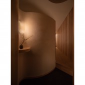
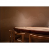
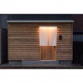
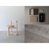
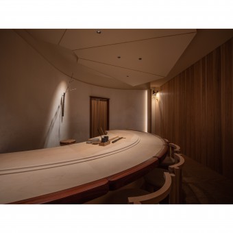
| DESIGN NAME: Sushi Koji PRIMARY FUNCTION: Restaurant INSPIRATION: Client is a sushi chef who has worked at many famous restaurants. In designing a sushi restaurant that would open when he became independent, we were inspired by him. To embody his warm personality and his attitude as a craftsman who brings out the flavor of ingredients, we created a space that gently envelops guests with soft materials. The space, created while taking advantage of the original characteristics of materials, will grow in depth with time, fostering an atmosphere only felt here. UNIQUE PROPERTIES / PROJECT DESCRIPTION: The sushi restaurant was designed using natural materials. There is only an 8-seat counter where guests can enjoy the sushi while watching the chef's work. The scrap ginkgo wood used for the countertop was utilized for the sushi board and cutting board. Chairs designed with the grain of the wood in mind, walls covered with original Washi, and signboards made of maple plates dyed by iron mordant not only reduce the waste of resources, but also create a healing effect with the use of solid wood. OPERATION / FLOW / INTERACTION: In order to create the maximum number of seats, the counter is designed fan-shaped. By doing this, creating a space around the entrance that separates it from the seating area, and also creating a gently changing scene in a space of only 24 m2. Guests pass through the door covered with cedar planks, change their minds at the entrance, and arrive at the seating area as if guided by the curved wall. They can enjoy sushi without worrying about the outside or the comings and goings of people. PROJECT DURATION AND LOCATION: Completed in December 2022, Fukuoka city, Japan FITS BEST INTO CATEGORY: Interior Space and Exhibition Design |
PRODUCTION / REALIZATION TECHNOLOGY: Avoiding the use of industrial products as much as possible, original handmade Washi and solid wood were used as the main materials. Washi on the walls was made by processing mulberry, and organic patterns were created by pouring gofun (Japanese powdered pigment) during the papermaking process. The countertops were cut with a custom blade to smooth the edges, and the chairs made of local cypress were joined with double mortise and tenon to ensure high strength and durability. SPECIFICATIONS / TECHNICAL PROPERTIES: Floor space 24 m2 TAGS: Interior, Restaurant, Sushi, Material, Japan, Fukuoka RESEARCH ABSTRACT: In working on the project, we considered "design as a brand". We extended the owner's worldview and spatial experience by directing a wide range of tools to communicate the store (brand), such as signage, business cards, and thank-you letters, using a space design approach and some of the materials used. CHALLENGE: The challenge was to efficiently arrange the seats without making it feel cramped. We placed great importance on the design of "ma", a uniquely Japanese aesthetic that is expressed in Japanese architecture and art. The fan-shaped counters and ceiling design give the impression of spreading endlessly. On the walls with minimal decoration, a single-flower vase is placed, creating a relationship in which the flowers and the blank space enhance each other. People can feel more expansive than area. ADDED DATE: 2023-06-28 11:40:23 TEAM MEMBERS (9) : Creative Director : STUDIO MOUN, Architect : Ryuji Kojo + Toshihiro Obata / STUDIO MOUN, Constructor : Yasutsunegumi, Branding Director : Hanae Yoshizaki / H Branding Works, Graphic Designer : Natsuko Saka / TSUTO, Calligrapher : Mikiko Kayama, Lighting Designer : Ryohei Koyama / ModuleX, Washi : Kamisukishikoushitsu and Bespoke Chair : Wataru Sakai IMAGE CREDITS: Image #1-4 : Photographer Toshihisa Ishii / Blitz Studio Image #5 : Photographer Airi Inoue PATENTS/COPYRIGHTS: Copyrights belong to STUDIO MOUN, 2023 |
||||
| Visit the following page to learn more: https://studiomoun.com/archives/works/su |
|||||
| AWARD DETAILS | |
 |
Sushi Koji Restaurant by Ryuji Kojo and Toshihiro Obata is Winner in Interior Space and Exhibition Design Category, 2023 - 2024.· Press Members: Login or Register to request an exclusive interview with Ryuji Kojo and Toshihiro Obata. · Click here to register inorder to view the profile and other works by Ryuji Kojo and Toshihiro Obata. |
| SOCIAL |
| + Add to Likes / Favorites | Send to My Email | Comment | Testimonials | View Press-Release | Press Kit |

