DESIGN NAME:
Reconstruct Boundary
PRIMARY FUNCTION:
Residence
INSPIRATION:
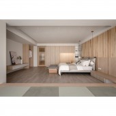
The space serves a family of four. The client hopes that this renovation will allow more frequent communication between the family members. To do so, the designer took the blurring of the boundaries of each area as the core according to the family's living habits. The designer removed unnecessary partitions and used metaphors to define the theme between each area. The blurring of the boundaries magnifies the visual effect of the interior, and the spacious social area significantly strengthens family cohesion.
UNIQUE PROPERTIES / PROJECT DESCRIPTION:
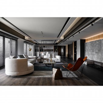
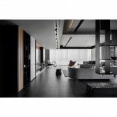
Breaking the boundaries: To blur the boundaries between the various areas, installed custom-made suspended ironwork in the social area to connect the living and dining rooms. The open laminate allows the space to be permeable, and the irregular lines provide a unique touch.
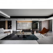
Flooring: Presents different visual effects on the floor, defining the theme of each space by the difference in color.
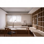
Study Room: Contrary to the general definition of a study room as a place to read, emphasizes 'relaxation�9;, making this space a social hall for families to spend time together.
OPERATION / FLOW / INTERACTION:
After the completion, the client gave positive feedback that the designer's separation of the social and private areas is very appropriate. In addition to the privacy of the living space, the dining room, living room, and even the study room are all highly comfortable.
In particular, the study room was originally an enclosed space, but after the renovation, the whole social area is more connected. If both parents and children have guests, the adults can use the living room and dining room, while the children and their friends can use the study area without interfering with each other.
PROJECT DURATION AND LOCATION:
The project finished in October 2022 in Taiwan.
FITS BEST INTO CATEGORY:
Interior Space and Exhibition Design
|
PRODUCTION / REALIZATION TECHNOLOGY:
Building materials: iron parts, stone plastic composite flooring, floor tiles, system cabinets, transparent glass, marble, slab tiles, eco-friendly latex paint...etc.
The interior is divided by dark and light tones to create a boundary between the social and private areas. The social area emphasizes dark tones such as black, white, and gray, with black iron parts creating a stylish look. Among them, the suspended iron laminate that connects the living and dining rooms is welded to the steel structure before the woodwork ceiling is constructed, to present a suspended effect.
SPECIFICATIONS / TECHNICAL PROPERTIES:
The total area of the interior design is 495.8 square meters, with 4 plus 1 room. Originally there was a partition next to the kitchen, which knocked down one of the walls to bring in natural light and transformed the space into a study room that can be used flexibly and also serve as a social hall. Whether it's for guests or daily life, the client's family can enjoy a cozy time in this space. The sliding glass door is worth mentioning so that parents can keep an eye on the children when they are alone inside.
TAGS:
Old apartment, family, cohesion, large area, low-profile luxury, boundaries.
RESEARCH ABSTRACT:
The designer eliminated the boundaries in the interior according to the client's living habits. After removing the unnecessary partitions, the original look of the space was restored. Used metaphor to define the theme between each area, to achieve the best balance between spaciousness and privacy.
The foyer is the core, with the social area on the left and the private area on the right. The foyer is made up of a variety of materials. The warm and elegant atmosphere extends from the left to the right with the warm wood veneer covered with white marble.
CHALLENGE:
The project is a renovation of a ten-year-old apartment. The initial site was in poor condition, and the design team had to reinforce the flooring and painting, so they spent a lot of time on the foundation work. During the construction, due to the spacious site, there were also disadvantages of low and large beams. The designer took a variety of techniques to make the space visually not too narrow while using open laminates and dark colors to match the space with a sense of texture.
ADDED DATE:
2023-06-28 09:30:02
TEAM MEMBERS (1) :
YI-RONG WEN
IMAGE CREDITS:
iiNO Design
|
