DESIGN NAME:
Reflections Impress
PRIMARY FUNCTION:
Office
INSPIRATION:
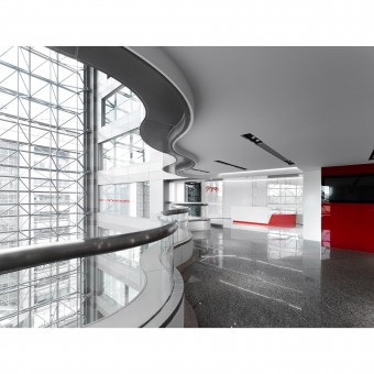
The project is an office. The company is in the software engineering industry, so the interior design is presented with advanced, innovative, and lively imagery. The designer planned a layout for the passageways required while solving the disadvantages of western exposure and irregular space to maximize space utilization. Finally, the corporate representative color, red, is used to cover the space, creating a comfortable yet textured office.
UNIQUE PROPERTIES / PROJECT DESCRIPTION:
Access Control System: The project planned the layout according to the premise that each department must be equipped with an access control system. The designer planned the interior like a maze, with arcs and glass to create a textured, sleek, avant-garde image in keeping with the brand's style.
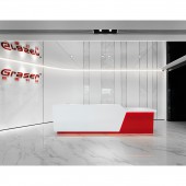
Reception Area: The flat is not a square pattern. When people step out of the elevator, they see the door at a 45-degree angle. The reception wall has the beveled facade of the technology company image as a turn so that the logo can be seen by visitors.
OPERATION / FLOW / INTERACTION:
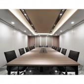
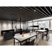
In addition to the grand impression, in terms of functional planning, the staff office area has a comfortable and spacious workstation while the lounge area meets the needs of three groups: guests, staff, and managers. In the manager's office, the designer installed a sliding wooden grille as the wall following the layout to create a sense of reliability, while the irregular space between the grille and the beams can serve as a storage space.
PROJECT DURATION AND LOCATION:
The project finished in March 2022 in Taipei.
FITS BEST INTO CATEGORY:
Interior Space and Exhibition Design
|
PRODUCTION / REALIZATION TECHNOLOGY:
Building materials: glass, white baking lacquer, silver marble, tile, aluminum grille, iron parts, titanium-plated metal, wood grain, etc.
The color scheme is minimalistic. The office and training space is covered with baking lacquer, and its crystal-clear texture echoes the glass. The lounge is presented with natural materials such as wood and stone, and the subdued color palette brings a serene, strong, and trustworthy atmosphere. Finally, the corporate color, red, connects the various areas and visualizes the company's core values.
SPECIFICATIONS / TECHNICAL PROPERTIES:
The site is a 30 year old flat on the 12th floor with a total area of 694.2 square meters.
The site is in a commercial building with a wide view. However, the ceiling height is only 2.3 meters, which makes the visual experience limited. The designer planned the ceiling to preserve its height as much as possible. The exposed pipes fit the style of a technology company and the grilles on the facade create a rhythm.
TAGS:
Technology industry, light tone, baking lacquer, maze, smooth, large space.
RESEARCH ABSTRACT:
To create an interior design that is in line with a technology start up, the designer took a combination of lacquer and translucent glass. In addition, to realize the independence of each area, a glass maze plan is presented. The designer used lines and light as visual guides, and each area is appropriately linked and connected to maintain a stable and harmonious rhythm.
In the large space, the designer took a light color scheme to match the main visual color of the company. Materials are selected according to the definition of space.
CHALLENGE:
The site is large. During the renovation, the designer had to consider the coordination between the construction team and the company staff, as well as the temporary response to unexpected conditions. In addition, although the site is lit from three sides, the planning of the building caused a disadvantage with western exposure, so more attention had to be paid to insulation methods and the choice of materials.
ADDED DATE:
2023-06-28 07:27:20
TEAM MEMBERS (1) :
CHIA-CHIEN YIN
IMAGE CREDITS:
Sketch Interior Design Co.,Ltd.
|
