DESIGN NAME:
Simple Harmonic
PRIMARY FUNCTION:
Residence
INSPIRATION:
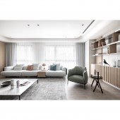
The project is a home gifted by a mother to her two daughters. The designer aimed to create a modern home to serve the two women. The theme is a modern style with a soft touch. Instead of a bright color palette, a low-saturation color palette is chosen. The light color palette emphasizes the details, and the use of baking paint, paint, and grille shows a variety of visual effects.
UNIQUE PROPERTIES / PROJECT DESCRIPTION:
Arcs with beauty and function: The white cabinets extending from the entrance to the dining room are made up of many small semi-circular shapes, and the rounded surface is not just a shape, but a quarter-circle storage cabinet.
Multiple material combinations: Although a variety of materials are used, the overall effect is quite harmonious due to the appropriate color scheme. The designer used gloss and matte finishes, as well as the visual contrasts created by the differences in convexity and flatness to emphasize the sense of solidity.
OPERATION / FLOW / INTERACTION:
The project is a renovation of an empty apartment. The designer customized the project according to the needs of the users, including the scale, storage, and functionality to meet their living habits. Since the two daughters did not have their own storage space for their clothes and belongings, the project is designed to provide separate dressing rooms with smooth circulation and a more spacious and convenient living experience, while perfectly visualizing the ideal home in their mind.
PROJECT DURATION AND LOCATION:
The project finished in February 2021 in Taiwan.
FITS BEST INTO CATEGORY:
Interior Space and Exhibition Design
|
PRODUCTION / REALIZATION TECHNOLOGY:
Building materials: metal iron parts, stainless steel, Belgium laminate flooring, system plates, trims, transparent glass, baking paint, paint, grating, solid wood staining, tiles...etc.
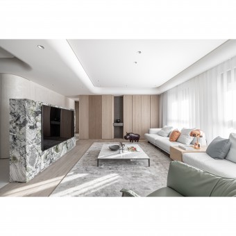
The designer used various materials to create the overhanging cabinets and laminates in the living room, making them a highlight. The rigid stainless steel combined with rounded arcs creates the laminate, the warm wood with straight latticework is used as the storage cabinet, and the tile and wood veneer is used as the facade at the back.
SPECIFICATIONS / TECHNICAL PROPERTIES:
The site has a total area of 148.7 square meters, with two bedrooms, a living room, and a dining room. The interior is divided into a foyer, living room, dining room, kitchen, master bedroom, dressing room, and second bedroom.
The site is an empty apartment, so the designer customized the circulation according to the living habits of the two clients. And because the client's family values Feng-Shui, the designer placed a cabinet in the foyer as a vista to provide functionality.
TAGS:
Modern style, mix-and-match style, Morandi color, light tone, various materials.
RESEARCH ABSTRACT:
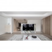
Although the bold pattern may seem unconventional, the TV wall serves as the centerpiece of the area. Furthermore, the designer utilized flooring to delineate the different themes within the open social space, effectively expanding the overall visual perspective by avoiding additional partitions.
Contrasting the social area, the private space features wood veneer and wood grain as the primary visual elements. The bedrooms for the two occupants are adorned with backing paint, fabric, and other materials in a Morandi tone, adding a touch of sophistication.
CHALLENGE:
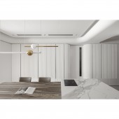
Although the site is a spacious empty apartment, it features several large beams, resulting in a relatively low ceiling height of approximately 265cm. Additionally, the ceiling requires hidden air conditioning installation, which further reduces the overall height. Moreover, due to the presence of numerous angles, the designer opted for rounded and curved lines to embellish the space. For instance, the cabinets flanking the dining table have rounded edges, and the ceiling showcases curved shapes.
ADDED DATE:
2023-06-28 06:53:12
TEAM MEMBERS (1) :
Ekko Chen
IMAGE CREDITS:
Shape 2 Design
|
