The Realm of Ink Residential House by Yun Hsien Chuang |
Home > Winners > #152712 |
 |
|
||||
| DESIGN DETAILS | |||||
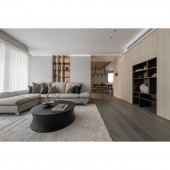
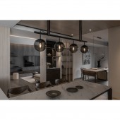
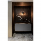
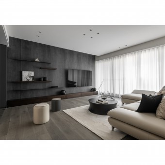
| DESIGN NAME: The Realm of Ink PRIMARY FUNCTION: Residential House INSPIRATION: The striking simplicity is established through a neat, pure minimalistic interior. The abode is an exclusive getaway from a city where everything seems to be fast-paced and stressful. Since interior design should reflect the essence of the individuals, this human-centered approach focuses on the needs and habits of the residents. The concept of "less is more" isn’t about creating sparse, bare rooms. It’s about using less to achieve more as well as cultivating neat, and practical spaces. "Less is more" embodies clarity that the house owner longs for by emphasizing simplicity and eliminating superfluous elements. UNIQUE PROPERTIES / PROJECT DESCRIPTION: Without complicated color variations, the space is filled with the stability of the wood accents and the calmness of the stone patterns. Besides, sunlight flows over the space widely, creating a warm and elegant living environment. In the residence, the semi-open layout not only allows natural light to flow throughout the interior space, but also offers privacy to the dining room and private space. The dining room is the hub of the abode, linking different fields and imperceptibly bringing family members closer. OPERATION / FLOW / INTERACTION: Upon opening the door, the cabinet forms a warm vista view made of wood. The calm atmosphere gradually unwinds the mind. The flooring materials change as you walk into the living room. The main wall is painted the same color as the shoe cabinet, with an increased intensity of textures. The rustic pattern of cracked ice adds a delicate layer to the cold gray tone. The horizontal extension of the table top and the vertical dividing lines provide orderly geometric divisions to the space with seemingly random in its nature, creating a balance between rationality and sensibility. On the wall behind the sofa, a see-through open display shelf is embedded in the middle to visually expand the space and also connect the living room and dining room. For the cabinets leading to the dining room, the same approach integrates storage and display functions to create a neat look and eliminate the sense of monotony brought by large volumes. PROJECT DURATION AND LOCATION: The project is finished in August 2022 in New Taipei City, Taiwan. FITS BEST INTO CATEGORY: Interior Space and Exhibition Design |
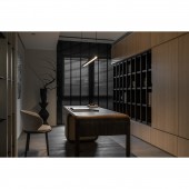
PRODUCTION / REALIZATION TECHNOLOGY: Italian quartz tile, iron parts, natural solid wood veneer, modeling panels, custom-made wooden floors, wallpapers, system cabinets SPECIFICATIONS / TECHNICAL PROPERTIES: In the space of 166 square meters, there are an entrance, one living room, one dining room, one kitchen, two bedrooms, one semi-open study room, and two bathrooms. TAGS: Interior Design, Residential, Wood, Less is more, Curved surface, Tranquil beauty RESEARCH ABSTRACT: The bedroom continues the clarity of the public space to create a comfortable sleeping atmosphere. In the secondary bedroom, a smooth curved surface above the bedhead wraps the low beam, reducing the sense of oppression and adding an elegant charm to the square frame. Along with white daylight, neutral shades of gray create a laid-back atmosphere. CHALLENGE: Different from the bright living room, the low-lit dining room and study room exude a sense of tranquil beauty. Woods accents spread extensively on the ceiling, wall, and flooring. The subdued atmosphere allows one to appreciate the five senses and helps to slow down and live for the moment. The space is transformed into a place of stability to keep the mind and body at peace. Instead of a monochromatic color scheme, the mix of different wood tones on the large book wall injects delicate details into the mellow space. ADDED DATE: 2023-06-27 08:58:00 TEAM MEMBERS (1) : Yun Hsien Chuang IMAGE CREDITS: SHEZING DESIGN |
||||
| Visit the following page to learn more: http://reurl.cc/qLX6aD | |||||
| AWARD DETAILS | |
 |
The Realm of Ink Residential House by Yun Hsien Chuang is Winner in Interior Space and Exhibition Design Category, 2023 - 2024.· Press Members: Login or Register to request an exclusive interview with Yun Hsien Chuang. · Click here to register inorder to view the profile and other works by Yun Hsien Chuang. |
| SOCIAL |
| + Add to Likes / Favorites | Send to My Email | Comment | Testimonials | View Press-Release | Press Kit |

