DESIGN NAME:
Langpai Tequ T9
PRIMARY FUNCTION:
Packaging
INSPIRATION:
The logo shape is primarily inspired by the elite team emblem, symbolizing power and masculine beauty. The logo incorporates five grains (sorghum, wheat, rice, glutinous rice, corn). The upward-flying beveled corners of the bottle represents the unique style of this dual-aroma liquor: Langjiu possesses unparalleled advantages, situated in the birthplace of strong aroma liquor and the core production area of world-class sauce aroma liquor, on the left bank of the Chishui River.
UNIQUE PROPERTIES / PROJECT DESCRIPTION:
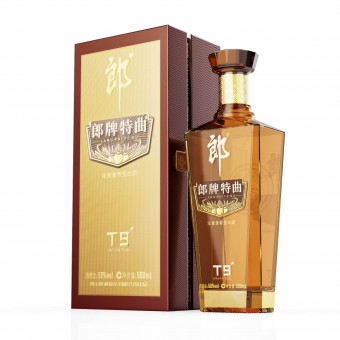
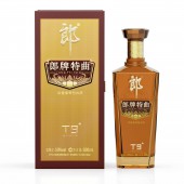
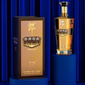
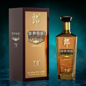
Langpai Tequ T9 is a newly upgraded high-quality liquor with a revamped bottle packaging. The bottle features a unique logo design combined with a five-grain pattern, and its eight-sided glass shape is visually distinctive. The overall design has a stylish and refreshed look, with intricate and dynamic patterns that symbolize the brand.
OPERATION / FLOW / INTERACTION:
-
PROJECT DURATION AND LOCATION:
-
FITS BEST INTO CATEGORY:
Packaging Design
|
PRODUCTION / REALIZATION TECHNOLOGY:
The design elements of the luxurious and elegant cap add a touch of exquisite charm and distinctive appeal. The style comprehensively showcases the cultural beauty, artistic conception, and style of Langpai Tequ, while delivering a new quality experience of both strong aroma and sauce aroma. It breaks through the boundaries of single flavor, combining strong aroma with sauce aroma. Besides, the back of the bottle is intricately engraved with a seal, providing a tactile grip, enhancing the bottle's fashionable appeal, and giving the product greater brand recognition and competitiveness.
SPECIFICATIONS / TECHNICAL PROPERTIES:
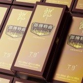
Text information is also an essential part of packaging. The design incorporates the brand and product information in a cross arrangement, intuitively displaying the alcohol content and volume of the liquor, clarifying the product's positioning. This wine bottle adopts a minimalist design concept, with a semi-transparent sprayed glass bottle with eight facets that enhances the sparkling quality of the liquor. The appearance features four exquisite cut surfaces to ensure a harmonious and unified visual composition, while the soft lines outline a sense of natural purity in aesthetic enjoyment. Furthermore, the application of holographic laser positioning paper technology adds a touch of color and light, enhancing the sense of opening the box from the details. The design is not only visually appealing but also boasts superior anti-counterfeiting performance, elevating the overall visual effect with its unique design.
TAGS:
Packaging
RESEARCH ABSTRACT:
The hand-writing "Langpai" visually aligns with the traditional brewing characteristics, strengthening the brand impression and facilitating consumer recognition. This not only enhances the product's tone but also achieves a high level of unity between functionality and aesthetics in the T9.
CHALLENGE:
T9 features a semi-transparent embossed T-shaped official cap design: the multi-faceted crystal-crowned cap exhibits exceptional texture, while the neck of the cap is adorned with relief craftsmanship and lattice patterns in the Tang and Song dynasty, creating an atmosphere of subtle luxury that symbolizes the intellectual elegance of a learned person. By incorporating the gentleman culture into the liquor packaging, the visual presentation elevates the cultural taste, showcasing the brand's core elements embedded on the bottle, and exuding a sense of sophistication . It not only satisfies the user's taste but also delivers a more distinguished and extraordinary experience.
ADDED DATE:
2023-06-27 03:11:02
TEAM MEMBERS (5) :
He Zhuang, Qiu Lina, Wang Bowei, Yu Jun and Wang Chaojun
IMAGE CREDITS:
He Zhuang, Qiu Lina, Wang Bowei and Yu Jun, 2023.
|
