DESIGN NAME:
Wabi Sabi Elegance
PRIMARY FUNCTION:
Residence
INSPIRATION:
The project serves a family of four. The client initially expected a luxurious and grand style with a light brown tone and less use of wood. The design team precisely analyzed the relationship between the site and the client's family and has four cores: "harmony, respect, purity, and tranquility", which corresponded to the circular design, spatial harmony, reduction of decoration, and comfortable scale. The design team used elements such as lighting or titanium-plated trim to outline the luxury, making the site more in line with family habits and clients’ expectations.
UNIQUE PROPERTIES / PROJECT DESCRIPTION:
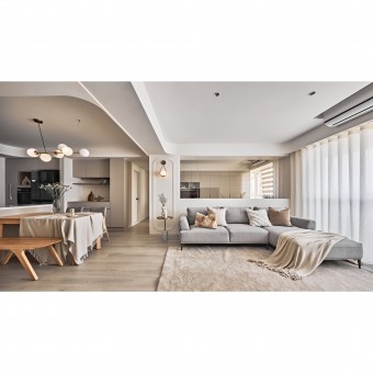
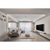
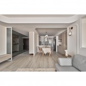
Visual connection: The design team uses a large number of rounded elements to outline the ceiling of each space, aiming to create a stress-free atmosphere and emphasize the theme. The softness of the arcs helps to guide the view and make the transition of each space look natural. Finally, the light strips in the walkway connect each of the individual spaces, giving them a more coordinated feel. The highlight is the two sides of the aisle, where the design team installed the black mirror to depict a complete framework for the light strips, linking the public and private areas.
OPERATION / FLOW / INTERACTION:
The client's family is very fond of the style of the space. After listening to the client's needs, the design team gave professional advice on what the client wanted and achieved the best possible result in a limited time. The design team worked professionally to create a comfortable look for the family, where each person could find their favorite spot to spend the day. For example, a window side couch with a city view, or a master bedroom dressing room to spend time alone with one's treasures. The space is also a great way for clients to tell their friends and family about their homes.
PROJECT DURATION AND LOCATION:
The project finished in January 2023 in Taiwan.
FITS BEST INTO CATEGORY:
Interior Space and Exhibition Design
|
PRODUCTION / REALIZATION TECHNOLOGY:
Building materials: system cabinet, Korean artificial stone, European floor tiles, subway tiles, wood flooring, eco-friendly latex paint, moru glass, trims, black mirror, etc.
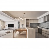
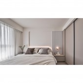
The color scheme is pure, with a cream color latex paint base that is close to the white tone. When the daylight falls, a sense of elegance and grace spreads through the room. Simple light strips and warm light outline the space, while the layered ceiling softens the sharp corners. Meanwhile, dark elements such as black mirrors and subway tiles are the accents in the details.
SPECIFICATIONS / TECHNICAL PROPERTIES:
The site is on the 11th floor of a 15-year-old pre-owned apartment with a total area of 115.7 square meters, with four bedrooms, a living room, a dining room, and two bathrooms.
The project is a renovation of a pre-owned apartment. The design team made only necessary changes to the original layout, such as replacing the facade between the study and the living room with glass to create a transparent visual effect and opening up the enclosed kitchen to allow for a dual balcony airflow in the public area. These two changes significantly increase the amount of light and fresh air in the interior.
TAGS:
Wabi-sabi style, old apartment renovation, light tone, open plan, cream color, high floor.
RESEARCH ABSTRACT:
The interior, which was designed with minimalism and purity, achieved 'harmony, respect, purity, and tranquility.'
The first is harmony. Took rounded curves to eliminate sharp corners and form a soft visual effect.
Secondly, respect. Changed the lighting, ceiling height, etc., after replanned the layout to link each area.
The third is purity. The site has light from three sides. When the decoration is reduced, the lighting will be brighter.
Lastly, tranquility. Arranged the furnishings and traffic flow on a comfortable scale so that the home can be more suitable for each user's habit.
CHALLENGE:
There are two shortcomings of the site. One is the low ceiling, which makes people feel oppressed. Another is the structure, which has many beams on the ceiling, which lead to disturbance of the view. The design team took the contrast between the height of the ceiling to create a high effect and applied a rounded design instead of sharp corners to eliminate the volume of beams. In addition, the aluminum frames are treated with a special silver exterior and white interior lacquer, which took time and effort to pursue the consistency of color without breaking the building regulations.
ADDED DATE:
2023-06-26 07:01:24
TEAM MEMBERS (1) :
Li-Hao Ou, Wang-Lin Lei
IMAGE CREDITS:
CHAOYI Interior Design
|
