Compostiton in Grey Dental Clinic Interior Design by Ping Yu and Tai Lin Wu |
Home > Winners > #152373 |
 |
|
||||
| DESIGN DETAILS | |||||
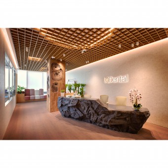
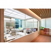
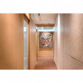
| DESIGN NAME: Compostiton in Grey PRIMARY FUNCTION: Dental Clinic Interior Design INSPIRATION: The clinic is located inside the medical building, and the base is separated into two parts by a public walkway, which made us rethink the definition of the boundary of the spatial place. Designer compare the layer and structure of the teeth to a venue, material and material gradually overlap to form the structure. The outermost layer of the base is considered as the shell covering the field, while the moving lines exist like a gray color, blurring the boundaries of the field. UNIQUE PROPERTIES / PROJECT DESCRIPTION: The clinic has always had a nervous and unapproachable appearance, and we hope to change people's previous impressions of the clinic. The designer made the clinic more approachable by implanting a warm atmosphere and blurring the boundaries of the base itself, which is divided into two parts by the public walkway, so we thought of naturally incorporating the public movement into the space and treating it as a blurred field. We hope that these two approaches will make this dental clinic different from the previous perception of dental clinics. He is a warmer and more intimate presence. OPERATION / FLOW / INTERACTION: After fully communicating with doctors and understanding the clinic process, designer wanted to treat the dental laboratory as an exhibition space with a large frame view, through which people can look into the laboratory with a surreal view compared to the gray field they are in to create a sense of contrast in different time axes, thus increasing the experience of the original media place. The x-ray room is located in the center of each operatory, so that customers and nurses can reach each operatory in the shortest distance. PROJECT DURATION AND LOCATION: The Project started in May 2022 in Singapore and finished in June 2022 in Singapore. FITS BEST INTO CATEGORY: Interior Space and Exhibition Design |
PRODUCTION / REALIZATION TECHNOLOGY: The ceiling of the reception and waiting area is made of grid, and the different levels of light from the back of the grid are used to bring more layers of imagery into the space. The center of the reception space is a large structure, which designer combined with the ceiling and incorporated the wood wheel element, which is formed by progressive stacking of layers, echoing the concept of our space. All places are made up of blurred boundaries superimposed one on another. SPECIFICATIONS / TECHNICAL PROPERTIES: 254 SQM TAGS: DENTAL CLINIC, CLINIC, INTERIOR DESIGN, INTERIOR ARCHITECTURE, COMPOSITION IN GRAY, COMPOSITION, SINGAPORE, LQ DENTAL, DENTAL CLINIC RESEARCH ABSTRACT: Designer have created a comfortable clinic environment, and after complete communication with the doctors, designer have fully adapted the clinic's operating habits and lines, and improved the efficiency of the clinic, unlike the previous dental clinics. Designer hope to bring people a new impression of the clinic and a more sustainable operation through our design of a different tone of the clinic. CHALLENGE: By creating a warm and approachable clinic atmosphere, designer remove the clinic's previous cold image.. The wooden veneer facade of the inner space is the entrance to each clinic, and also serves as a kind of intermediary to enter each clinic through this layer, each clinic is slightly different in its facade. The other facades are slightly different from one clinic to another, just like our teeth, with similarities and some differences, adding a different experience and interest to each visit. ADDED DATE: 2023-06-20 04:35:18 TEAM MEMBERS (2) : FOUNDER & CREATIVE DIRECTOR:PING YU WU and FOUNDER & CREATIVE DIRECTOR: TAI LIN WU IMAGE CREDITS: Image #1: Photographer:Raymond Tay/ Creator:Design Director & Founder Ping Yu Wu, Design Director & Founder Tai Lin Wu, Image #2: Photographer:Raymond Tay/ Creator:Design Director & Founder Ping Yu Wu, Design Director & Founder Tai Lin Wu, Image #3: Photographer:Raymond Tay/ Creator:Design Director & Founder Ping Yu Wu, Design Director & Founder Tai Lin Wu, Image #4: Photographer:Raymond Tay/ Creator:Design Director & Founder Ping Yu Wu, Design Director & Founder Tai Lin Wu. |
||||
| Visit the following page to learn more: https://lqdent.com.sg/ | |||||
| AWARD DETAILS | |
 |
Compostiton in Grey Dental Clinic Interior Design by Ping Yu and Tai Lin Wu is Winner in Interior Space and Exhibition Design Category, 2023 - 2024.· Press Members: Login or Register to request an exclusive interview with Ping Yu and Tai Lin Wu. · Click here to register inorder to view the profile and other works by Ping Yu and Tai Lin Wu. |
| SOCIAL |
| + Add to Likes / Favorites | Send to My Email | Comment | Testimonials | View Press-Release | Press Kit |


